

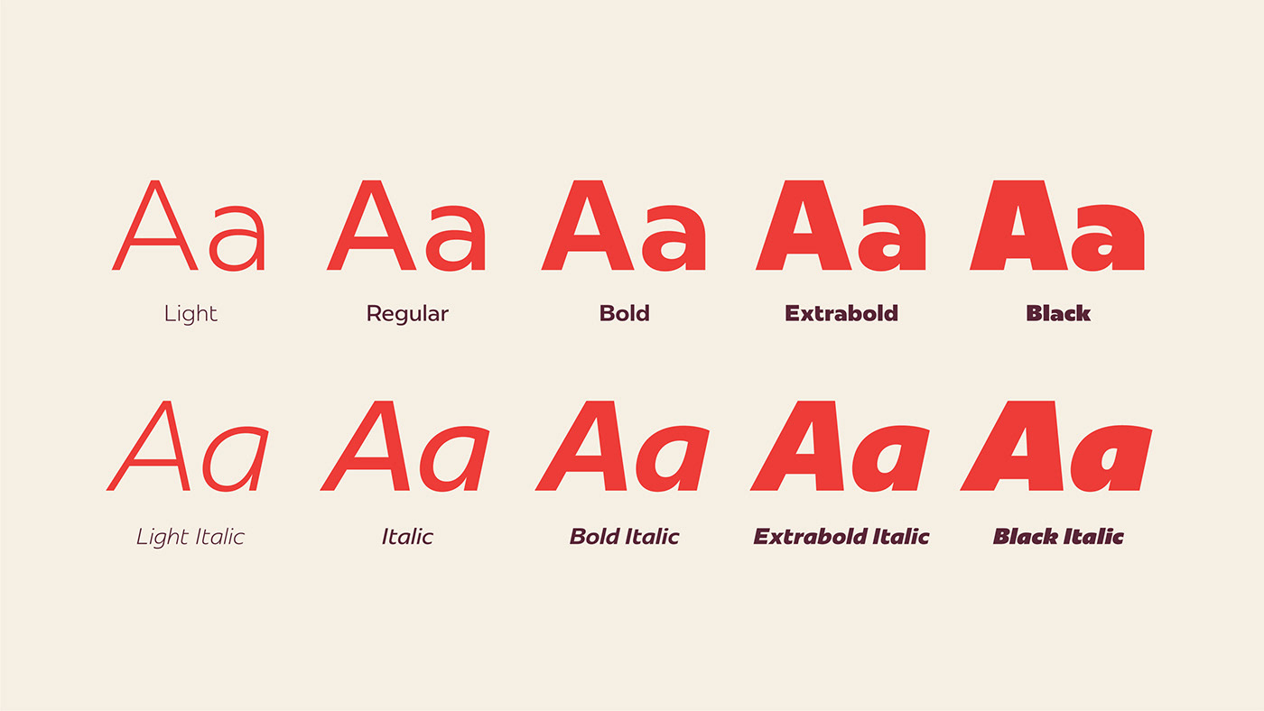
Born out of the desire to have an exclusive font for our own communication, Redonda was too big to keep just for ourselves. This is how the 10th typographic family launched by Plau appears, the first being signed by Carlos Mignot. The font design came from a search for a lot of impact. But from the beginning in black weight, with only capitals and geometric aspirations, it developed into a versatile humanist font. While keeping th1e impact that inspired it, it also delivers performance on flowing interfaces and texts. This balance also reflects the font development process: born from historical research, but with a greater concern for being contemporary.


Some references from PhotoLettering OneLine that we used to design Redonda


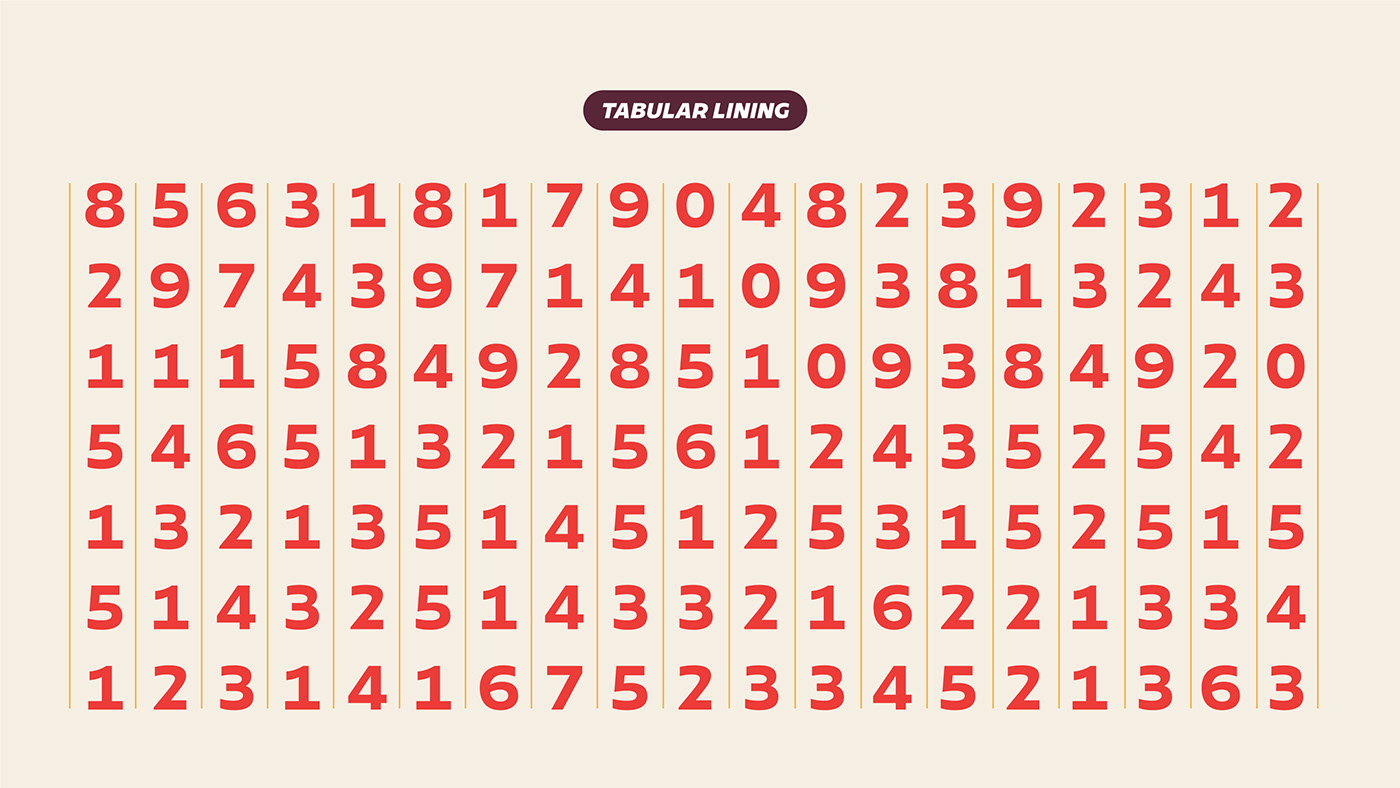


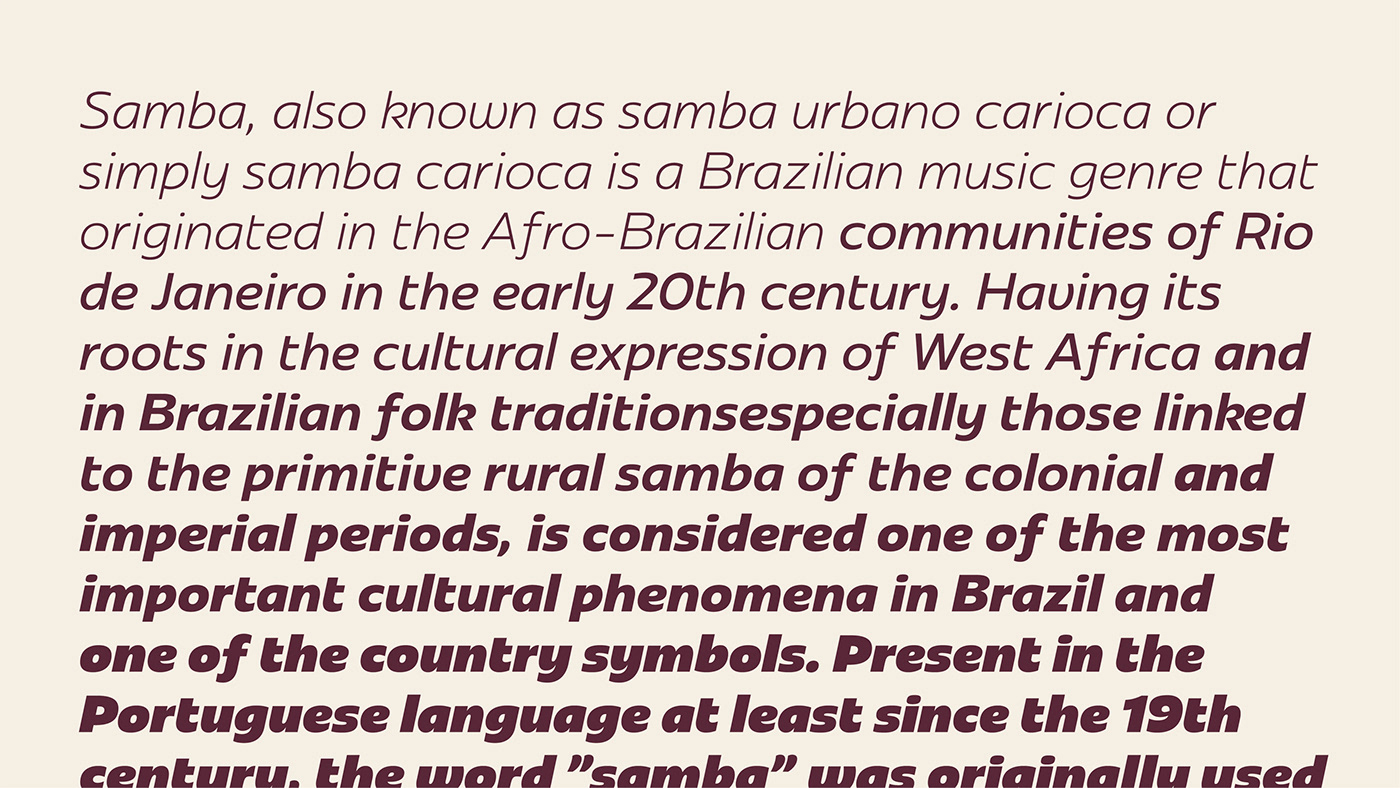
Variable Font in use


In 2022, Redonda was improved and remastered, also gained a width axis for two new styles: Condensed and Compressed. Now, the font family has 36 style, in addition to a three-axis variable font. We called it Redonda 2.0


License Redonda on our shop
or activate on Adobe Fonts
or activate on Adobe Fonts
Typedesign: Carlos Mignot
Type production: Carlos Mignot, Rodrigo Saiani and Felipe Casaprima
Copywriting: Valter Costa


