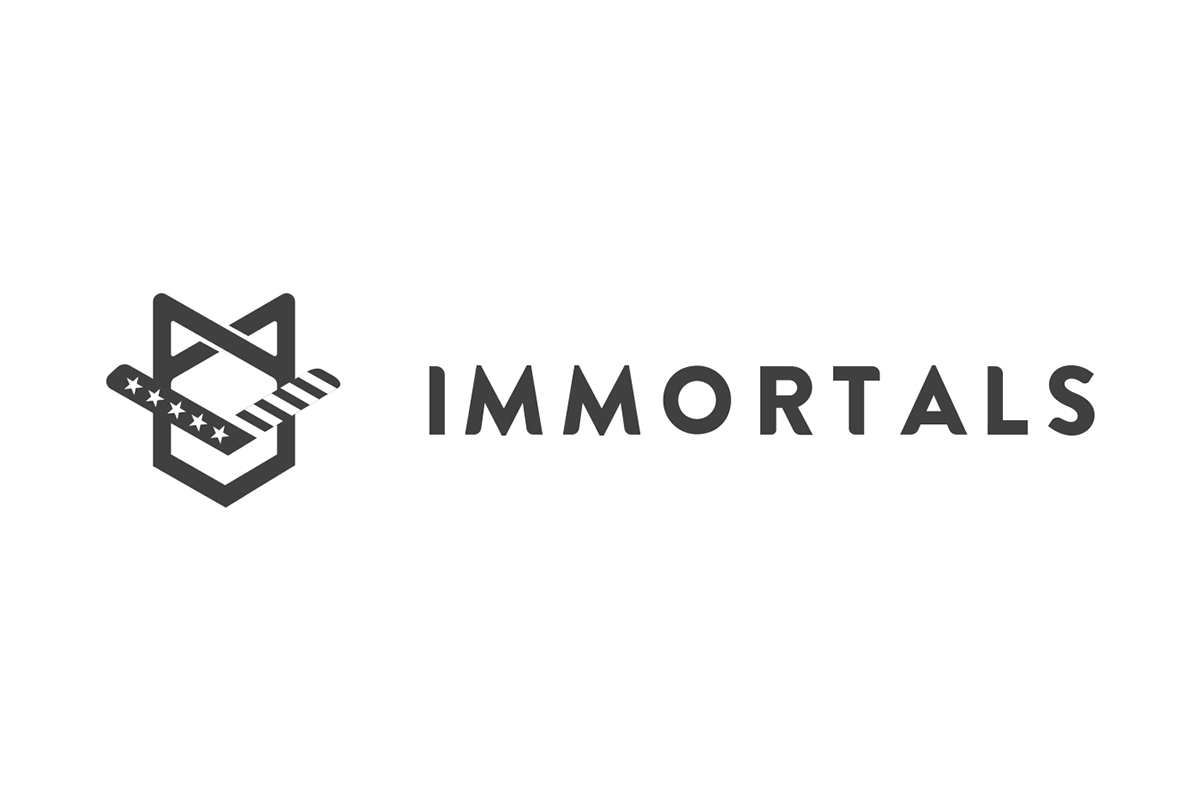
Immortals is a newly formed eSports team. Their name was originally inspired by an ancient Persian military unit and also by the concept of immortality. The original logo (shown above) featured a symbol with an ancient warriors helmet. The team wanted to achieve two goals with this project. They wanted to simplify the logo so it was a bit more minimal, they wanted to update the typography so it didn't give off a tech-related feeling. Secondly, the team wanted to try to find another solution for the symbol, moving away from having such a literal image and wanted something a bit more abstract, subtle, but that still had a hint of a militaristic theme to it.
My objective was to create something unique to the eSports scene. Immortals is a brand new team so it was the perfect opportunity for them to make a strong visual impact and to introduce something fresh.

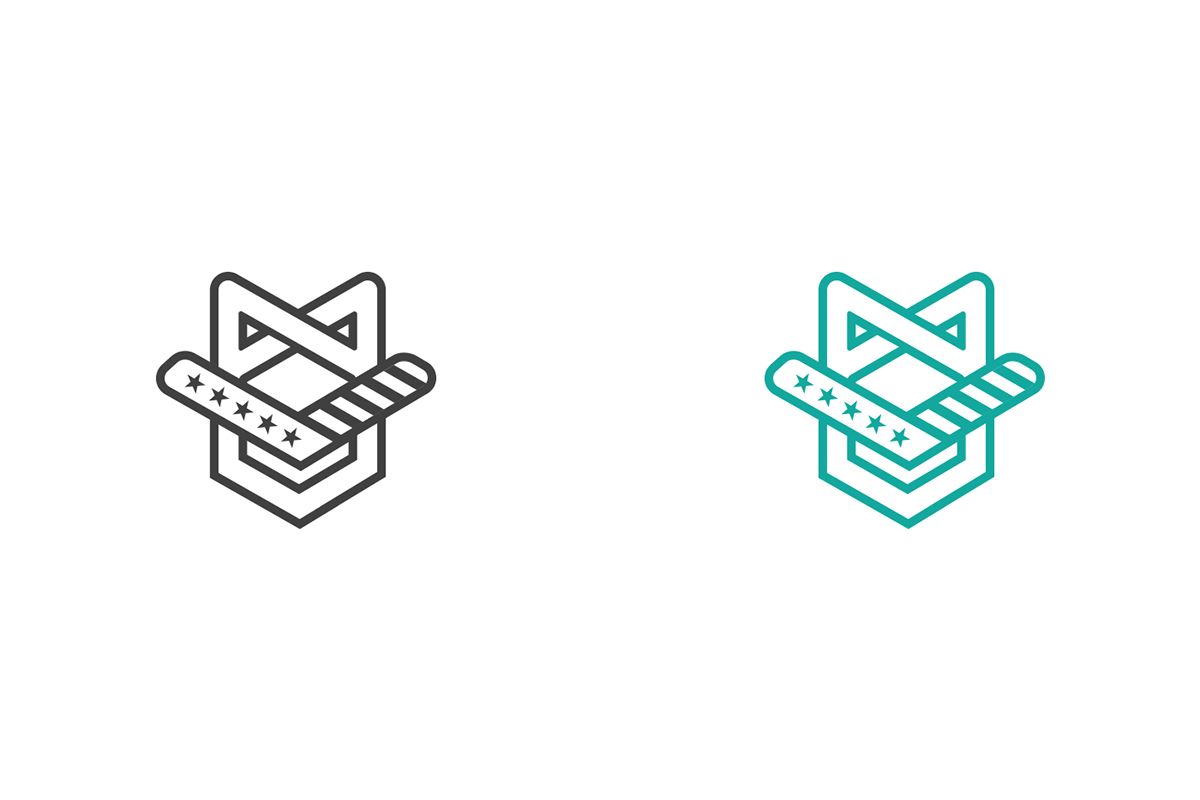
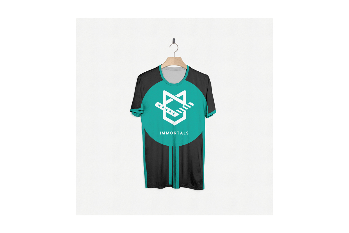
One of the requirements for the logo was that the color teal needed to be present. I decided to add a dark gray for some contrast.


The first option I designed simplified the original symbol.


One of the more interesting typographic experiments.

I gradually moved away from the original symbol, trying to find an interesting shape to play around with. I ended up trying to find a way to merge an infity symbol with the two "M"s to create a unique symbol. Ultimately this direction proved to be too abstract.

This logo was the most developed from all the options I sent and it was the logo with the most potential.

The symbol was comprised of three parts. An infity symbol, a shield, stars and stripes. The stars and stripes were inspired by military insignias, 5 stars standing for the highest rank attainable.