


[pt]
Leo Benítez é um professor particular de língua inglesa. Oferece aulas particulares online para todo Brasil e Europa, com foco em jovens adultos e adultos. Trabalha com nichos como empreendedores, pré-intercambistas, adultos no mercado de trabalho e pessoas que procuram um caminho pra fluência mais rápido em relação as escolas tradicionais de ensino da língua.
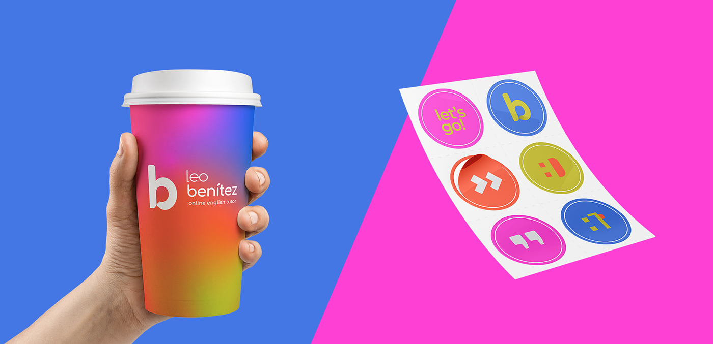
O desafio para criação da identidade visual era de transmitir os pontos que fazem a marca ser especial: um ensino prático, fora da caixa, divertido, dinâmico e digital, que dá enfoque nas necessidades e no ritmo de cada aluno. Para isso, desenvolveu-se uma marca versátil para o âmbito digital, que foge da paleta de cores padrão do segmento (a dualidade entre azul e vermelho e o uso de roxo) e que busca transmitir o que há de mais energético e atual em cada escolha.
[en]
Leo Benítez is a private English language teacher. He offers private online classes to Brazil and Europe, focusing on adults and young adults. It works with niches such as entrepreneurs, pre-exchange students, adults in the job market and people looking for a faster fluency path in relation to traditional language schools.
The challenge for creating the visual identity was to convey the points that make the brand special: practical, out-of-the-box, fun, dynamic and digital. It focuses on the needs and pace of each student and to this end, a versatile brand was developed for the web enviroment. The chosen colors differ from the standard color palette of the segment (the duality between blue and red and the use of purple) and seeks to convey the most energetic elements in each choice.


[pt]
A paleta de cores foge completamente das usuais do segmento (azul com vermelho e o uso de roxo). O verde, vermelho e rosa combinados são descontraídos e irreverentes. Já o cinza e azul chegam para acrescentar a dose certa de sobriedade e confiança que a marca precisa.
[en]
The color palette is completely different from the usual ones in the segment (blue with red and the use of purple). The green, red and pink combined are relaxed and irreverent. Gray and blue arrive to add the right dose of sobriety and confidence that the brand needs.


[pt]
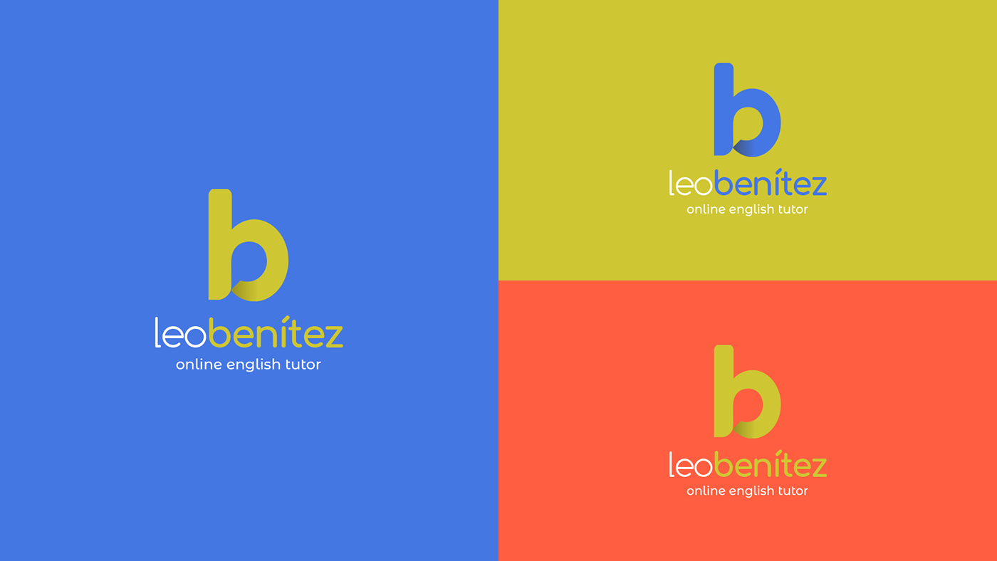
Desenvolvida para acrescentar significados ao universo da marca, a pattern é divertida, alegre e repleta de conceitos. As ilustrações remetem características marcantes da marca. Por exemplo, a casa representa o aprendizado de onde estiver, o cursor e emojis remetem o digital e as setinhas vem para dar o indício do botão "skip" (pular), representando um método mais rápido em relação aos tradicionais.
[en]
Developed to add meaning to the brand's universe, the pattern is fun, cheerful and full of concepts. The illustrations refer to the brand's remarkable characteristics. For example, the house represents learning wherever you are, the cursor and emojis refer to the digital and the arrows come to give the indication of the "skip" button (skipping), representing a faster method compared to the traditional ones.


obrigada! // thanks! :)
follow me on instagram @stevieiradesign
by stephanie vieira
stevieiradesign@gmail.com


