


La Souche
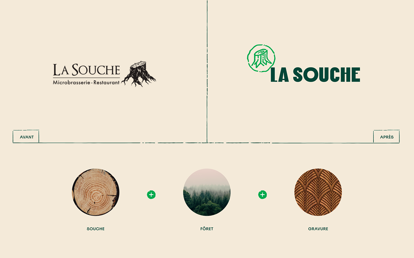
Rebrasser une marque forte
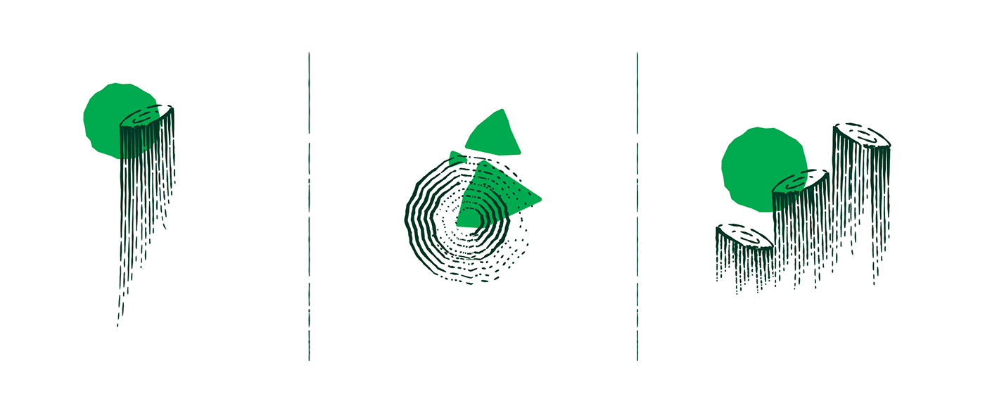
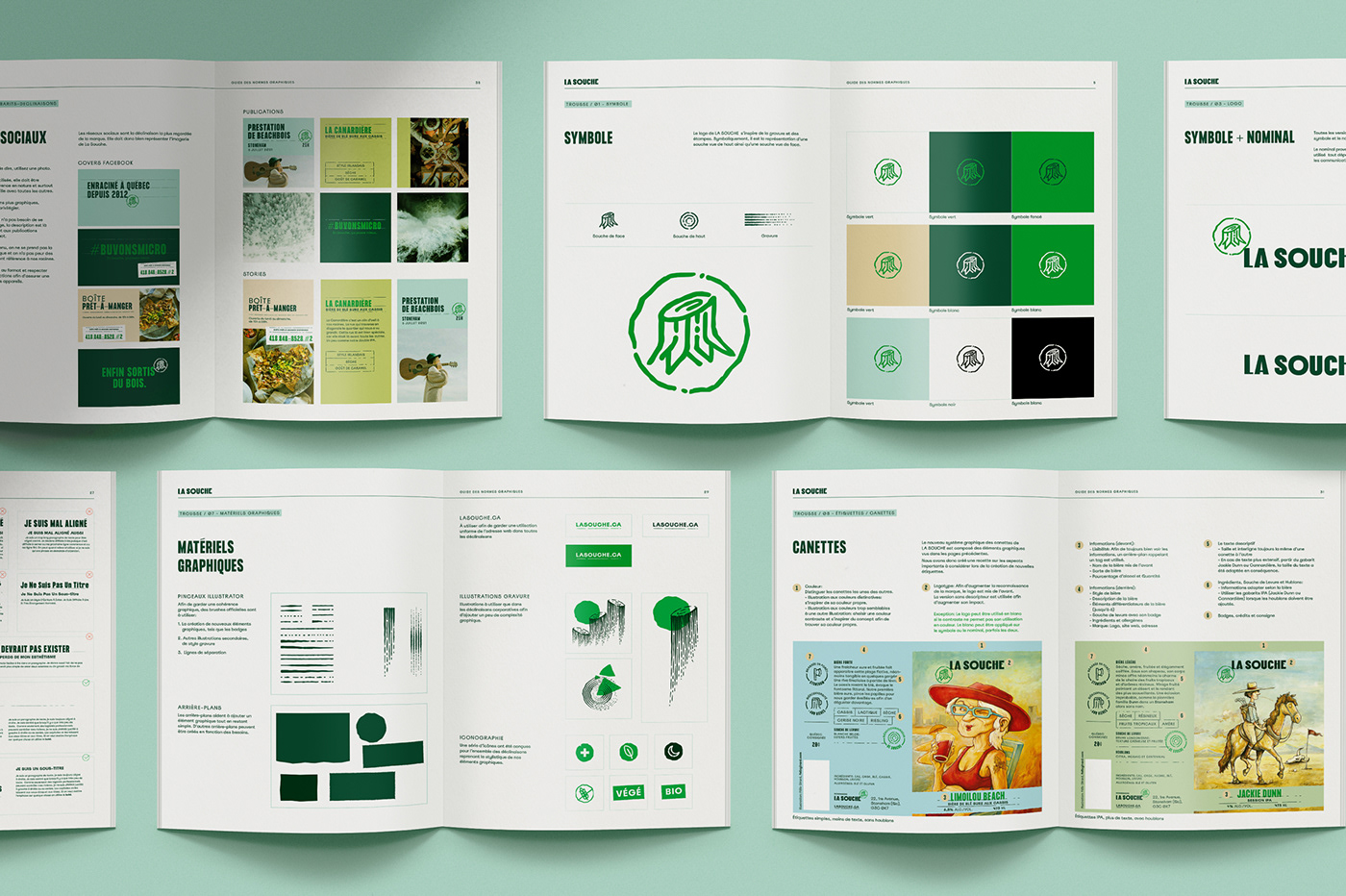
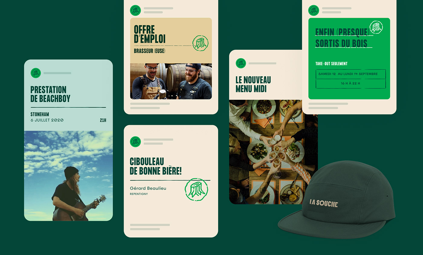
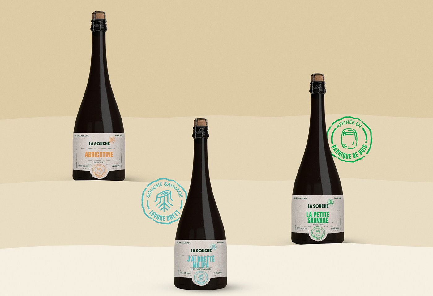
La nouvelle identité est enracinée dans la vision à long terme de La Souche et les valeurs qui la caractérisent: la chaleur, la diversité et la nature. L’identité visuelle définie et établie des bases pour la marque. Elle facilitera sa reconnaissance et cohérence dans ses déclinaisons actuelles et futures.
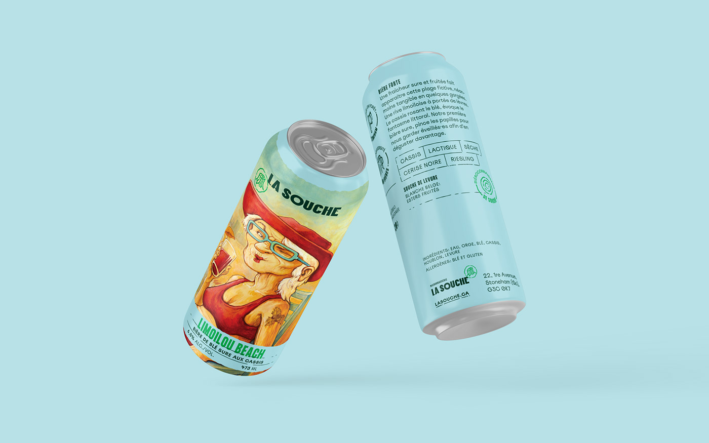
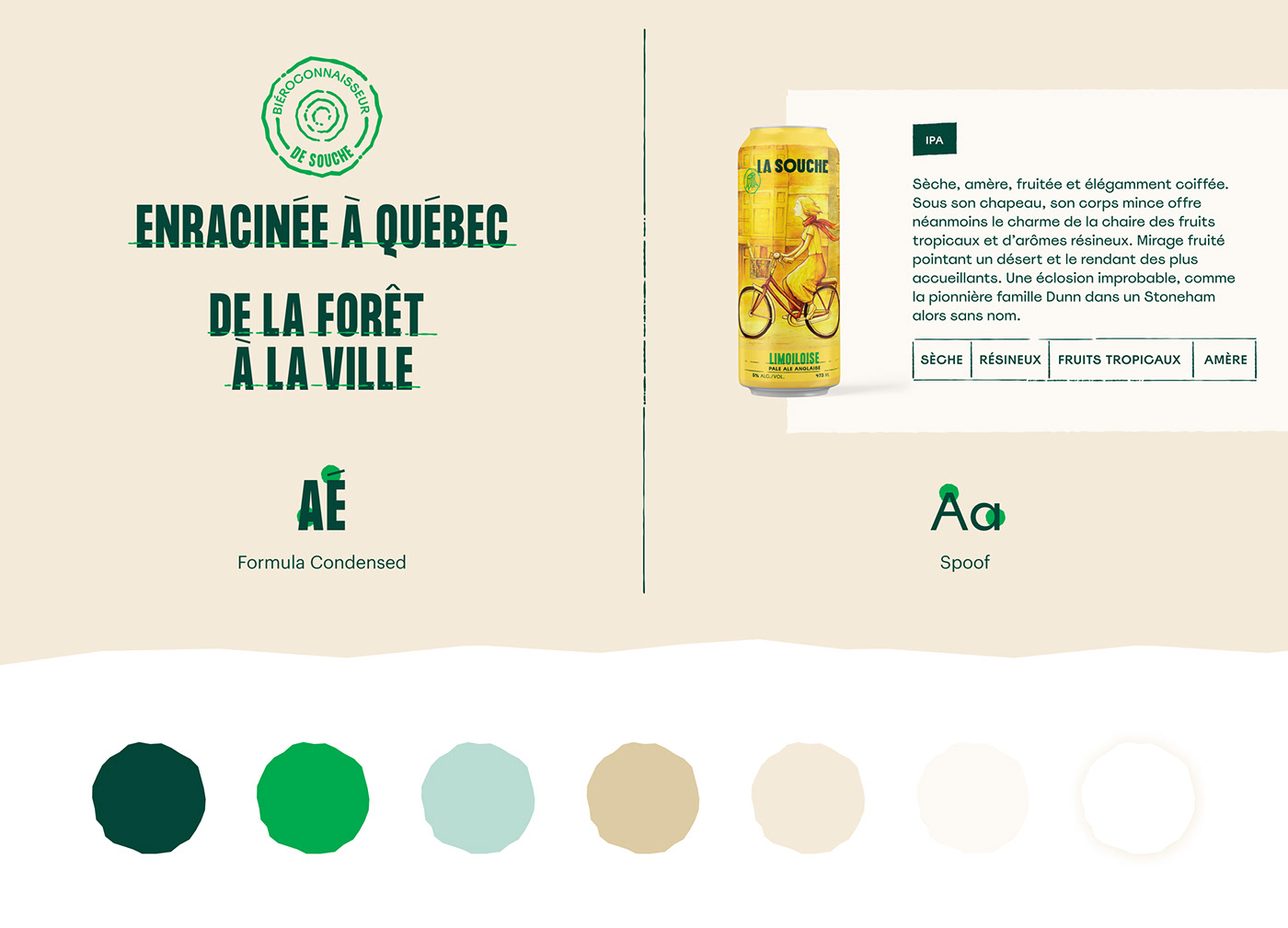
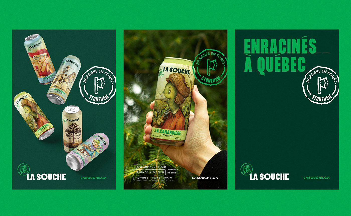
À chaque bière sa couleur!
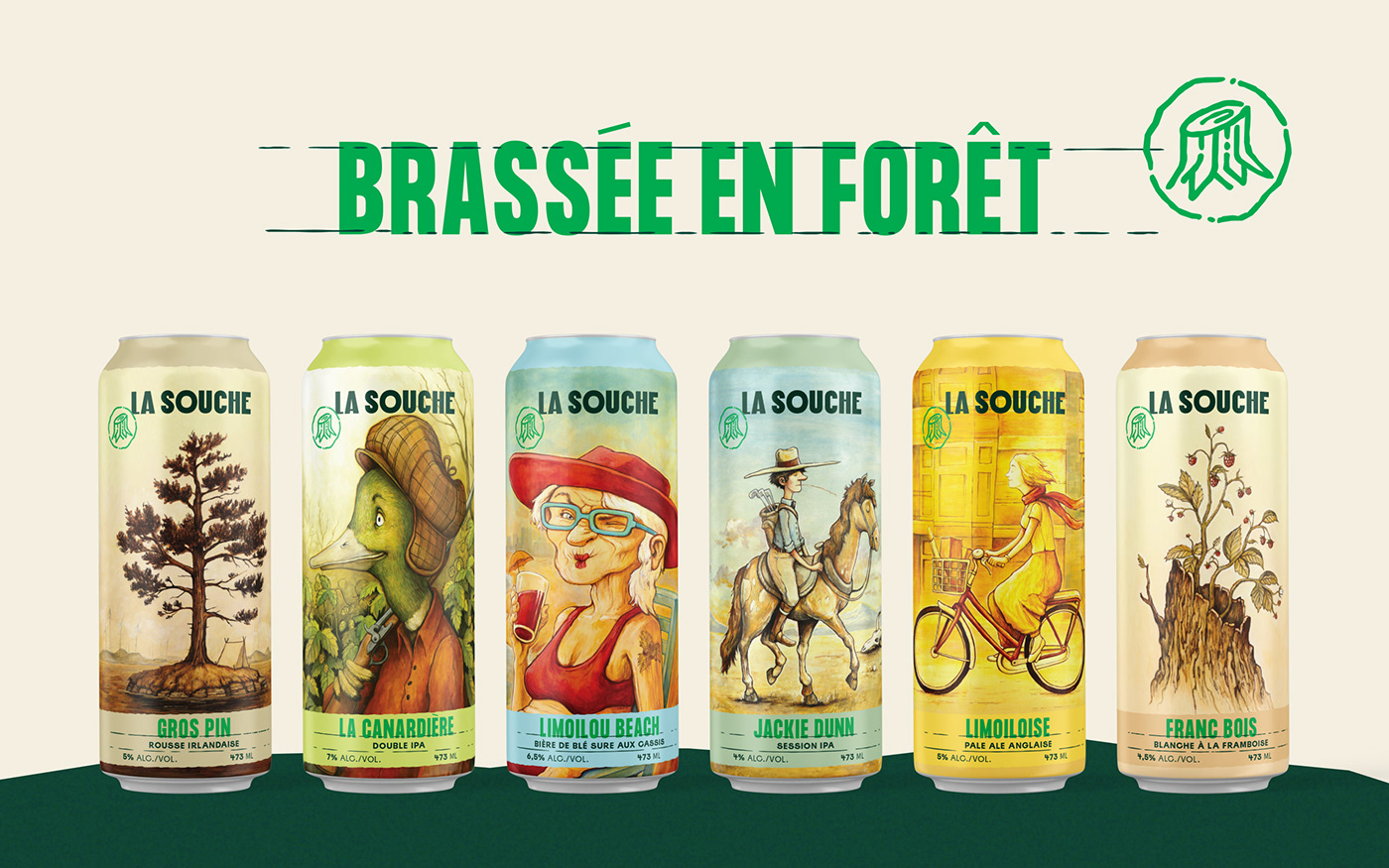
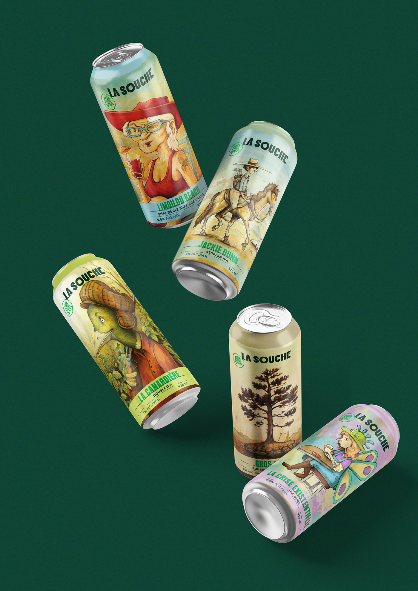
Améliorer la reconnaissance de la marque en tablette tout en conservant les racines des anciennes: les illustrations de Félix Girard. La palette de couleur a été mise à jour afin de faciliter la différenciation entre les produits.
-
Brewed in nature
Rooted in a long-term vision and the values that characterize La Souche: warmth, diversity and love of nature.The new identity defines and establishes the brand foundations. It facilitates its recognition and consistency across all platforms.
Rooted in a long-term vision and the values that characterize La Souche: warmth, diversity and love of nature.The new identity defines and establishes the brand foundations. It facilitates its recognition and consistency across all platforms.
To each beer its color!
Improving in-store brand recognition while retaining the roots of the old labels: the illustrations by Félix Girard. With the rebrand, there is now an easier differentiation between products and there is a more significant place for storytelling elements.
Improving in-store brand recognition while retaining the roots of the old labels: the illustrations by Félix Girard. With the rebrand, there is now an easier differentiation between products and there is a more significant place for storytelling elements.


Art Direction : Zorani Sanabria
Design: Guillaume Beaulieu & Tommy Hachez
Illustrations: Félix Girard


