

UI/UX Critique of Drizly Product Page
The following is a robust critique of the Drizly mobile web experience including recommendations and thought starters.

Problem:
There is no convenient way to change the user’s delivery location. It is assumptious to think that the user is always ordering from the same location.
Solution:
Iteratively test visuals to address the ability for a user can click this area to edit delivery address.
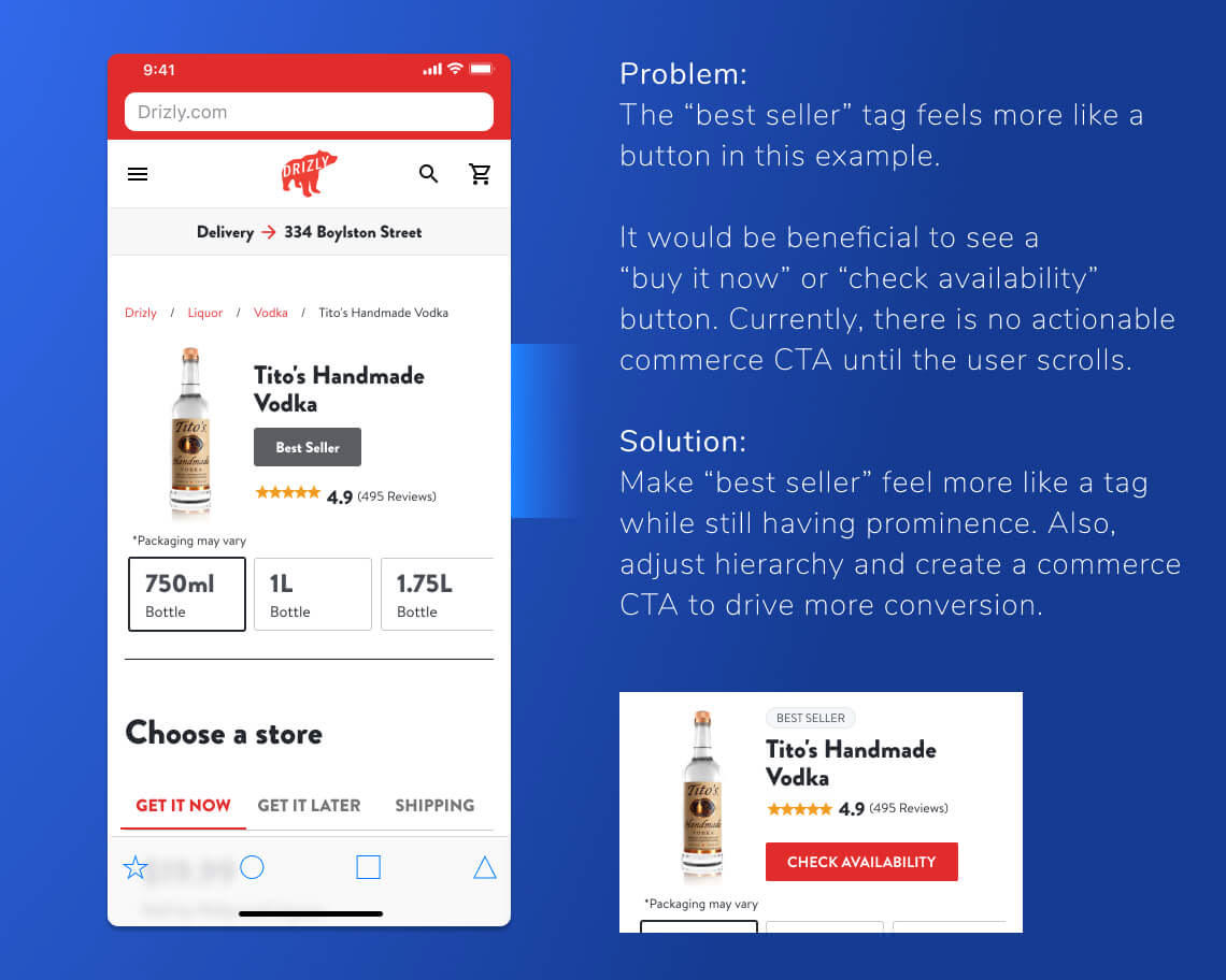
Problem:
The “best seller” tag feels more like a button in this example.
It would be beneficial to see a
“buy it now” or “check availability” button. Currently, there is no actionable commerce CTA until the user scrolls.
Solution:
Make “best seller” feel more like a tag while still having prominence. Also, adjust hierarchy and create a commerce CTA to drive more conversion.
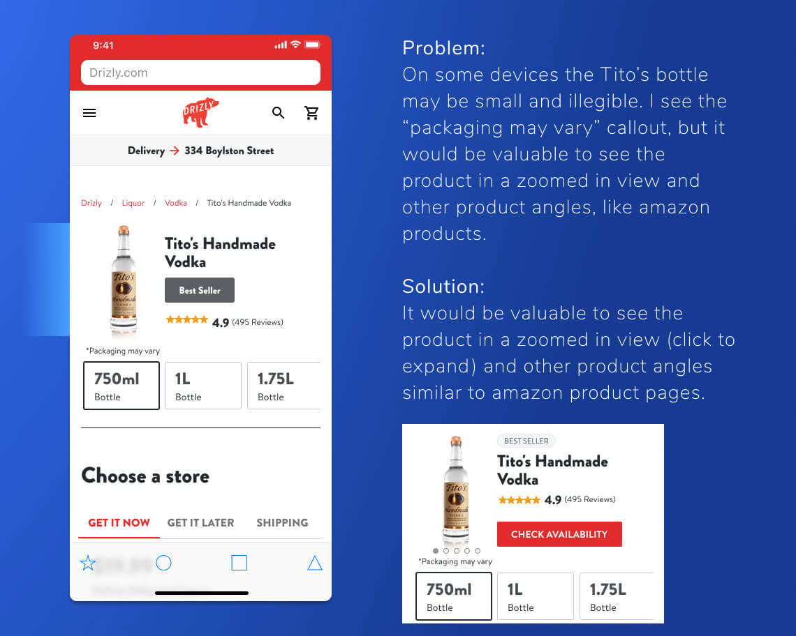
Problem:
On some devices the Tito’s bottle may be small and illegible. I see the “packaging may vary” callout, but it would be valuable to see the product in a zoomed in view and other product angles, like amazon products.
Solution:
It would be valuable to see the product in a zoomed in view (click to expand) and other product angles similar to amazon product pages.
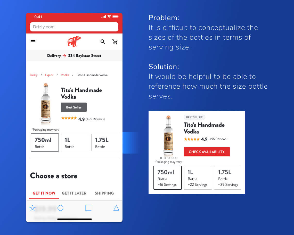
Problem:
It is difficult to conceptualize the sizes of the bottles in terms of serving size.
Solution:
It would be helpful to be able to reference how much the size bottle serves.

Problem:
There is inconsistent use of red, black, dark gray, and green elements throughout the page. There would be a clearer direction of what to interact with if specific colors were designated for specific uses.
Currently, the red is a link in the bread crumbs, and an interactive element in the “Choose a Store” tab. In addition, gray and black are also used as interactive/navigation items.
Solution:
Refine style guide to better define usage of colors in a consistent manner.

Problem:
There are 14 store locations in this page’s “Choose a Store” section. Fourteen stores feels excessive and may not help the user as it would cause information overload.
Solution:
Testing a shortened list with three or four default stores in addition to a “see more locations” button would be helpful. Also, a “view on map” store locator would bring more context to the list. The ETA is a helpful feature, but it would be interesting to test this against a map which would provide the distance in a more contextual and visual manner.

Problem:
It is ambiguous whether the 9.8 tag is the rating of the store, the liquor, or the delivery experience.
Solution:
Test iterations of more context added to the review.
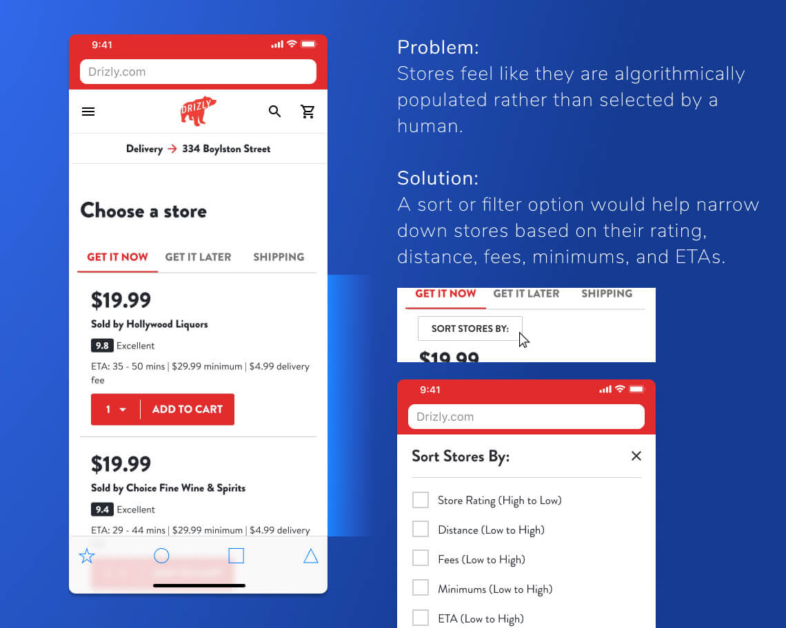
Problem:
Stores feel like they are algorithmically populated rather than selected by a human.
Solution:
A sort or filter option would help narrow down stores based on their rating, distance, fees, minimums, and ETAs.

Problem:
The CTA in this instance is a different pattern from the red button displayed within the store section. This is the first time the user is introduced to the color green which feels out of place.
Solution:
A test around which element performs better with users would
be insightful.
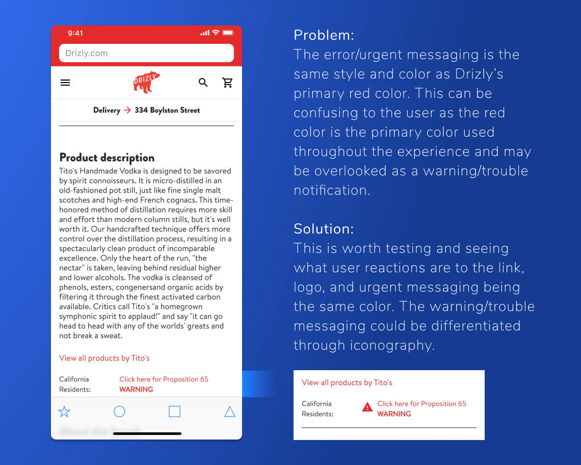
Problem:
The error/urgent messaging is the same style and color as Drizly’s primary red color. This can be confusing to the user as the red color is the primary color used throughout the experience and may be overlooked as a warning/trouble notification.
Solution:
This is worth testing and seeing what user reactions are to the link, logo, and urgent messaging being the same color. The warning/trouble messaging could be differentiated through iconography.
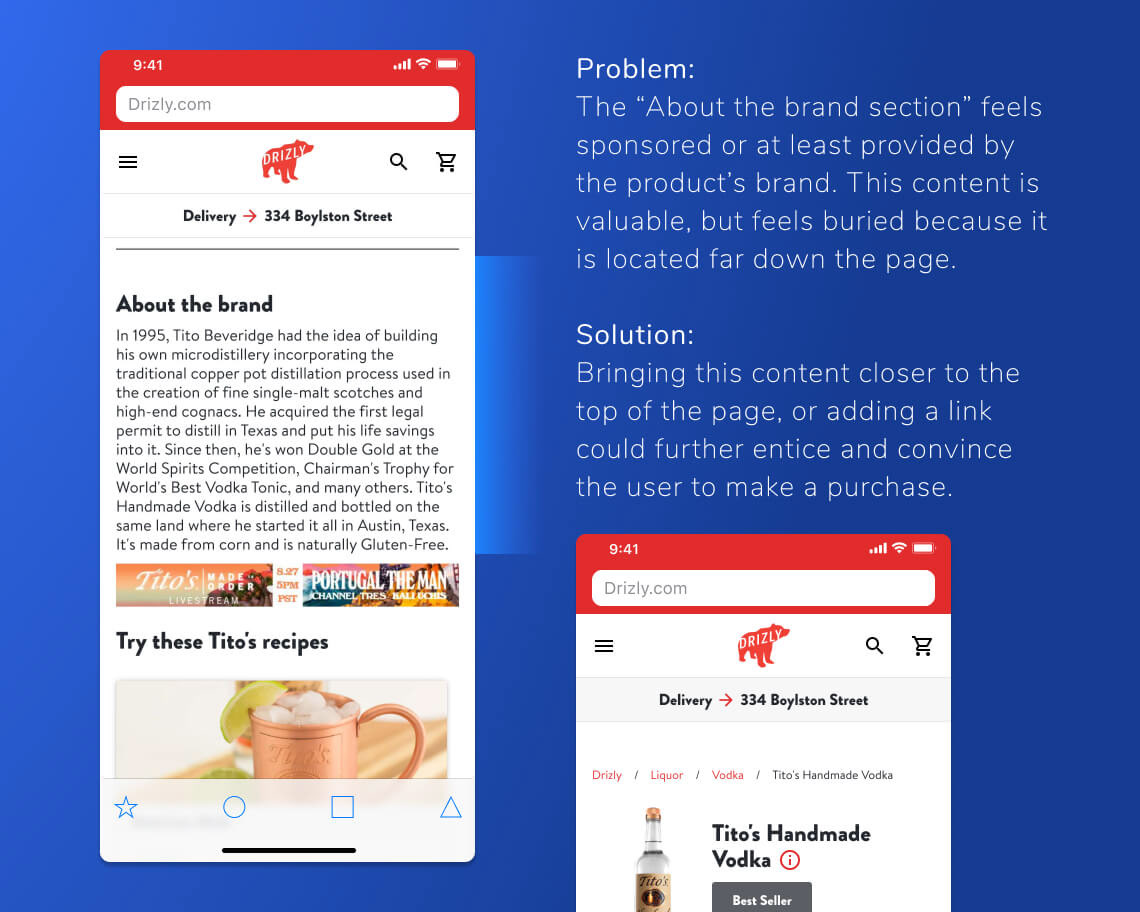
Problem:
The “about the brand section” feels sponsored or at least provided by the product’s brand. This content is valuable, but feels buried because it is located far down the page.
Solution:
Bringing this content closer to the top of the page, or adding a link could further entice and convince the user to make a purchase.
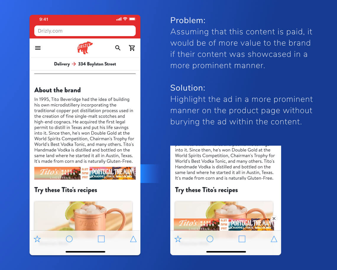
Problem:
Assuming that this content is paid, it would be of more value to the brand if their content was showcased in a more prominent manner.
Solution:
Highlight the ad in a more prominent manner on the product page without burying the ad within the content.
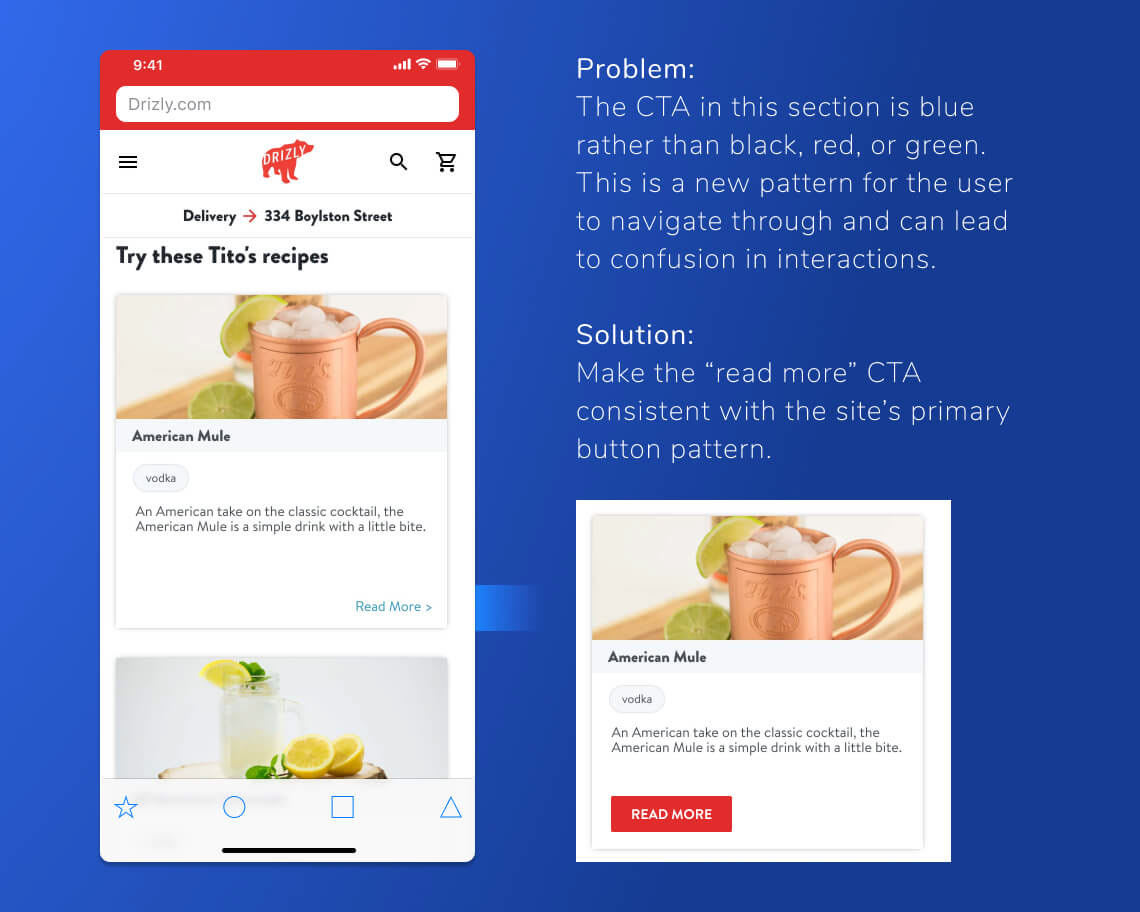
Problem:
The CTA in this section is blue rather than black, red, or green. This is a new pattern for the user to navigate through and can lead
to confusion in interactions.
Solution:
Make the “read more” CTA consistent with the site’s primary button pattern.
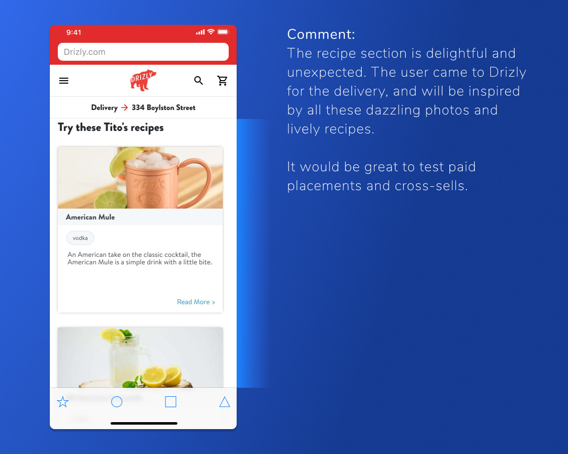
Comment:
The recipe section is delightful and unexpected. The user came to Drizly for the delivery, and will be inspired by all these dazzling photos and lively recipes.
It would be great to test paid placements and cross-sells.
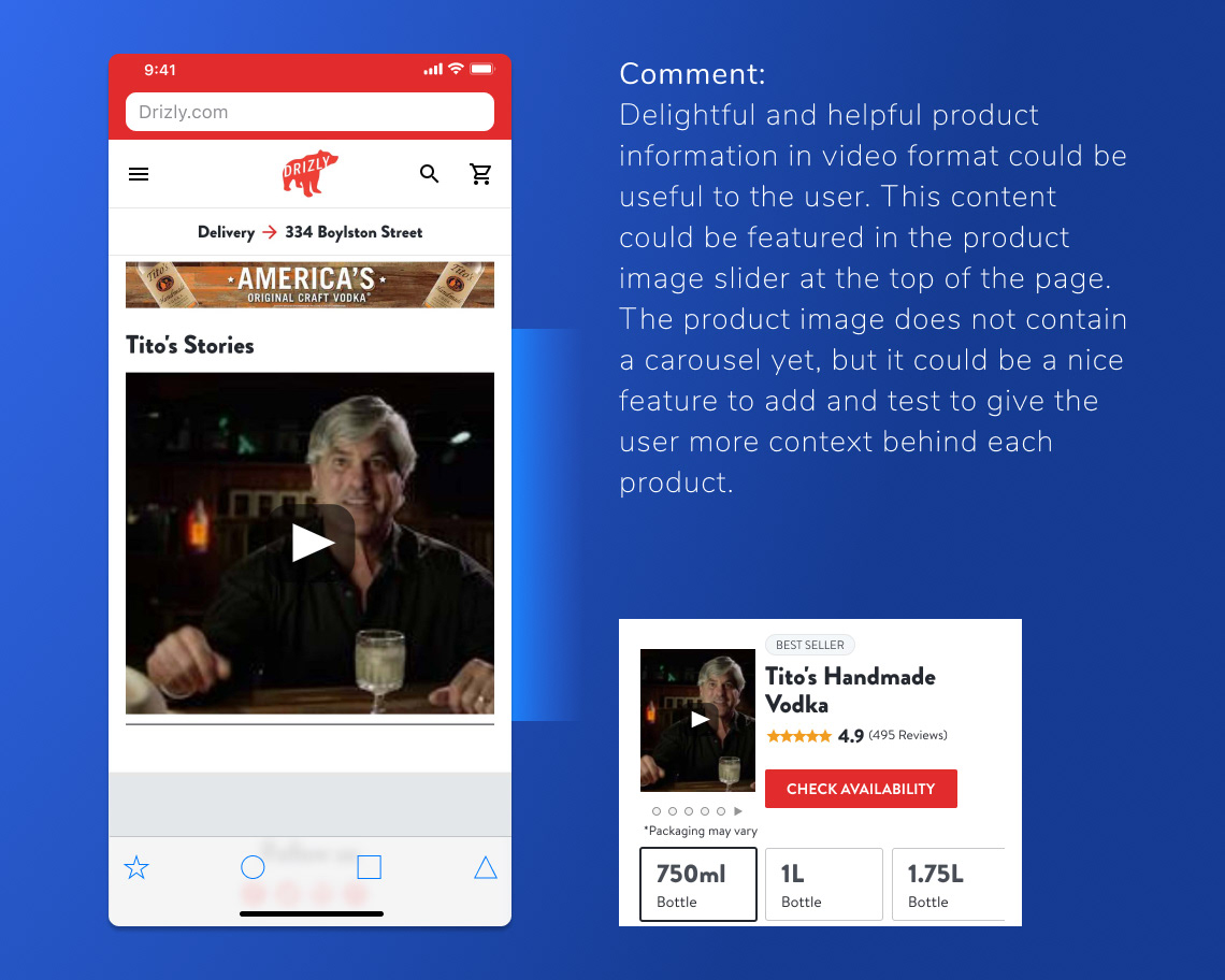
Comment:
Delightful and helpful product information in video format could be useful to the user. This content could be featured in the product image slider at the top of the page. The product image does not contain a carousel yet, but it could be a nice feature to add and test to give the user more context behind each product.
• • •
Thank you for checking out my work!


