

iSpeakDog
UX/UI Design

Role: Web and UX/UI Designer
Duration: 11 months
Software: Illustrator, Photoshop, Figma
Purpose
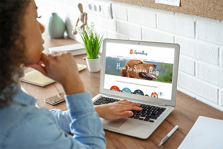
iSpeakDog is a website that aims to help dog lovers better understand their dogs by teaching the meaning of dog behavior and body language. Through this, people improve the interactions with their pets and enhance their relationships. A previous graphic designer had created the initial site. However, the site owner wanted to improve the site and find someone with more experience with web usability. I was tasked with redesigning the website in time for its relaunch for a major annual dog training event. View Site
This case study focuses on the iterative process of taking iSpeakDog to the next level. Through interactive design sessions with the stakeholder, we eventually succeeded in creating a site that tripled the number of pages users visited.
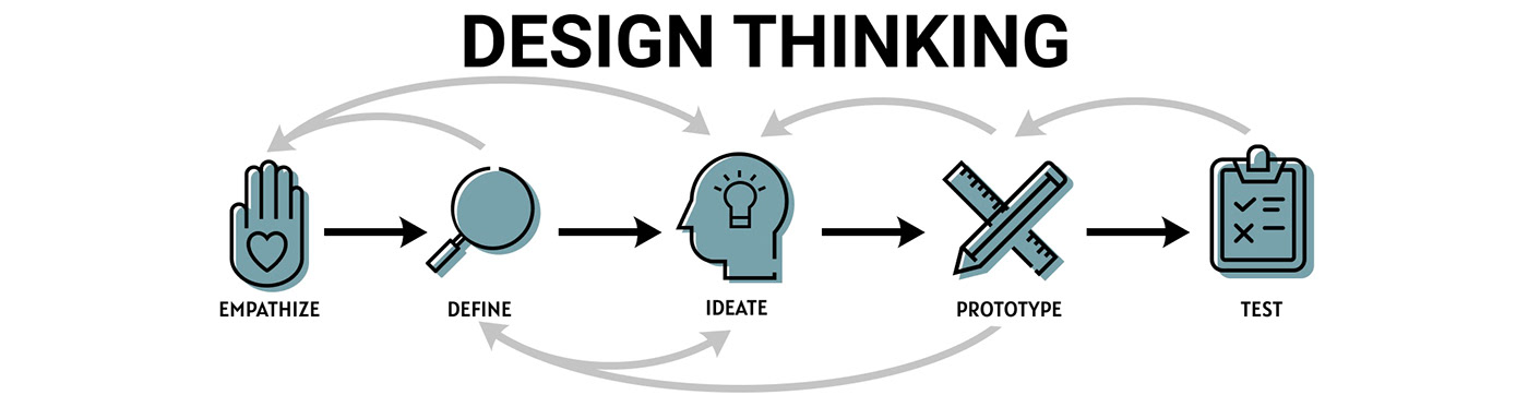
The design thinking process was a loose reference I used during iSpeakDog’s development, and helped me keep the main goals in mind.
Empathize
Understanding the User
With the stakeholder’s goal to enhance a platform that many already found value in using, we wanted to understand how to best streamline the user experience process so visitors would come, stay engaged, and then leave feeling educated.
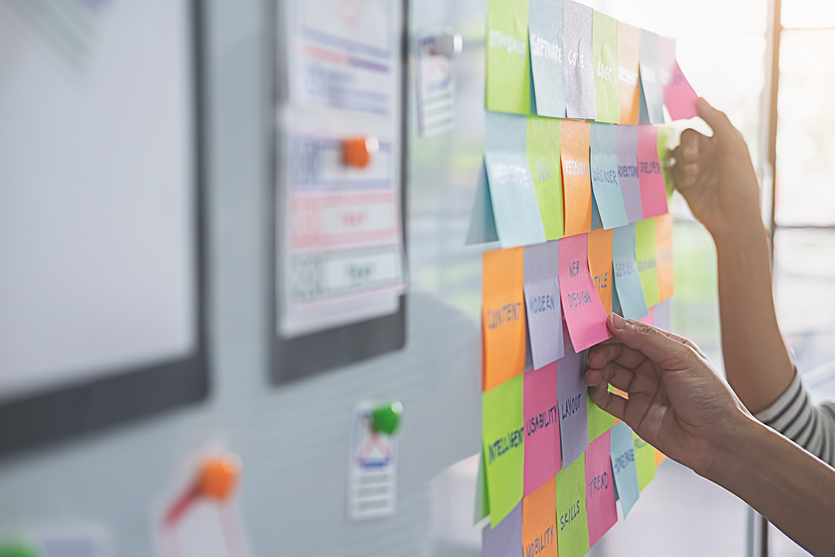
At this stage, research would usually be conducted to gain insights. Due to the budgetary constraints of this project, guerrilla research took the form of talks with the stakeholder who had several years of experience in this space in lieu of traditional research. Over the process of creating this site, three points became clear to me:
Major Points:
• Target users of this site didn’t want to use a completely clean and sterile site, they wanted something engaging and fun.
• Focus of my work would be cleaning up the existing site structure and interface as it already had an established identity.
• People discovering this site would likely have been googling things like “dog bowing, dog eye whites showing” and would have a problem requiring immediate attention.
• Focus of my work would be cleaning up the existing site structure and interface as it already had an established identity.
• People discovering this site would likely have been googling things like “dog bowing, dog eye whites showing” and would have a problem requiring immediate attention.
The way these three points were discovered will be explored later on in the case study.
Define
“In a sense, engagement was more important than usability”
Clarifying the User Needs
Now that I had been chosen to work on the project, it was time to set up a meeting to go over the expectations of the project and how the progress of each step of the project would look. After talking to the stakeholder in the initial meeting, I set about the process of creating a user experience that would meet those needs succinctly and effectively.
And this is how the first key point was discovered. In our second meeting, I shared the mockups that I had been working on, and it was then I received the feedback that the direction my mockups were taking the site was undesired. As the stakeholder explained, they didn’t want the site to look completely different from the original. And they also didn’t want a site that would be too sterile, because a) the current users liked the site the way it was and b) it wasn’t on brand with iSpeakDog.
Instead, the second key point became clear: the focus of the project would be to clean up the site, clarify some of its processes, and keep its fun and engaging identity.
In a sense, engagement was more important than usability.
After the welcome clarity from their feedback, I was able to go back and redo the initial home page mockup, which was readily approved the next meeting.
Problem Statements
Jen wants the ability to find out what is going on with her dog clearly and succinctly
Jen wants to the ability to explore a site with a wealth of information and discover new concepts she wasn’t even looking for
Ideate
Finding Solutions
Now, guided by the newfound clarity of these insights, I had the ingredients needed to develop a blueprint. As the sitemap already existed from the site’s first launch with the graphic designer, I focused on refining it. The logo and other design assets were also given to me from the graphic designer, which were also refined for increased usability.
My process for improving the overall usability of the site was broken down by page section. Using some design hierarchy guidelines, I examined each part of the site for areas where it could be tightened up. I discovered several: the logo and navigation bar of the initial site was very large and taking up a lot of key real estate on user’s computers. I reasoned that it could be forcing them to have to scroll more to get to the important information. This could tire the user and cause them to lose interest.
I solved that by making both the logo and header smaller in proportion to the other elements, and this was implemented across the site.
In our meetings, I would explain changes such as these to the stakeholder, elaborating on the reason why I made that particular design decision while going through the new mockup. In response, I would hear their feedback on my solutions.
Another area where I found the need for increased usability was in the graphic design assets. One site graphic was central to the site, the 3 step How to Speak Dog graphic. It appeared on the site several times. I cleaned this graphic up by doing things such as reducing the number of colors used, and thus reduced the cognitive load on the user, so they would be able to focus on comprehending the steps. Finding the balance between simplicity and engaging was a constant process.
I also made the decision to incorporate more photography in the site. This would break up the monotony of the text and add more color, making the information easier to digest for the user. Using online resources, I found license free photography that were high definition and matched with the site’s visual identity and brand colors.
On the HTML side, I used my background with alt tags to add descriptions to several elements, improving the site’s SEO and making it accessible to more users.


Prototype
“...I could have risked offending a key portion of our target users.”
Iterative Prototyping
Through interactive sessions, I created mockups for the website page to preview with the stakeholder before implementing. The feedback I got from the previews was used to further guide my design decisions. I used a website builder to make the changes to the site.
For example, one key issue was uncovered after I independently decided to add more engagement to the site through the use of a GIF. It was a simple way to make the site more interactive for users. After previewing the change with my stakeholder, she responded that the GIF would not be a good idea, and went on to explain why. With her years of background in the dog training field, she knew that the kind of GIF I had selected would not be taken to kindly by certain members of the community, because it anthropomorphized animals. Basically, I had a dog doing a human thing.
Without her knowledge, a valuable piece of information would have been missed by me and I could have risked offending a key portion of our target users.
The solution was easily implemented, as I found an even better GIF that was more in line with the site’s brand colors.
Test
Evaluating the Results
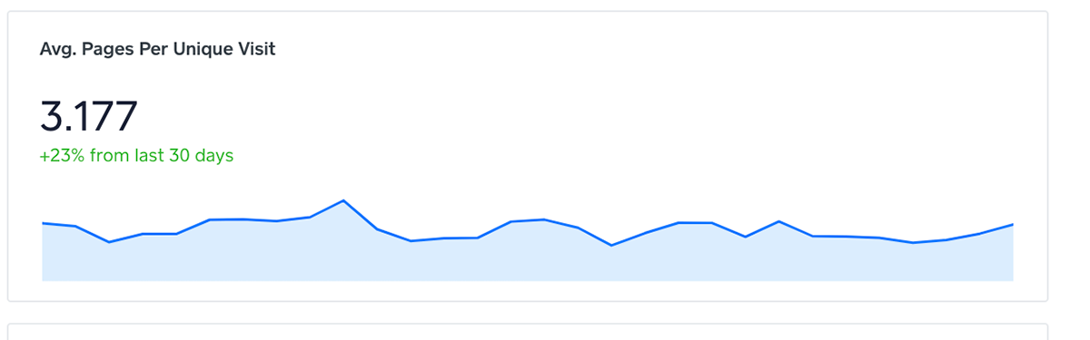
After the site was published, I was able to view the analytics.
I discovered that the project had met its goal of clearer communication of the dog body language concepts, as the number of pages visited had tripled, growing by 23%.
At slightly over 3, this metric was meant it was also higher than the unofficial industry standard, which sits at 2 pages per session.
It was solid evidence that the engagement had increased for the average user and they were now spending more time on the site. It also validated the design decisions that I had made, such as reducing the header size. See them in detail up in the Ideate section.
Style Guide
In order to maintain a level of consistency throughout the design, I created a style guide from the graphic designer’s previous color and font choices. I introduced some new ones from my work as well.


Overall, working on this project enabled me to implement usability design principles and evaluate the effectiveness of its impact. It was a valuable experience working with the designer and founder to come up with the final product.
Before and Afters
Home Page


Page Two


Page Three


Key Takeaways
There were a few key takeaways that I had from this project. The biggest one for me was the importance of flexibility. As the designer, it was important for me to be able to take the feedback that I received and change the design decisions I had made to better serve the purpose of the site. So I became adept at converting feedback to improved design decisions.
Another key takeaway was that in lieu of traditional research, a solid background of the space you are in is necessary to identify any potential issues and pain points before they become a problem. This saved us several times throughout the project.


