Redesigning Profession.hu – the most visited HR Portal of Hungary
The challenge
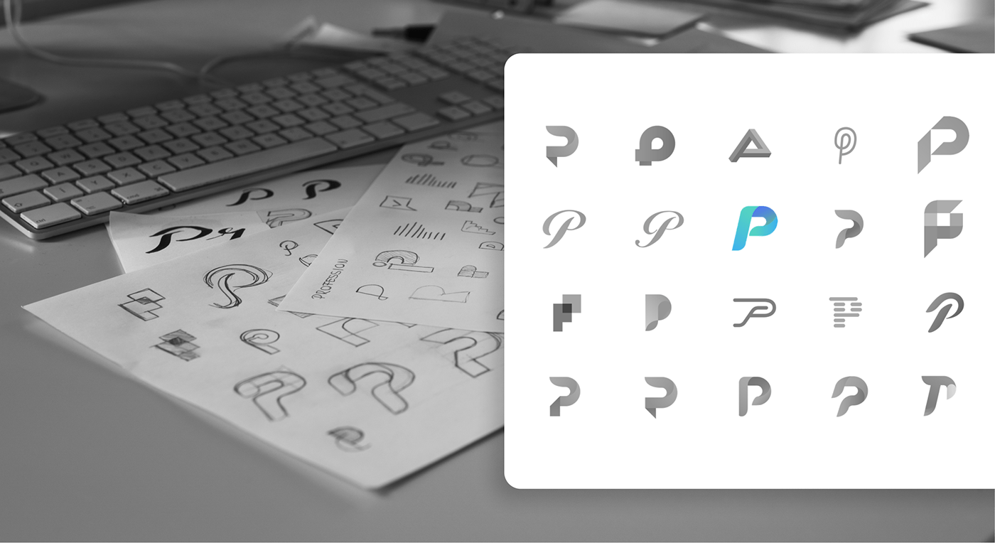
Profession didn't change significantly in 15 years of being active. They wanted to get a fresh look for the 2020's that their users will like. The P lettermark was there to stay, yet we had several shots on the redesign. We created more than 40 variations in several directions. At the very end, Profession let their audience choose the best one.
Our solution
We started with their new mobile application. After developing the dynamic 'P' emblem, we defined the visual system of the brand with colors, typography, iconography and custom illustrations.
Logo & Brand redesign
The start
With the internal success of direction we pointed the application, profession.hu reached out to us to redesign their brand appearance. They had the same logo and outlook for 15 years. We used the mobile application system for the basics, then we turned for the logo.


The logo
We created 40+ versions for the new emblem. To make sure it will resonate with their audience, they asked their users to choose the winner. After they chose the dynamic P emblem we refined it on a 16px grid and iterated it for different use cases (gradient, monocrome, lined emblem).


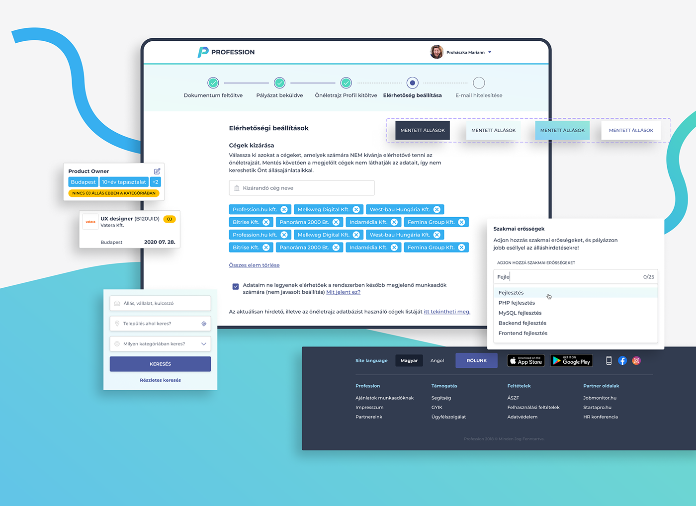
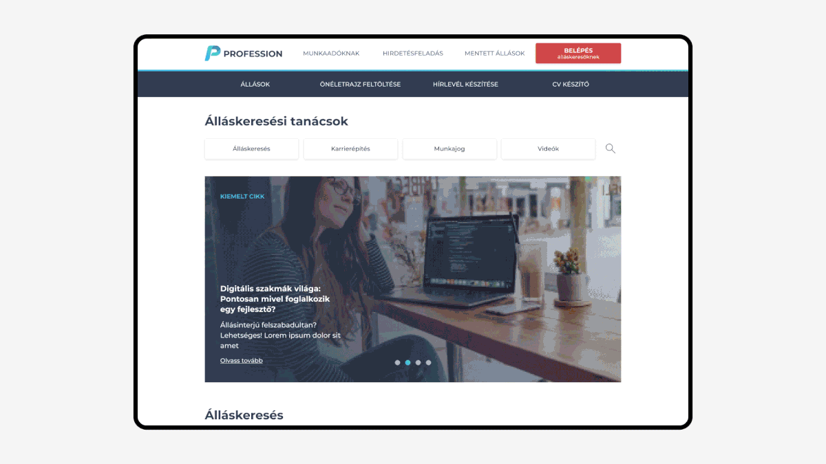
Reiteration of all professional functions and subpages
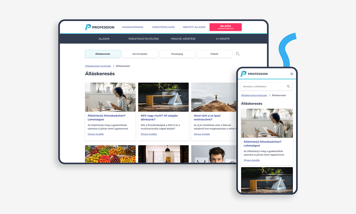
Profession.hu is a huge platform and massive database with tons of functions and subpages. We came up with some simple rules and a framework on how to change the visuals of all these pages without the complexity of rebuilding all of these parts from the ground up. We agreed on shipping these pages fast, and reiterate and enhance them later on the go. To this day we are continually improving these enhancements, in collaboration with the Profession team.
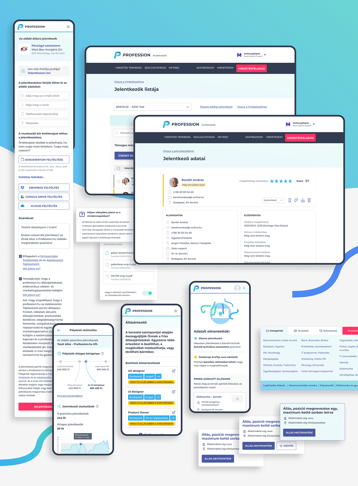
UI design of the new Profession app
Basics
The mobile application is the innovative playground of the Profession database. It's always a step ahead of their other platforms. This means that the overall UI is somewhat more modern and experimental as well. We redesigned the elements from the ground up, from job ad cards, to search elements and so on.
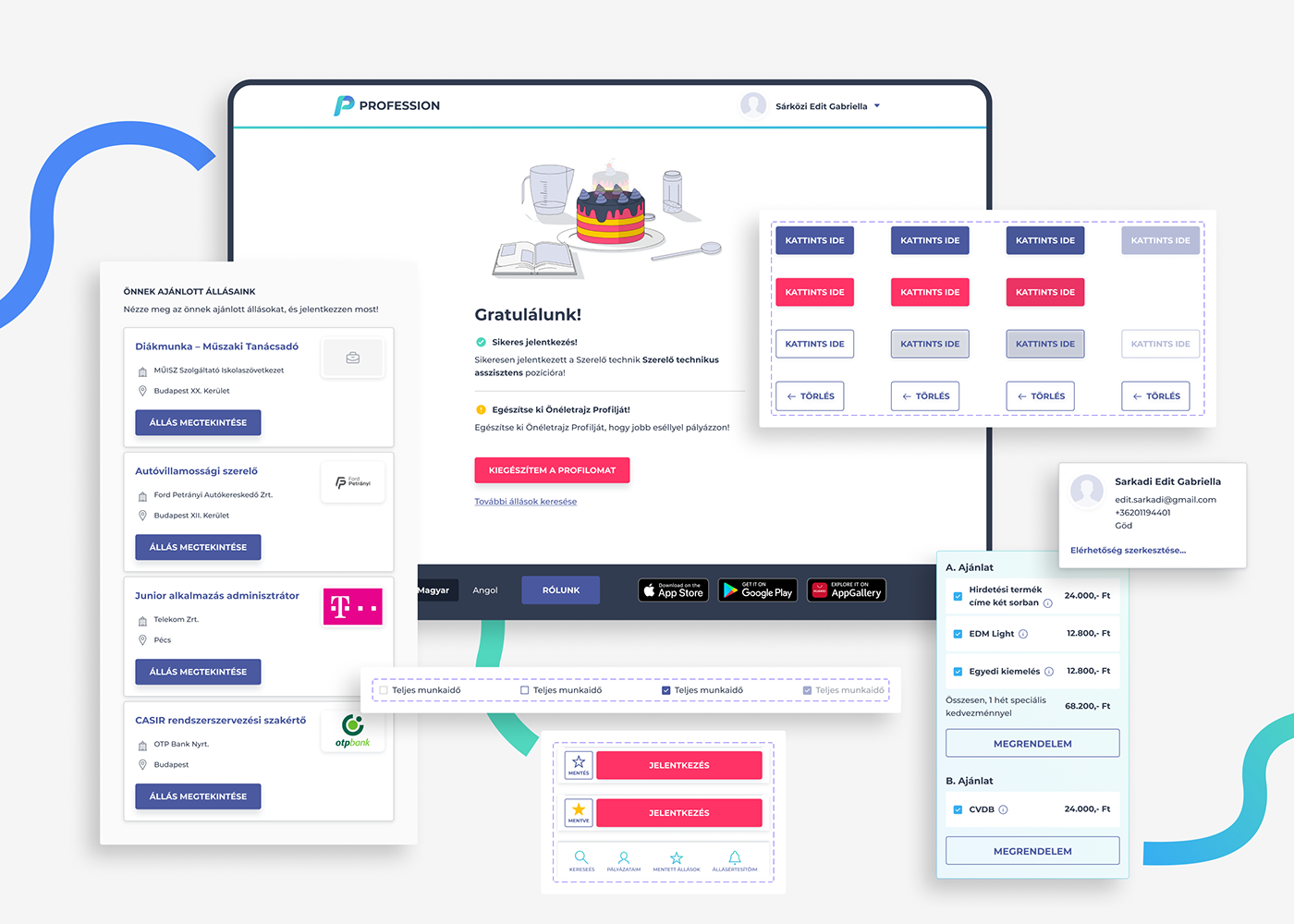
Starting with UI system
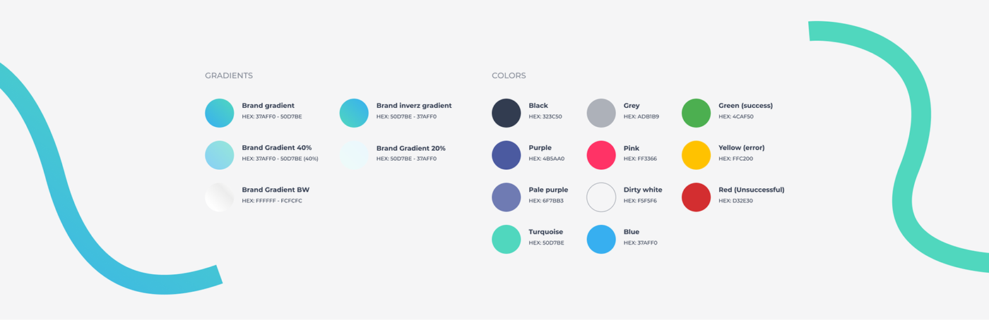
We strictly defined the rules of how to use elements. We introduced a new colour palette, enhanced typographical hierarchies and a new way to use icons on the platform. We used Google's Material Design as a backbone for definitions.
A comprehensive design system and UI rulebook
At the end, we created a 30+ pages long book of their new UI system that helps their internal product and marketing teams to stay on point with their new identity.
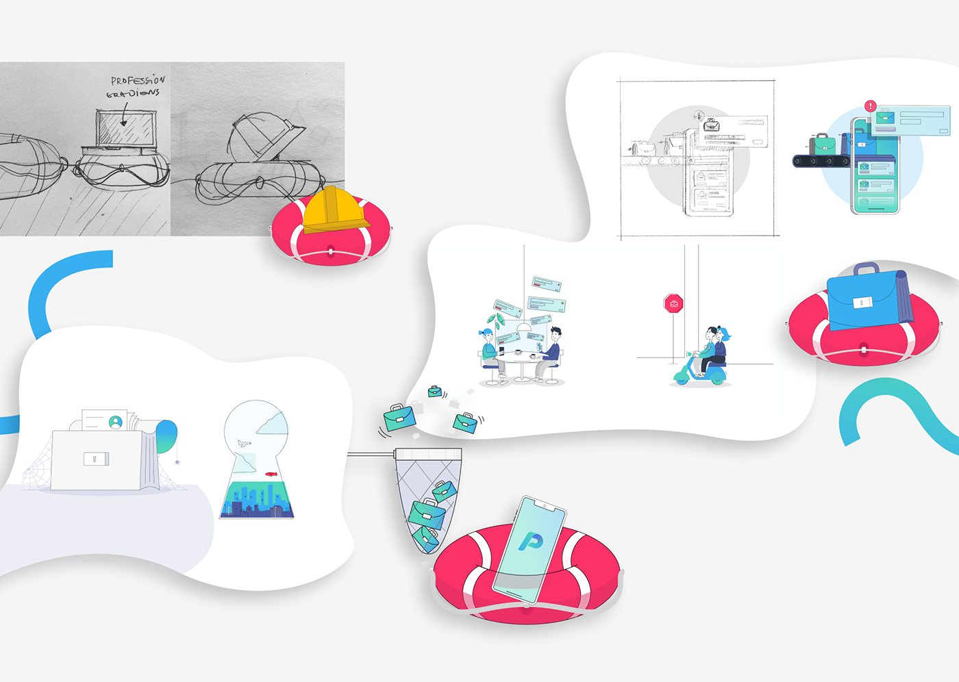
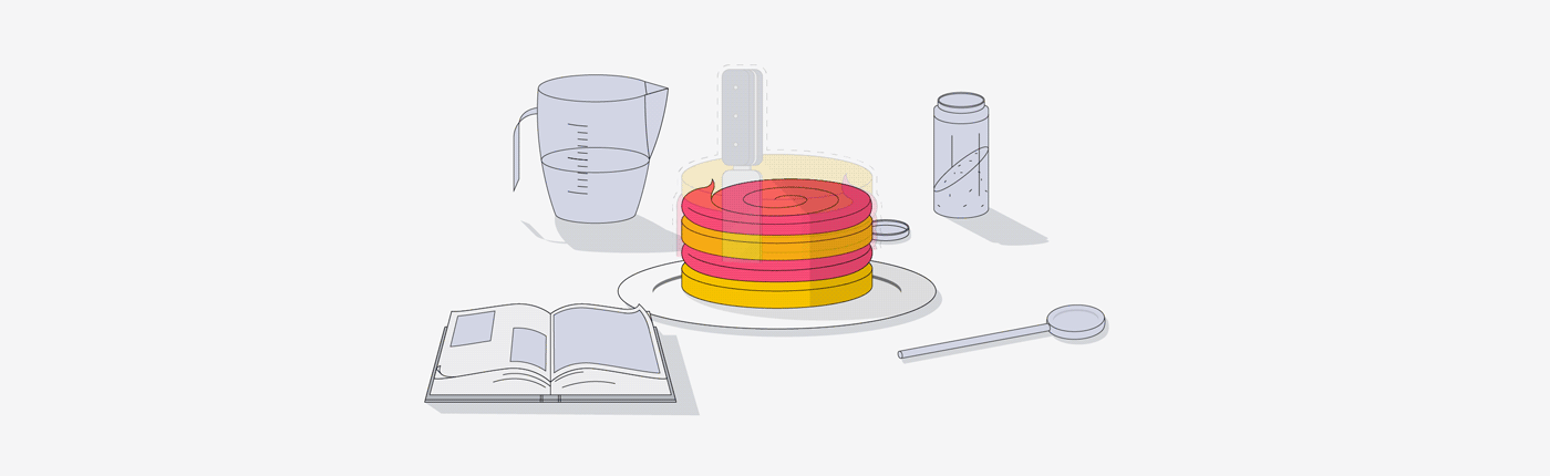
Illustrations
We created a distinguishable illustration style for Profession's communication materials. Brand colours, custom line illustrations, and a touch of humour.


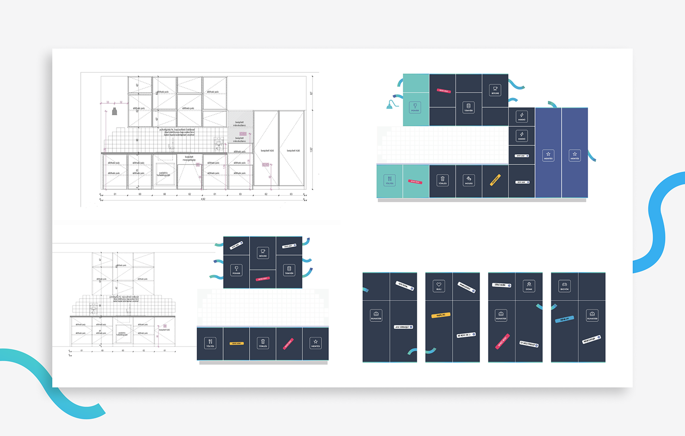
Office Design
Profession.hu employs 150+ people. It's not a surprise that a rebranding project is not only important for communications, but for a company culture reason as well. We backed up their new visuals with little touches in their Budapest HQ.
Kudos from Profession.hu
We've been working together for a long while, they're quick, accurate, creative and flexible. Not merely executed the tasks, but served as consultants as well.
Balázs Varga, Head of Marketing @Profession.hu
Credits
Lead designer — Dániel Pucz
Designers — Gábor André, Gábor Vitáris, Zoltán Beke, Viktor Suszter
Illustrations — Gábor André
Project Management — Ágnes Fehér, László Schelhammer