THOYEN
UX Case Study
Role: UX Designer
Duration: 1 month
Software: Figma, Zeplin
Purpose
THOYEN is a company that aims to connect people who need things done with college students who can do it for them. It has an app with a provider (college student) side and client side. The founder of the company wanted to redesign the landing page to clarify its message. They had a web developer design and develop the original site, and the result was a site that lacked usability. I was tasked with redesigning the website. View Site
This case study focuses on the process of transforming THOYEN into a page that was easy to understand and appealing to the user. Through interactive design sessions with the stakeholder, we eventually succeeded in creating a site that was more usable.
The design thinking process was a loose reference I used during THOYEN’s development, and helped me keep the main goals in mind.

Empathize
Understanding the User
With the stakeholder’s goal to improve the user friendliness of the landing page, we aimed to create a site that would be engaging to the user.
At this stage, research would usually be conducted to gain insights. Due to the budgetary constraints of this project, guerrilla research was conducted via talks with the stakeholder who had experience with the website in lieu of traditional research. Over the process of creating this site, valuable insight that the stakeholder had were made known to me and caused me to implement a different design decision.
Insights:
• Target users of this page were not the college students. Making a site that was aimed at both the students and community had only confused everyone in the past.
• Students instead would have a smaller piece of page real estate.
Define
Clarifying the User Needs
Now that I had been chosen to work on the project, it was time to go over the expectations. After conversing with the stakeholder in the initial exchanges, I set about the process of creating a user experience that would effectively meet those needs.
• Streamlined Message
• Clear Call to Action
• Clean UI
Ideate
“The user would have to scroll and scroll”
Finding Solutions
My process for improving the overall usability of the site was to go by page section. With usability heuristics in mind, I analyzed the site for areas of improvement.
I discovered several. For example:
There was a lot of text laid out across the site. The user would have to scroll and scroll before they reached the bottom of page.
I solved that by implementing constraints and using design patterns: common UI models that would signify the intended interaction. The patterns I used were sliders and tabs. These saved space and introduced constraints to the design, guiding the user’s attention to view only one group at a time.
I also rewrote the copy of the page, trying to use less words to describe more.
Another area where I found the need for increased usability was in the graphic design assets. They were pixelated, and had no brand identity standard. I solved this by finding high quality stock images and adding a new brand color to the company, navy blue. This improved usability by increasing desirability and balanced out the densely hued and saturated logo colors.
On the HTML side, I used my background with analytics to create a google analytics tag for the site so we could gain a deeper understanding of the site’s visitors and later on improve conversions.
Prototype
“With his prior experience, the stakeholder knew what wouldn’t work with the target users”
Iterative Prototyping
I created mockups for the landing page to present to the stakeholder before implementing. Their feedback helped orient and reorient my design decisions.
For example, after I showed my first high fidelity mockups, the stakeholder explained that the “For Students” section would have to get removed, because they had tried to create a site for both sides before but it had only confused users. The main purpose of this site, he explained, was for the community members.
With his prior experience with building webpages for the company, the stakeholder knew what wouldn’t work with the target users.
Test
Evaluating the Results
The analytics tag could be used to see if the new site had affected any user metrics. That was up to the developer to add, and since this is an ongoing project, we are still waiting on that additional information.
For now, other user testing methods are being conducted on the target primary and secondary users of the site to see what they prefer about the new site.
Design System
In this project, I established a design system for THOYEN to use in the future. This design system was created with Zeplin, and would make handoff smoother for the developer.
Handoff
Handoff to the developer was the last stage of the project for me. And key. For this stage, I used Zeplin to inspect my mockups and define each of the elements of the document. Zeplin pulled the CSS code directly from the mockup page. From there, I incorporated them into the design system described above.
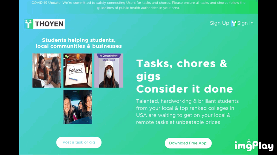
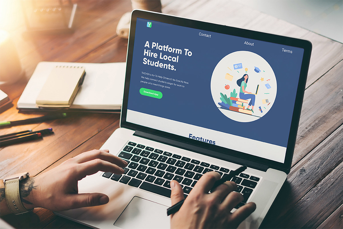
Before and After
Landing Page


Key Takeaways
There were a few key takeaways that I had from this project. The biggest one for me was the importance of flexibility. As the designer, it was important for me to be able to take the feedback that I received and change the design decisions I had made to better serve the purpose of the site. So I became adept at converting feedback to improved design decisions.
Another key takeaway was that in lieu of traditional research, a solid background of the space you are in is necessary to identify any potential issues and pain points before they become a problem. This saved us several times throughout the project.


