


Superhero Leadership Academy
A UX-ish Case Study
Role: Creative Director/Graphic Designer
Duration: 1.5 years
Software: Illustrator, Photoshop, Indesign
Purpose
Superhero Leadership Academy is an organization that aims to empower at risk youth to develop skills in leadership, character, and business. It was started in 2016, and that is when the founder approached me to help establish its premier corporate identity and communications. I was tasked with all the standard branding deliverables in addition to bringing other things that enhanced the project.
This case study focuses on our process of turning SLA into an organization that would be taken seriously by investors, eventually grossing over 50k in grant funding and enabling it to advance its mission. Through meetings with the board members, the founder, and other stakeholders, we were able to turn SLA into a standout organization with collaborations with Disney, sports teams, and various government sectors. Recently, SLA was named one of the top startups in South Florida. View Site
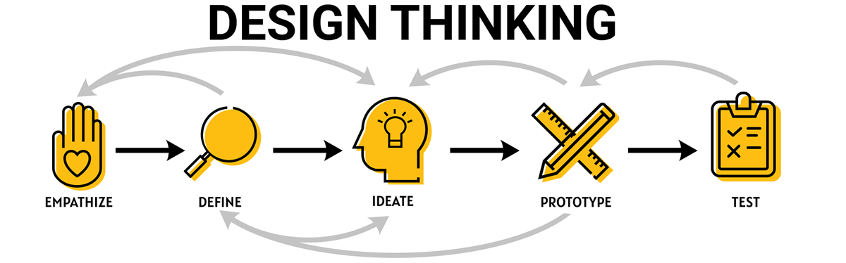
This year, 2016, was when I first got introduced to interaction design and the user centered design process. I had started implementing it in all of my projects, even non-UX ones like this, because I saw its value and wanted to work on UX projects one day. The design thinking process was a loose reference I used that helped me guide the project from start to finish, and elevated this role from just a rote graphic designer to a creative problem solver in the form of creative director.
Empathize
Understanding the Problem
We now needed to define a goal for the project and then understand it. After the meeting with founder it was clear: to create an identity that would reflect SLA. SLA aimed to be an organization that was empowering, and working with a younger demographic meant it could also reflect that with a more playful appearance.
At this stage, I dove deep into understanding the stakeholders’ needs and goals. I gathered as much information as I could from our discussions, then took all that to the drawing board to create potential solutions.
As I worked on the project, I became more familiar with the organization, and a few more things became clear to me that were creating pain points between its objectives and its reality. Throughout this case study I will describe how I took the necessary steps to solve that, which would result in a nonprofit organization that was able to advance and expand its mission throughout the state and is still going strong today.
The pain points are as follows below.

Pain Points:
• SLA was a new organization and it was difficult to establish trust with potential business partners
• SLA was having a hard time conveying its complex mission to outsiders and thus securing grant funding
Define
“In a world of two minute elevator pitches and glitzy videos, its message was getting lost”
Clarifying the Business Needs
Now that I had met with the stakeholders, it was time to think of solutions.
From the pain points arose the business needs:
• Creating a corporate identity to build trust
• Creating an easy to follow way to understand the organization’s objectives
Throughout this process, I would meet regularly with founder, sit in on events the organization was holding, and meet with the organization’s board of directors. I would get sent word documents with page after page of the organization’s plans and missions, and other word heavy materials related to SLA. The influx of information was overwhelming at times, but I took the time to sit down and sift through it. One day as I was doing this, I wondered how many other people had also received this information and felt the same way.
That’s when the second pain point become clear to me. SLA was having a hard time explaining its complex and multifaceted plan to lower gun violence by empowering at risk youth to outsiders. In a world of two minute elevator pitches and glitzy videos, its message was getting lost to potential supporters.
Although the stakeholders hadn’t asked me to tackle this issue, it had become apparent during my work.
Ideate
Finding Solutions
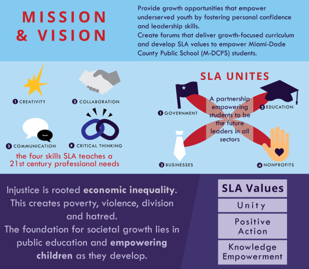
The solution I came up for this problem was simple: Using my visual design skills, I would translate the plentiful pages of word document text into infographic that would break each step down in an easy to follow format. I presented this idea to the founder, who was thrilled by the prospect of it.
This along with the corporate branding were the solutions to the problems the organization was facing. The branding would gave SLA a face so to speak, and that would build trust. These assets solved the first pain point that SLA had run into, and the reason why the founder had sook my help in the first place: establishing trust as a new organization within the public and private sector.
Prototype
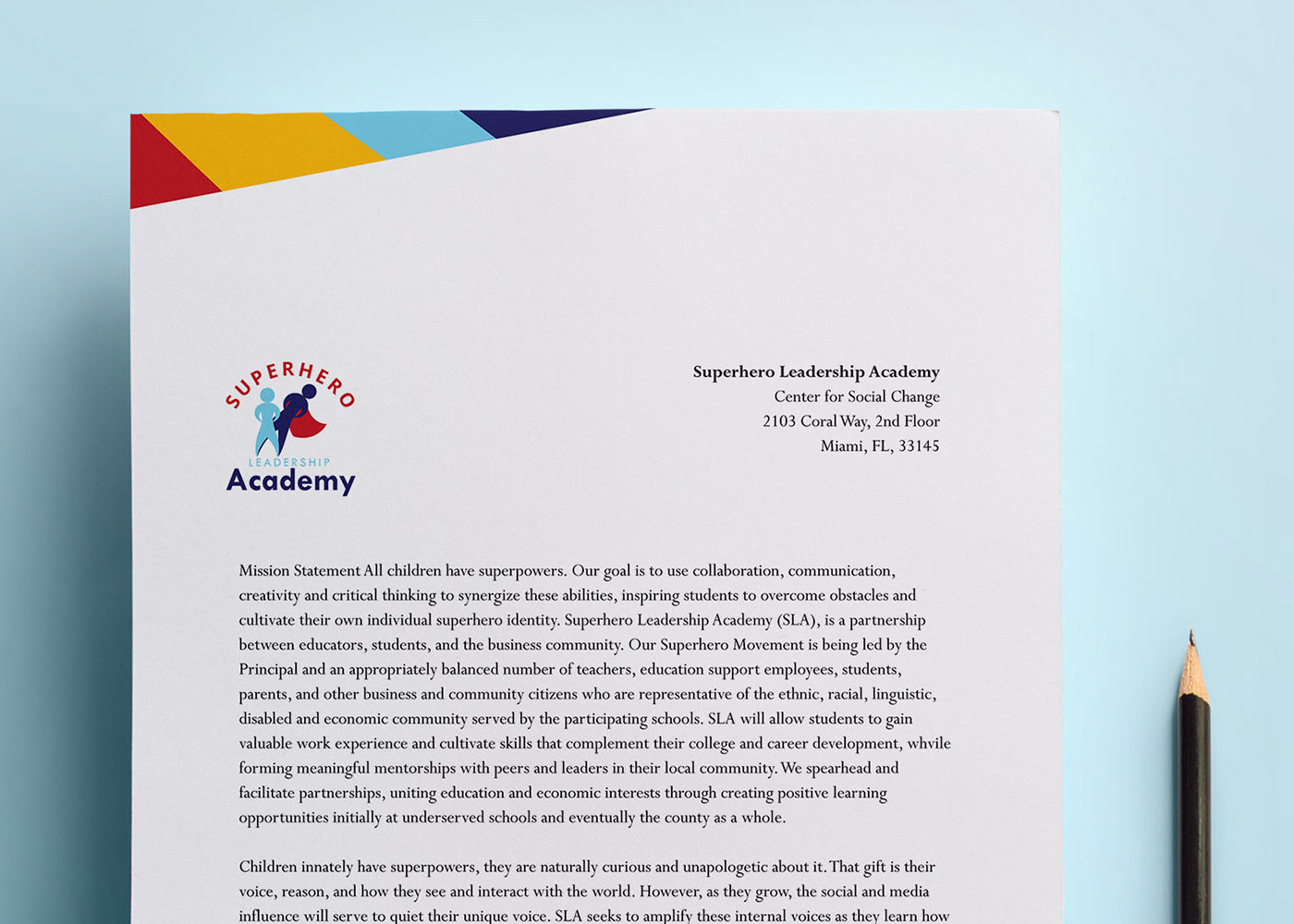
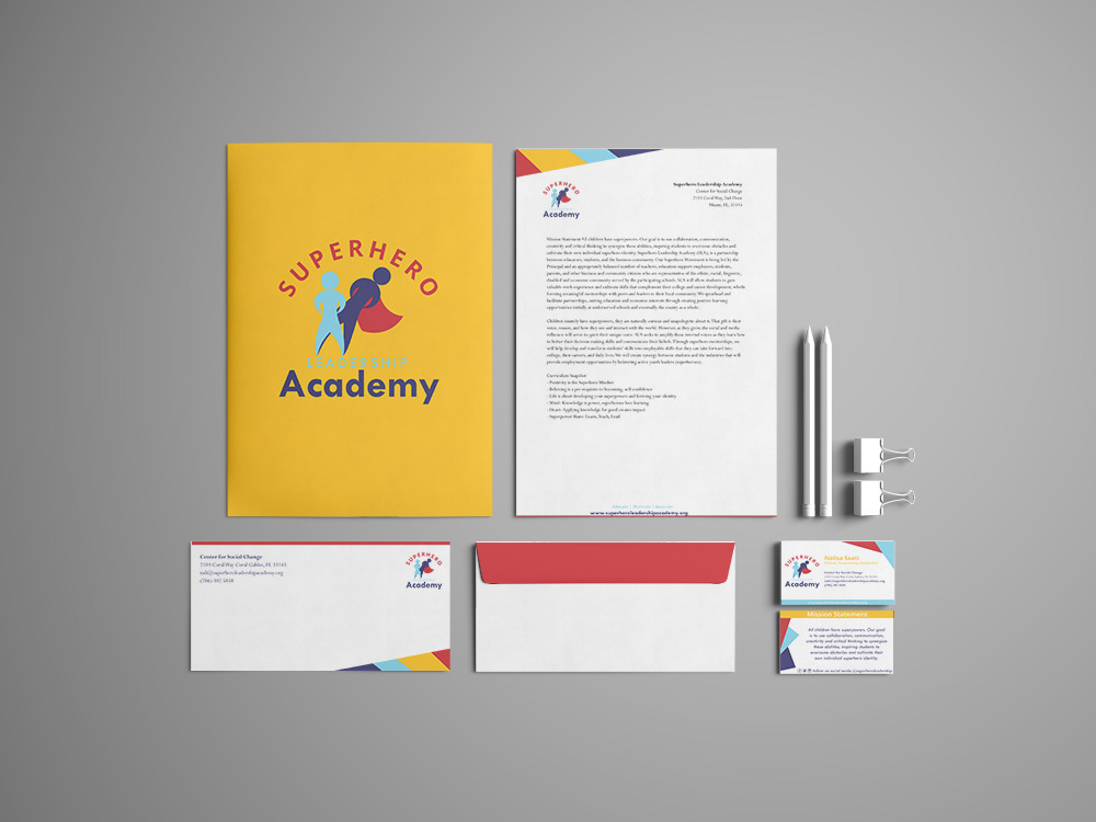
The first deliverable I took on was the creation of a logo and ensuing brand colors. From there, I went on to implement the other deliverables.
We spent a few sessions piggy backing back and forth between different logo concepts before one finally settling on one that matched the foundation’s character.
Along with the logo, business cards, brochures and letterheads were also created.
Then it was time for me to put the infographic into motion. I brainstormed different ways to convey the information in visual format. I even took on a data visualization project to properly render a map that would show the exact places SLA was planning to target. This was not without its challenges but in the end resulted in a stunning hub of information on the organization.
View full infographic here.
Test
“It was empowered to achieve its business goals.”
Evaluating the Results
As an organization and not a digital product, the way to test our work was through the results. That first year, SLA was able to secure over five thousand in funding, which would enable it to continue for the next year. Each year this number would get bigger and bigger.
SLA was able to reach the lives of the young people they had intended to, putting on new after school programs and taking its existing operations to the next level. It was empowered to achieve its business goals.

Key Takeaways
There were a few key takeaways that I had from this project. It was a rewarding project to be a part of, and I saw firsthand the impact that my wok had had on the world. This empowered me the way the organization intended to empower its members, and I saw the value of the work I provided.
Another key takeaway was the importance of the empathize and define stages. These stages were not necessarily linear, and instead took the form of vast amounts of information gathering and synthesizing. Without this part, however, I wouldn’t have been able to identify a key problem that had been missing from the official strategy and ended up making a big difference.
Overall, this project demonstrates how I could still think like a User Experience Designer even in projects that were not purely UX.


