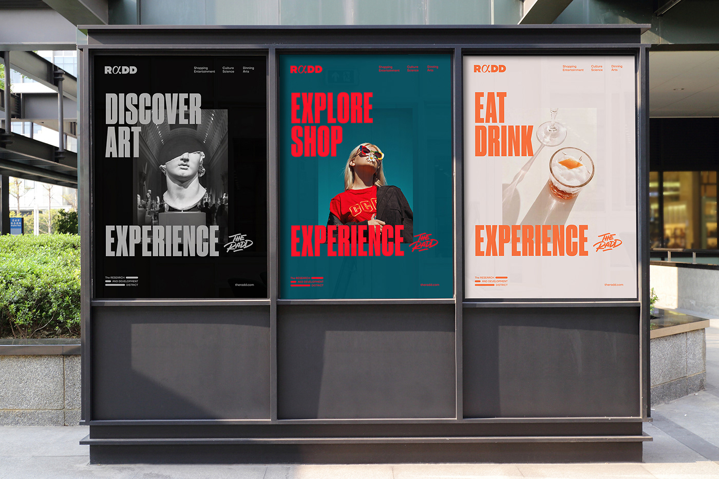
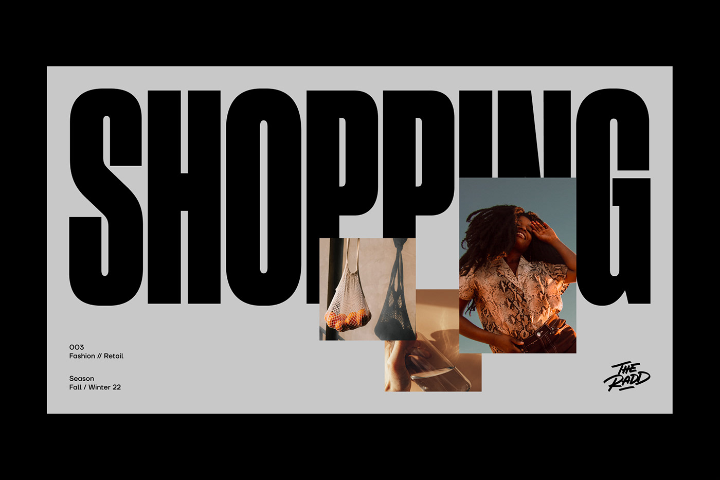
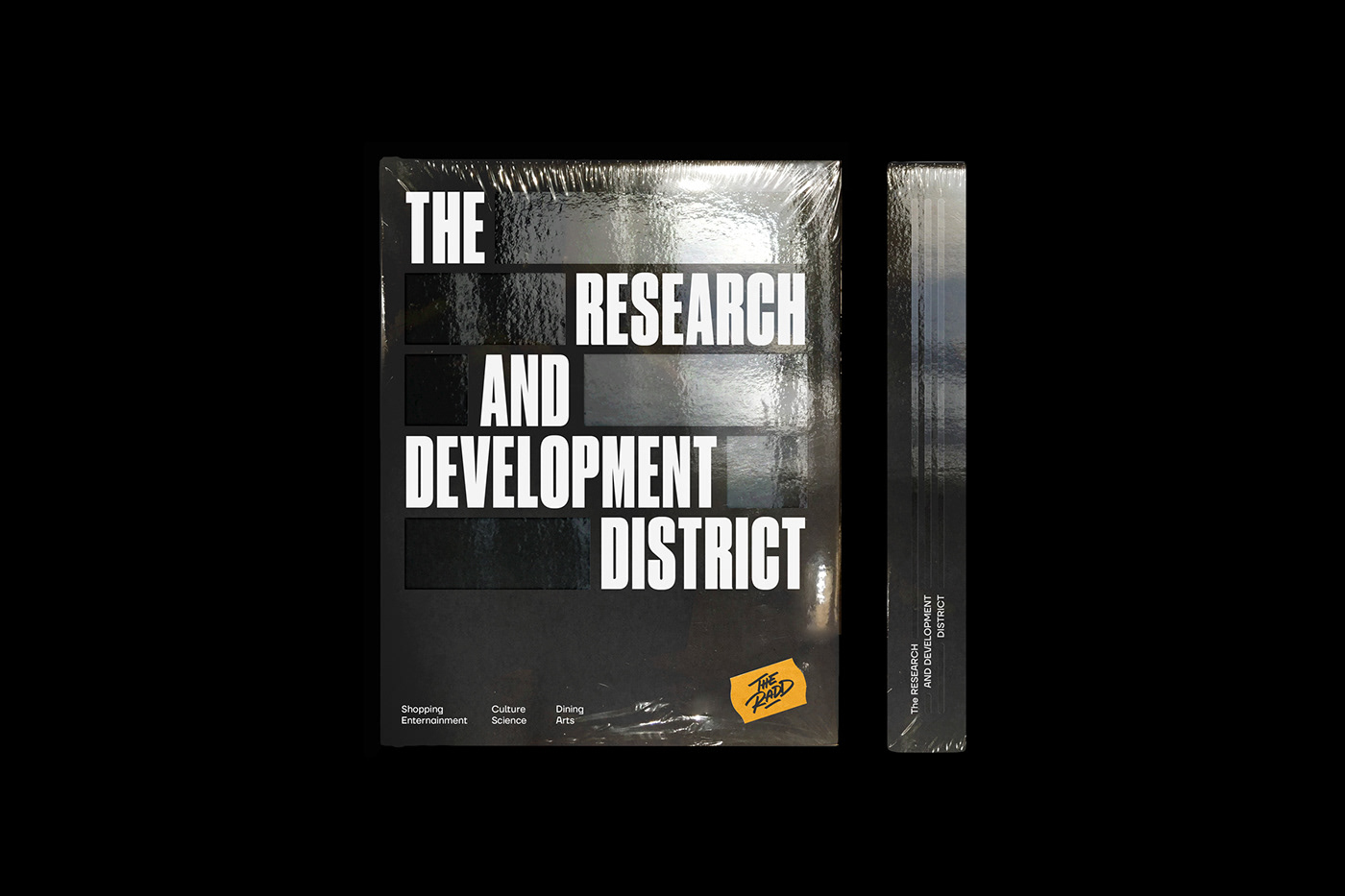
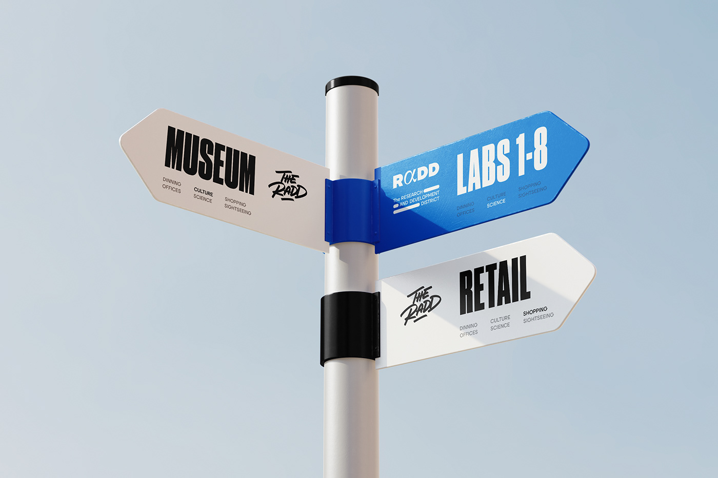
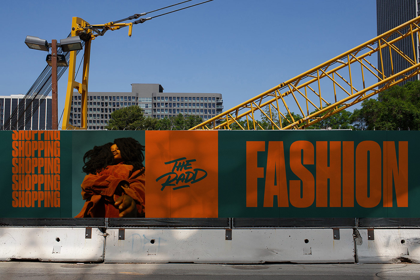
Soon to be a new office, lab, and retail space, The Research and Development District (The RaDD) represents the largest urban commercial waterfront site along California’s Pacific Coast.
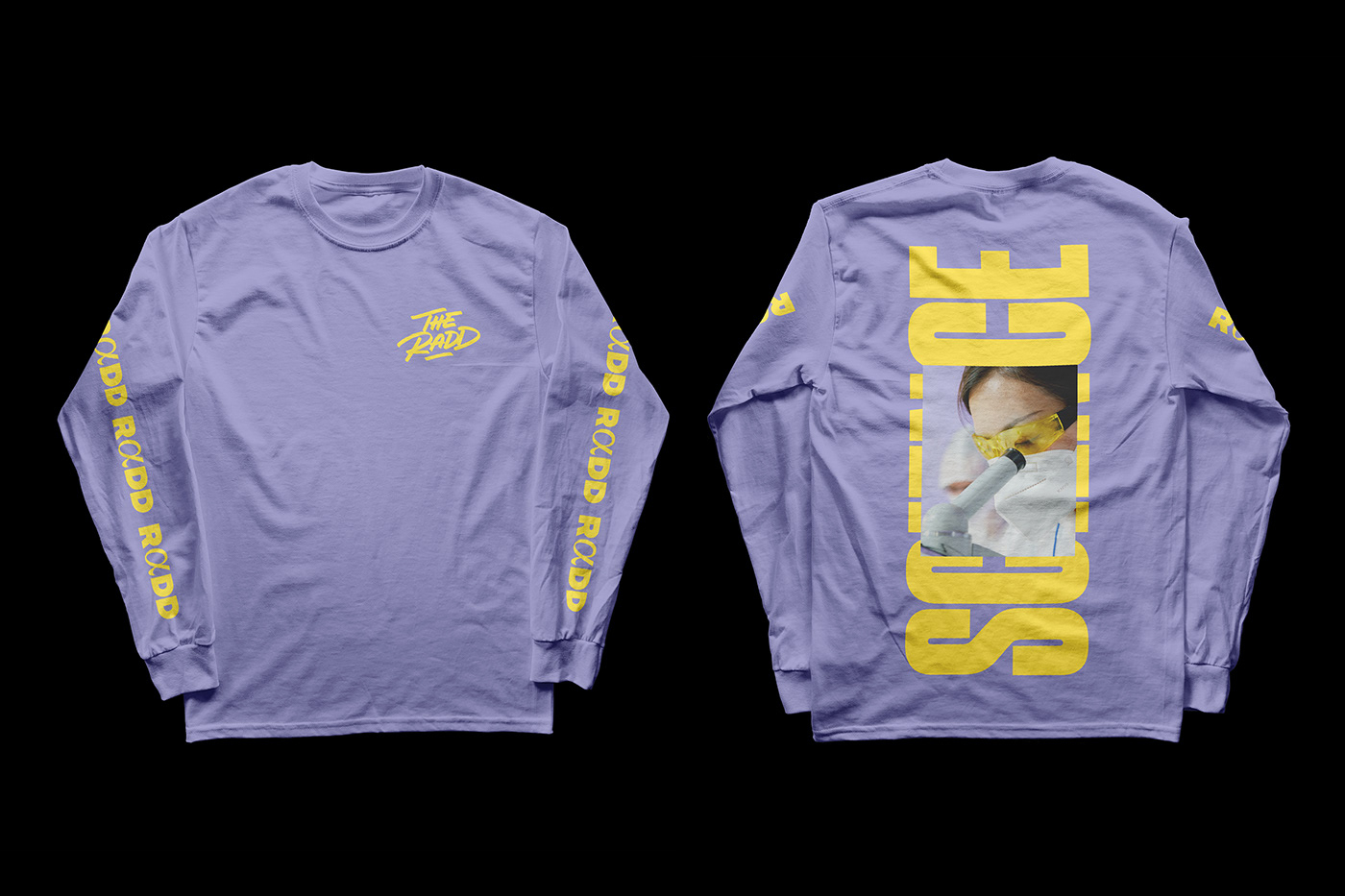
The name “RaDD” is a play on words with the urban expression “RAD = cool”. The visual identity is developed to feature the versatility of the place, blending different elements of the science, military, and urban culture: the α (Alpha), a symbol used on science and leadership, the American Flag, used as grid to represent San Diego as a Gateway to the United States, the Morse Code as a nod to the American Naval Roots, and the Urban Lifestyle to highlight the RaDD’s location as the “it” destination.


Agency: Mubien Brands / Workshop Built
Creative Direction: David Mubien
Art Direction: Javier Ochoa, Daniel Iglesias, David Mubien
UI/UX: Javier Ochoa
Motion: Daniel Iglesias
Art Direction: Javier Ochoa, Daniel Iglesias, David Mubien
UI/UX: Javier Ochoa
Motion: Daniel Iglesias


