Balance: a physical and mental health app

My roles: UX Researcher, Information Architect, UX Designer, Interaction Designer, UI Designer.
Project Duration: 10 Months.
Tools: Figma, Usability Hub, Optimal Workshops, Balsamiq, Pen & Paper.
Team: Individual.
The Challenge
To design a web responsive app that lets its users keep on top of their health and/or wellbeing needs.
Using a Human - Centered Design (HCD) approach.
Where was I to start and what process was I to follow? As a designer, my job is to advocate for the user. For this, I applied a Human - centered approach that makes the user the centerpiece of the design process.

Defining a first hypothesis: Applying the Double-Diamond Strategy
With such a broad challenge and before conducting any research on competitors, I wrote a first problem statement using the Double-Diamond Strategy.

Problem Statement:
People need a way to access a variety of information on their health that is easy to understand,
In order to take the steps needed to improve their health and wellbeing.
We will know this to be true when our users will use the app regularly to check on their health and also more users with different health issues will start using the app.
Analysing the competition
I started off my research by analyzing what other apps in the market had to offer and conducting a competitor analysis with the elaboration of SWOT profiles for each competitor I wanted to research. One such competitors was Moodfit, whose Strengths and Weaknesses extended to many other apps in the Mental Health sector:

Conducting user interviews
But the user research part of my project really took off with user interviews. 4 user interviews were conducted with the goal of uncovering frustrations, behaviours and needs of people when using health apps with a special emphasis on their issues, feelings and thoughts on mental health. The main insights were:

Creating user personas & user flows
Who was I designing for? To collate the information I had collected in the user interviews, I created two user personas to empathise with the user(s) I was building a product for and to focus on their goals, behaviours, and attitudes.

User Personas
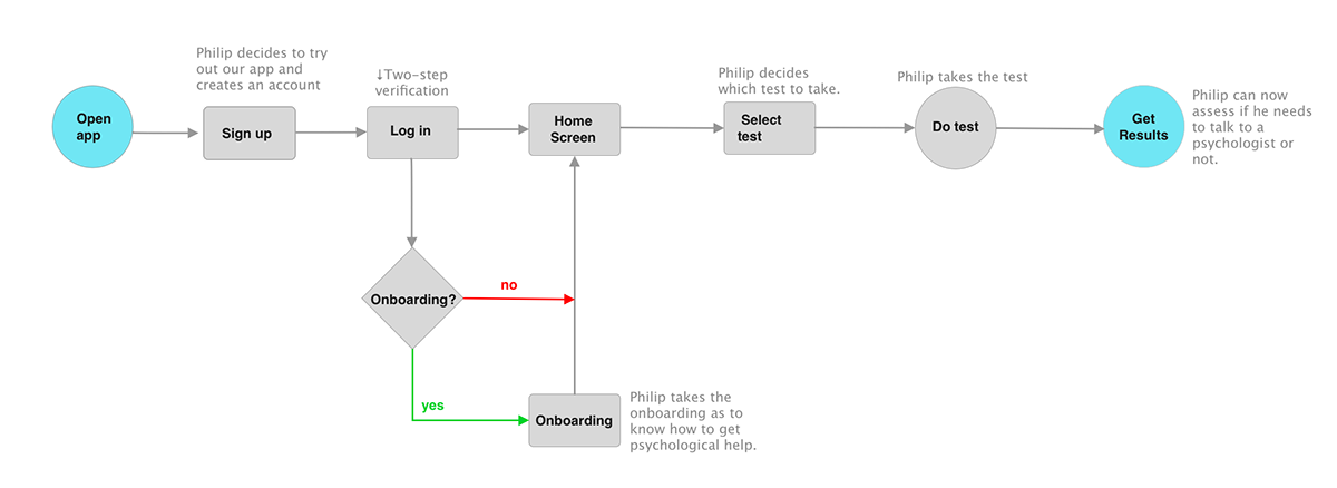
After creating my personas, I mapped out each and every step the user takes—from entry point right through to the final interaction, to accomplish a task through user flows,
"As a user, I want to gauge my feelings and mental state before I talk to a therapist." (Philip)
Creating a site map
Since I was veering away from my first problem statement, it was time to revise it before continuing building a solution to my challenge.
Problem Statement (revised):
People need a way to keep track of their health and to set appointment with health professionals in order to improve their general health and wellbeing.
We will know this to be true when users will be able to set up appointments with health specialist as well as access to a variety of resources to improve their general well-being.
According to the user flows I created, I then sketched out a site map that would help me organize the Information Architecture of my app into categories and to define the taxonomy of the site with three main features in mind, namely: Workshop Section, Booking an Appointment section, and Taking a Mental Health test.

Site Map
Reviewing my site map with card sorting
Organizing the content of my site into categories could make sense to me. But what if these categories didn't make sense to users? Making a card sort session would help me gather quantitative data as to what categories made sense to users. I gathered 20 participants who organized the the different screens and actions of the website into categories that made sense to them. The results were as follows:
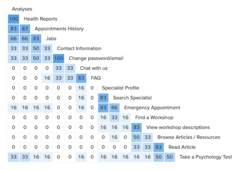
Similarity Matrix & Findings
There were 4 potential clusters, although the Article and Workshop cards were cross-pollinated, meaning that users weren't sure as to put them in the same category or in different ones. I reorganized the site map accordingly by grouping the latter Article and Workshop screens together, although I kept the first version of the site map at hand as it was equally valid.

Revisited Site Map

Creating wireframes
Based on the three aforementioned core features of my app, I created low, mid and high fidelity non-interactive wireframes to be latter assembled into a prototype to test with users.
With a mobile-first design approach, I designed first the wireframes for mobile resolution before diving into the design for desktop resolution.


User testing
I conducted user testing with 6 users, which helped me uncover main frictions when using the app. I collated the data on a rainbow spreadsheet:

Rainbow Spreadsheet
Once I had identified the issues and classified them according to their level of severity, I conducted a first iteration round to fix usability issues before implementing the UI.

5/6 users were unable to find the test. I changed the copy to make it more concise and to the point. However, users would still struggle to find it. I would have to later add an illustration with an appropriate CTA button for users to pay more attention to it.

4/6 users didn't scroll down the homepage to uncover content below the fold because they simply didn't know there was more content that what was showed on the screen. This was fixed by making content below the fold peak out.
Creating a style guide
The primary colour palette consisted of Blue Jeans, Medium Aquamarine, and Dark Charcoal. They were the lead colours with dark and lighter variants.

Colour Palette and Typography

Iconography
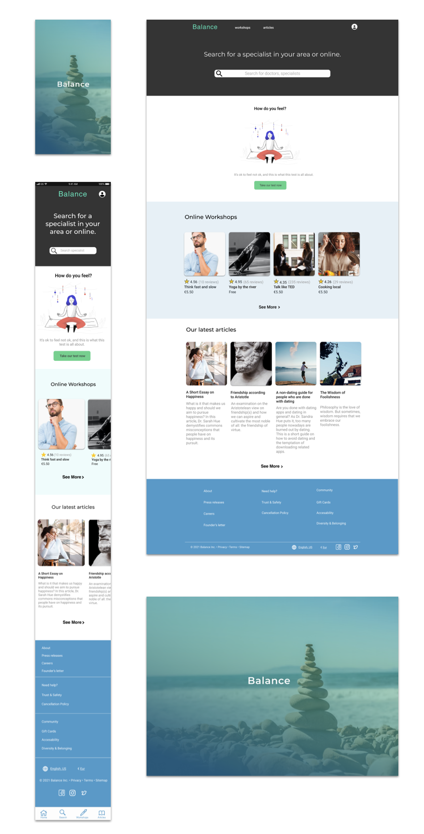
UI Design of Homepage and Splash Screen.
Conducting a last iteration round and designing for accessibility.
After creating a style guide and implementing it into my design, I conducted a last round of iteration according to peer reviews and WCAG guidelines, to make the app not only look aesthetically pleasing to the eye, but to use colouring, sizing, and spacing to improve usability and minimise accessibility issues always with a mobile-first design approach.
I added additional labels when the content requires input from the user as recommended by guideline 3.3.2 by the WCAG.

I applied a colour contrast ratio for CTAs of at least 4:5:1 as in accordance with accessibility WCAG guideline 1.4.3.

As per one designer's feedback:
“These two boxes look a bit cramped down here. I am also not sure when or how payment takes place (especially since here it says "Cards not accepted").”
So following her insight I added more spacing between elements and expanded the copy as to what to do if one payment method was not accepted.

After 600 hours of work, 400 presentation slides, numerous reviews and 4 iterations, I finally produced a credible solution to my challenge:
And here is the desktop version.
Final thoughts
Although I worked for more than 600 hours on this project and I acquired many skills along the way, I have come to think that this app can be improved in many ways.
My first concern was to make users who were reluctant to discuss about mental health issues to feel at ease and explore the possibility of getting professional help. This is why I devised the Test feature that could be added into any medical appointment-making app.
On the other hand, users while engaging with the content (Articles & Workshops) of the app could also read content on the benefits of mental health and hence decide to take a test or directly book an appointment. This is why I provided the content section, yet I am still working on creating a flow that would link articles and workshops back to the test or appointment-making feature.
Would I tackle this project differently had I known the outcome? I am not sure, although I feel satisfied with the end-product, having even designed the UI with no prior knowledge of UI Design (and although this aspect could be improved a lot more), I believe that the content sections for user engagement could focus only on health issues (articles on pregnancy, workshops on health and health lifestyle etc.), rather than on Health and Wellbeing, attracting a more specific kind of user.


