Luminar Ai
Case Study
Role: Chief Design Officer, Senior Product Designer
Done: Product design, Branding, Interaction Design, UI&UX Design, Sound Design, Principle Marketing Materials Design, Video Score.

Teaser Video done in FinalCut Pro X, Video Score done in Ableton Live.
More than creating something new, I love making products that help create. Therefore, I was thrilled when my friends from Skylum wrote to me and suggested rethinking the Luminal application, which already existed on the market. We already had a great work experience before, I did the design for the Photolemur app, and we even got a Red Dot Award for it.


I have been doing photography for a long time and am not the biggest fan of processing, so I wanted the most understandable and straightforward editor, including myself. It is challenging to make application applications because you do not know how your product will be used in advance. In everyday utilities, you can build a tunnel along with the oblique user moves, and then you need to give tools so that they all work with each other.
What we had at the start:
— Current product. A photo processing program with a classic interface and a relatively high entry threshold.
— Analysis of the market and competitors.
— Analysis of the market and competitors.
What had to be done?
— Lower the entry threshold, rethink the UX/UI, breathe new life into the product, and make it memorable.
— Attract a new audience due to the apparent differences and advantages from competitors.
— Attract a new audience due to the apparent differences and advantages from competitors.
— Make work in the program faster and make the interface feels smooth and natural.
— Make a boring product fun.
— Make a boring product fun.
Luminar, in fact, resembled a direct competitor to Lightroom and Capture One, but with its own unique features that did not catch the eye at first glance.
Pendulum Principle
First, you need to do it the way you want, it feels, without considering the audience, technology, etc. A concept that you can dream about and that explains everything just in one look. You need to draw it to demonstrate what works and how to discuss it with the client. Not to look around but to do what comes to my mind first.
Not always the client can make any of your choices.
The designer must define and convey what this feature does for business, clients, development, etc.

First attempts...
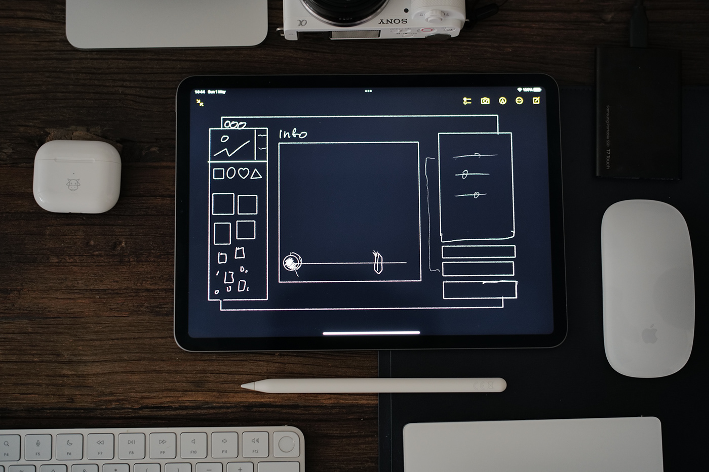

Rapid prototypes I often made in Keynote. It works perfect even on iPad.
Cyberpunk, colour distortions, colourful photographs, the 80s...
Feedback from Team: "it is too far from our product, but we like the mood. We need to keep current customers and try not to frighten them with abrupt changes."
Then I start thinking about how to redesign the current product so that it is recognisable to existing users and, at the same time, gets a new character and vibe.
While I'm waiting for feedback from the prototype, I'm starting to work with the main icon. I believe that the branding concept and the product icon should be done as early as possible; then, in the work process, you can ask, "does it look like something with this icon?"

I asked myself: What can process a photo in real-time without spoiling the original image? Glass, filter, prism?
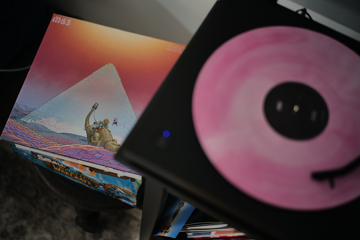
It's funny that at that time, I was listening to vinyl by m83 and thought that the prism in profile resembles a pyramid. And I got an option that everyone liked.
The Luminar icon
looks like the prismatic pyramid in the fog. We probably do not know what size this pyramid is. In addition, it vaguely resembles the landscape genre of photography, which is especially popular among users.

Based on this icon, I made a logo, a new installer, and a splash screen.


The logo in the application performs several functions at once:
— The title of the window for navigation is always apparent in the screenshots.
— Application loading indicator, we show through animation what the application thinks.
— Menu button, especially relevant on Windows.
— The title of the window for navigation is always apparent in the screenshots.
— Application loading indicator, we show through animation what the application thinks.
— Menu button, especially relevant on Windows.

Subtile gradient animation on the logo, when app is thinking.
I suggested calling this version Luminar Ai instead Luminar 5 because I wanted to show the main feature of the editor in the title.
Since the program essentially has 4 programs inside: Library, Filters, Editor and Export. I suggested drawing arrows on them, meaning in this way that the photo should go from import to export.

Ideally, everything should happen on the same screen, but we decided not to risk it :)
Prototype with content based workflow. Without separate sections. Made in Principle.
Onboarding.
I always want to avoid onboarding since the user has not yet had experience using the program and still won't remember anything. And those who have already used it still miss it. It is better to dissolve the training in the application.
Welcome → Next → Next → Next → Bla-bla → Yep → Next → Skip → Next → Finish
It's best when the interface explains itself, but here we went further. After installing the program, I noticed that to start using it, you need photos, but it turns out that they are not always there. Therefore, I suggested posting a sample photos in different genres and using links to tell you what you can do with them. In the future, I want to be able to call such an intelligent assistant on any photo and decide for myself what to do and what not to do. So we kill two birds with one stone — do the tutorial and immediately give the content you can already work with.
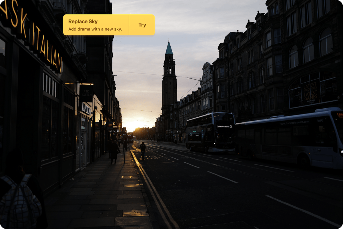
Edinburgh. Leica Q2.
Real Product Demo.
We went through a wiiiiiiiiiiiiide variety of options for the interface and chose the one that seemed most familiar to previous users.
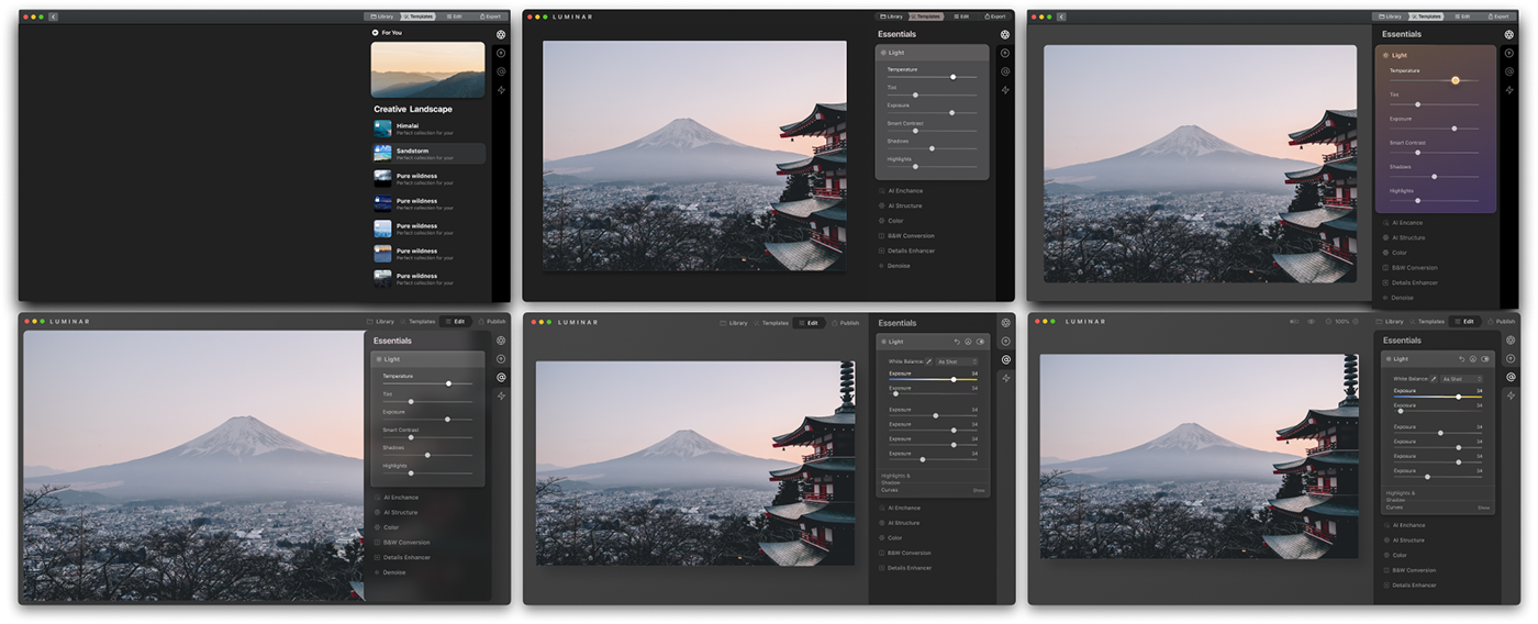
Templates
Special attention was paid to templates. The product's unique feature is that Luminar can offer edit presets based on photography. And also, if you make your preset, it works the same way on different photos and practically does not require modification.

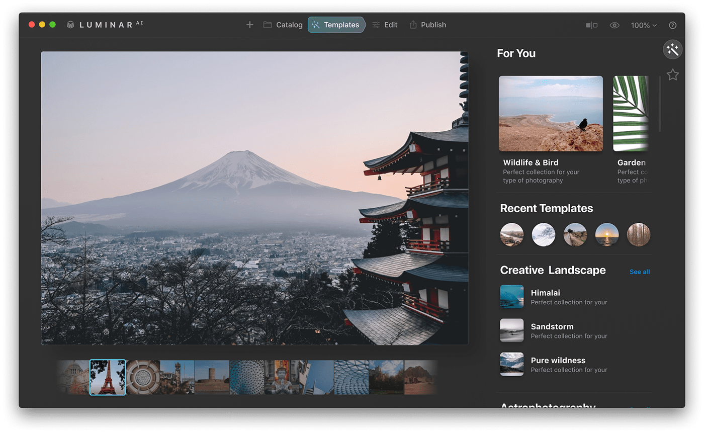
Early screen of Templates section
You can also buy packs or subscribe to them. I made a separate icon for this subscription. And designed small app for template pack creators.


Editing
Advanced users always need high flexibility. Usually, sliders are used to edit photos. But I tried to rethink the controls. The main idea is that the UI has an affordance. It means the interface shows what will happen to the photo when interacting with it.
It's more obvious for new users.


Still trying to make the Cyberpunk-style interface :)
Before the release, we would not have had time to conduct such an experiment, but some ideas still partially got into the release. For example, the sky selection is now not just a drop-down list but full-fledged thumbnails.

Need for Speed
The developers and I worked parallel from different sides for the program to make it feel fast. While they tried to rewrite or optimise algorithms, I did animations, interactions, and some tricks.
Prototype was done in Principle.
Landing
We worked on the Landing together with the Clay agency. We wanted to make it so that it was immediately clear what works and how without downloading the program.
Conclusion
You can retouch portraits and change the lighting and sky in a couple of clicks. And professionally colour grade RAW photos without special knowledge! When the Luminar Ai came out, it made a splash for everyone who tried it.
Peter McKinnon reviewed it, and we got a Red Dot Design Award.
Demo Video. Done in Rotato. Music Made in Ableton Live
Client: Skylum Software, New York, USA
Project Team:
Skylum Software:
Ivan Kutanin (Chief Executive Officer)
Juliana Chyzhova (Chief Marketing Officer )
Dima Sytnik (Chief Product Officer)
Dmitry Novikov (Chief Design Officer)
Dmitry Novikov (Chief Design Officer)


