
The single most daunting adversary faced by the financial industry is the threat of security and more specifically in recent times cyber threats. Financial institutions part ways with exorbitant funds, either directly through the loss to cyber criminals, or indirectly by spending on mitigating systems and software that fights against these cyber bad actors. With majority of the world online via mobile, there’s no doubt that a cost-effective end-to-end security system is the most sought-after solution for financial institutions.
TheOne platform, powered by Clydestone in collaboration with Gemalto Thales, is a software as a service platform that harnesses the latest bio-metric technology to provide the highest level of security for users to access services, confirm and sign transactions. Clydestone reached out to CaveLantern to develop an identity for their flagship product that will help them cut through and set them apart in a faceless category.

Challenge
As a B2B product, the challenge facing TheOne was the risk of easily
coming across as a soulless entity as most business software do.
We realized there was an opportunity to define the product as an
entity with character without compromising on the assurance and trust
the system consistently provides.
coming across as a soulless entity as most business software do.
We realized there was an opportunity to define the product as an
entity with character without compromising on the assurance and trust
the system consistently provides.


Creative Direction
We led with ‘Layered Security’ inferred from the multiple independent authentication
factors which simultaneously and collectively averts cyber threats.
TheOne needed an appropriate and distinct logo that spoke to the seriousness and
core of the brand—Security. Employing a logotype with an infusion of a symbol of
security, the primary aim of the logo was to be easily distinct and read, this meant
the icon can be a secondary recognition that can be extracted and used in scenarios
where only icons fit.


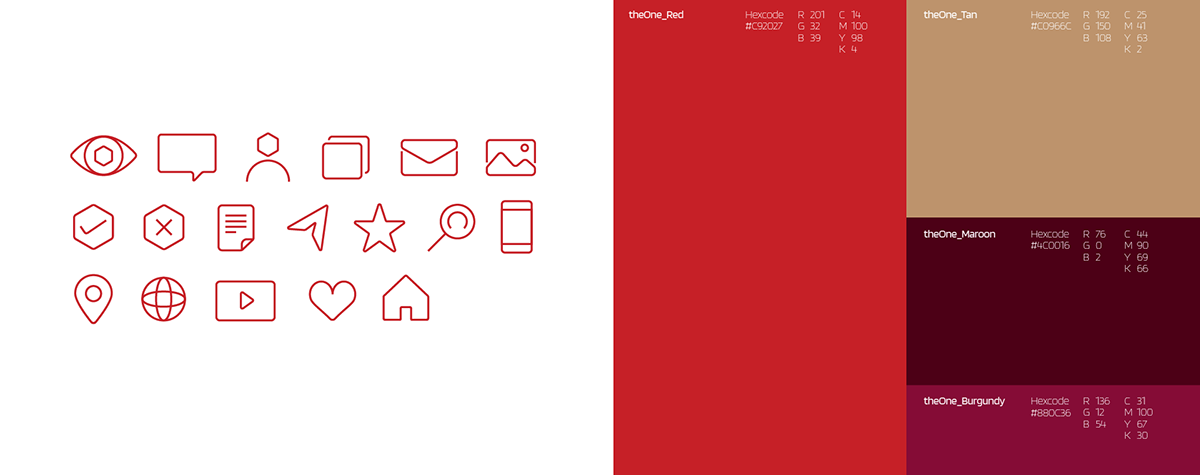


Design System
Still leaning on the ‘Layered Security’ direction, the brand came alive in
motion and communication with layered elements. As a sense of secured
reinforcements, the brand took to the employment of stacked elements,
multiplicity and concentric forms in order to express fully the idea of multiple
risk mitigating checkpoints. The hexagonal shape extracted from the logo was
used as a brand device in layouts and the basic element in most of the brand
touch points as exemplified in the brand guidelines manual. The scope of the
project extended to art directing and designing the user interface and experience
of the mobile application and brand website.


Motion System
The motion system drew inspiration from the unique proprietary obfuscation techniques
of theOne’s platform (masking of native development languages to prevent reverse
engineering). This meant abstract non-linear motion, shrouding its next move and also
random seeded compositions of animated elements that change algorithmically.
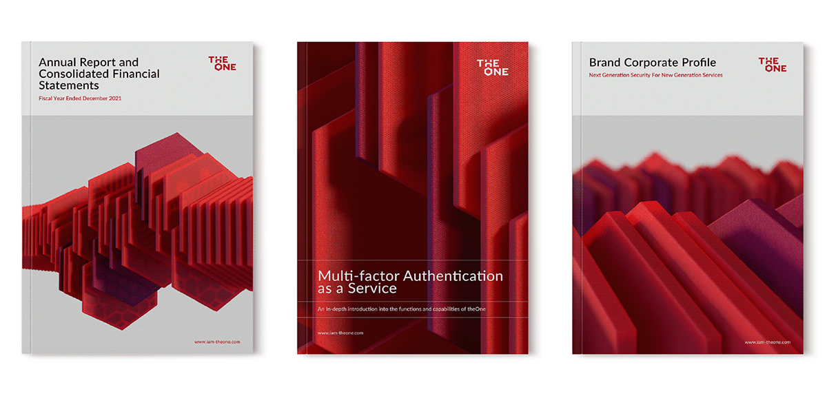
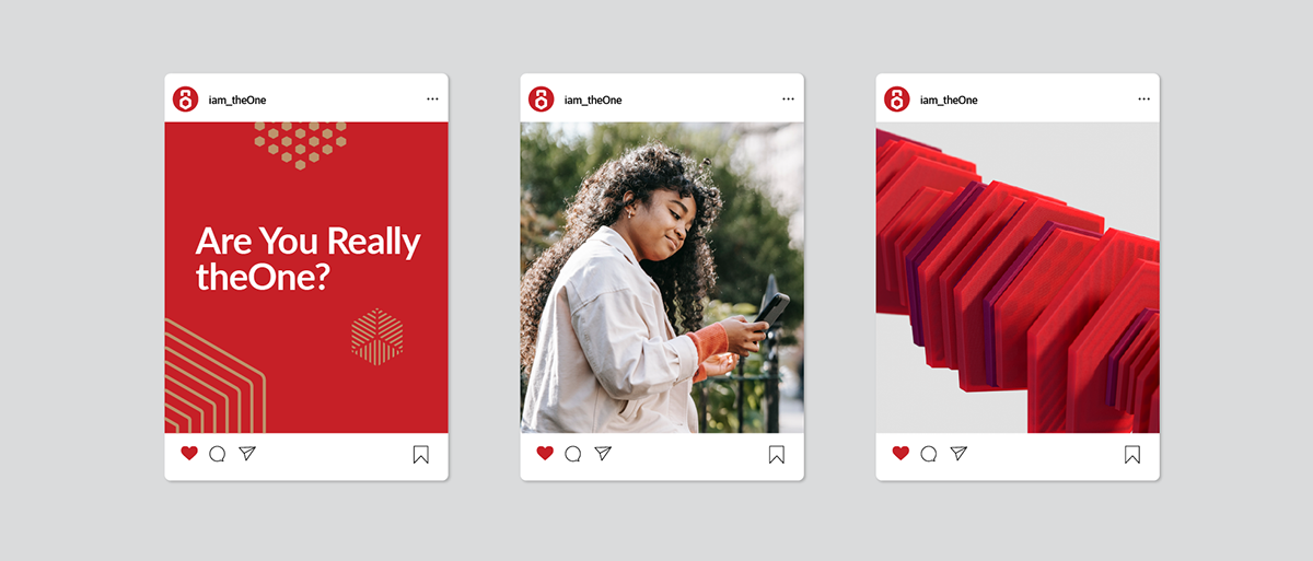
In a bid to further set itself apart, the brand sort to using 3d illustrations in visualizing
and adding form to the brand idea. Subtle translucent hexagons with varying patterns
at its core stressed upon the differing protective features. Varied compositions and shot
angles of these 3d plates make for myriad of compositions and backdrops for the messaging
of TheOne.


Check Out CaveLantern's full portfolio: www.cavelantern.com


