


When Dantaxi merged with Taxinord and became Denmark’s largest taxi service, they needed to fuse not just two logos but two cultures, two-car fleets, and an array of apps. At Designit, we helped them with a brand new visual identity and a completely redesigned app experience that not only marked a new beginning for Dantaxi but set the bar for the taxi industry in Denmark as a whole.


'T is for Taxi. It can be that simple.' In a market still using phone numbers as brand names, we took a radically simple approach in order to secure nationwide recognition and consistency across touchpoints. Starting with the name – or rather – a symbol, that naturally positioned Dantaxi as a leading mobility service alongside other familiar symbols of transportation known to the public in Denmark.


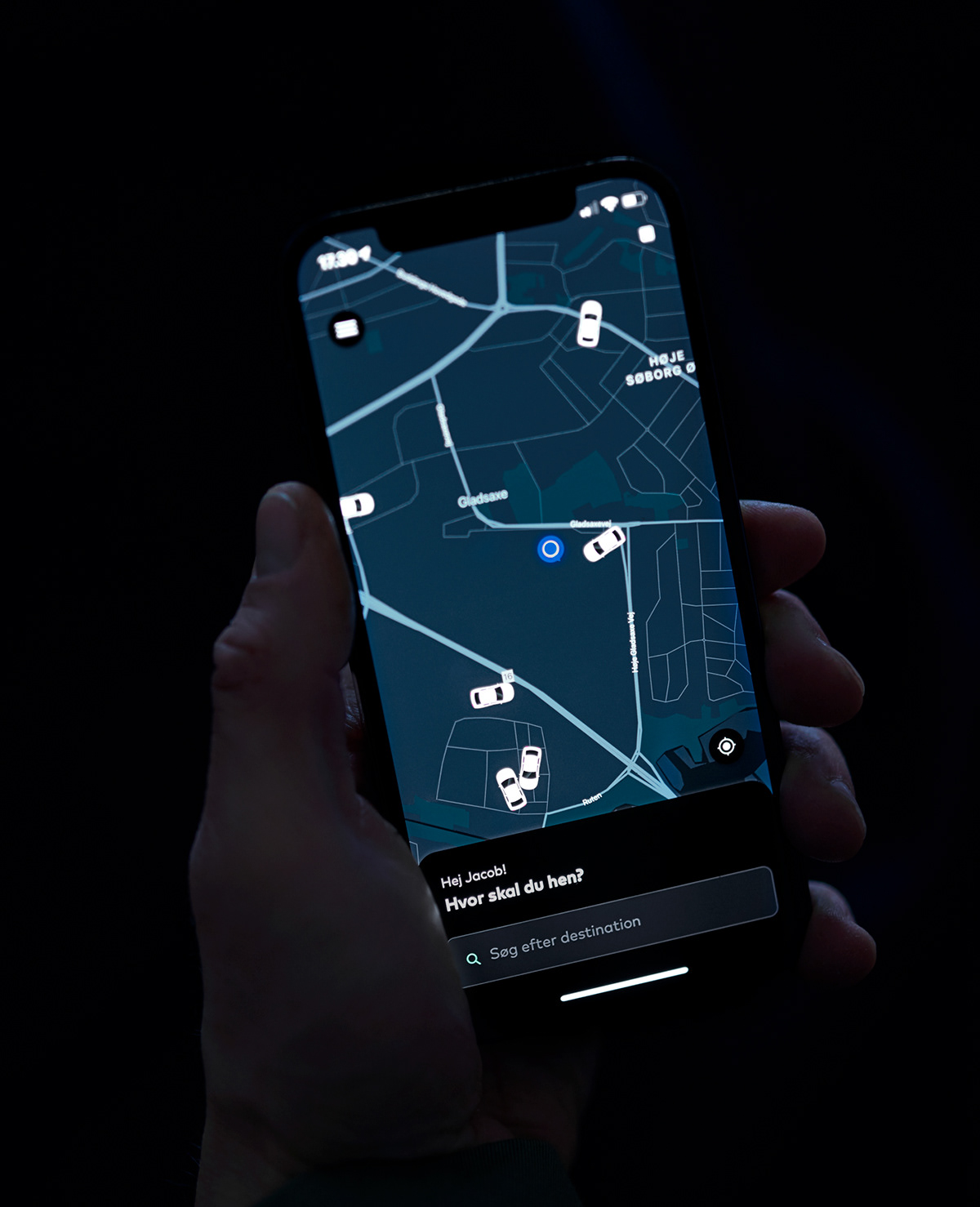
The complete app experience, from onboarding to ordering flow, was redesigned. From dark mode to bike mode, fixed price or electric only. We made it easy for customers to choose exactly how they want their ride and built the UI to scale with any future customer preferences.


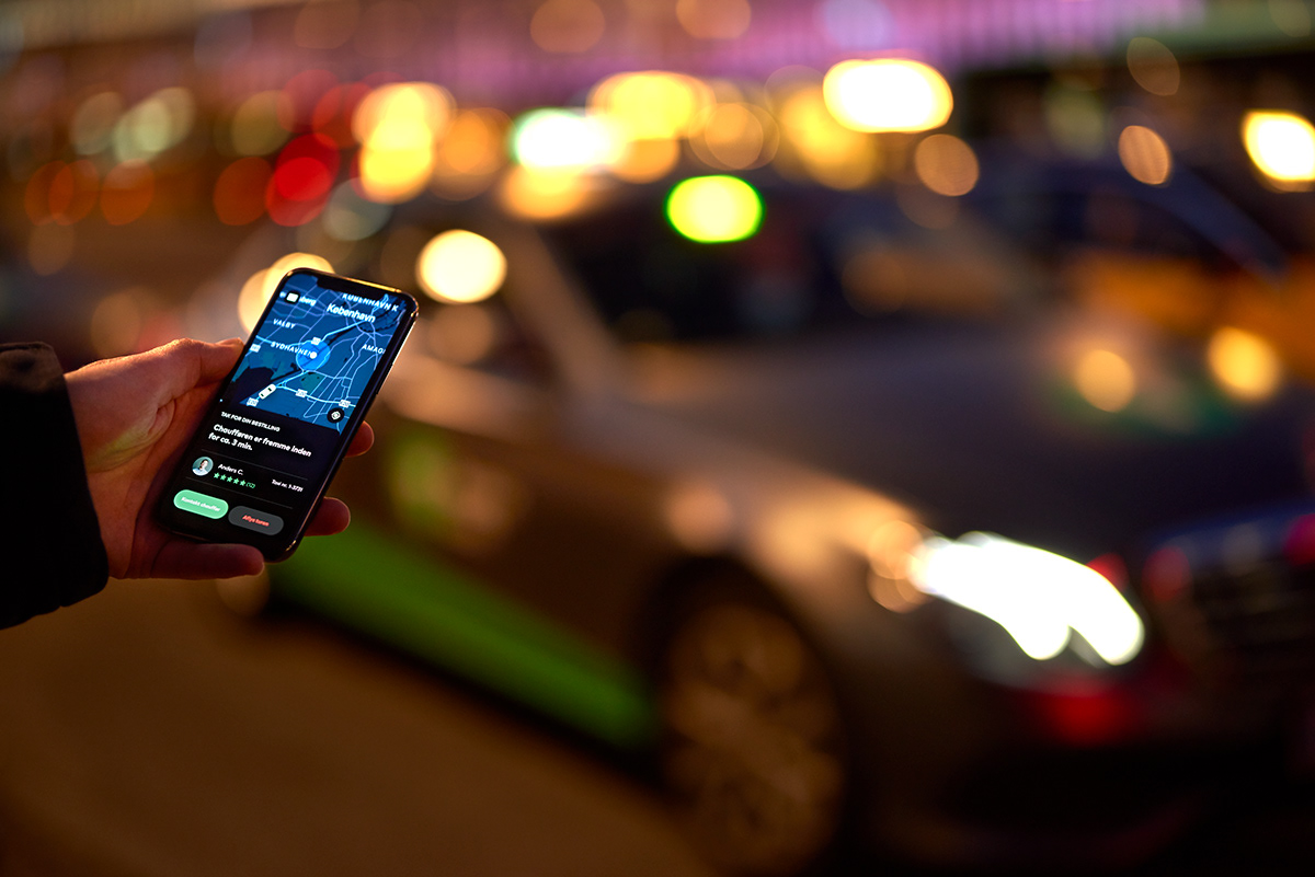
For a more enjoyable experience that lowers eye fatigue when interacting with the app during night time, a UI that supports native dark mode on iOS and Android devices was created.


Client: Dantaxi
Agency: Designit
Creative Director: Carsten Nguyen Henriksen
UX Lead : Jens Christiansen
Design Lead: Jacob Bøgelund Larsen
Senior Brand Designer: Thorbjørn Gudnason
Photography: Pierre Stachurska


