Jow is a personal grocery shopper at your fingertips. Jow simplifies your day-to-day so you can take back time for yourself and your loved ones. They came to us to explore a rebrand as they moved into the US market (from France). In the rebrand, our goal was to transition Jow from a technology app to a service that can improve your everyday life. We set out to capture the “Joie de Jow”, the exuberant enjoyment of life.
The headline type is a custom modified font with playful ligatures. We created an alternate option of the font with squiggles for more expressive and heartfelt moments.
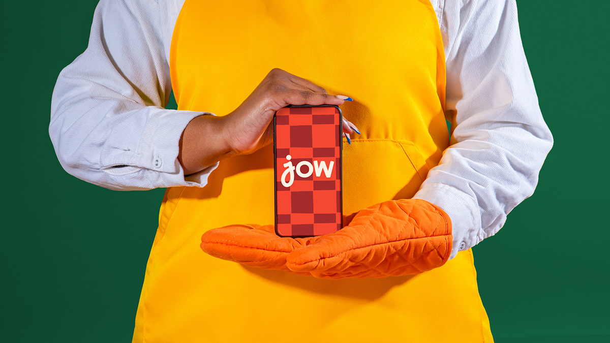


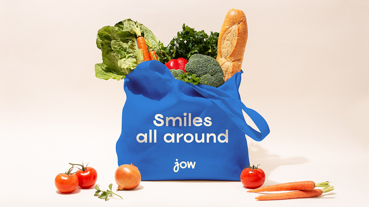
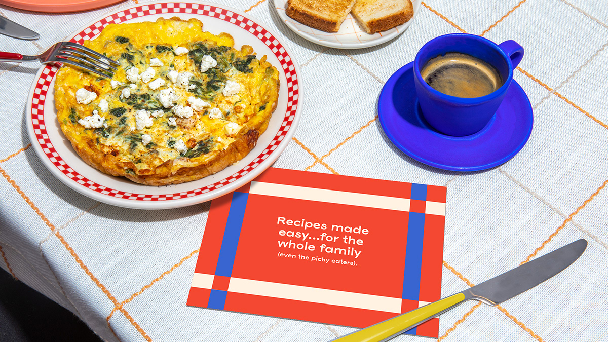
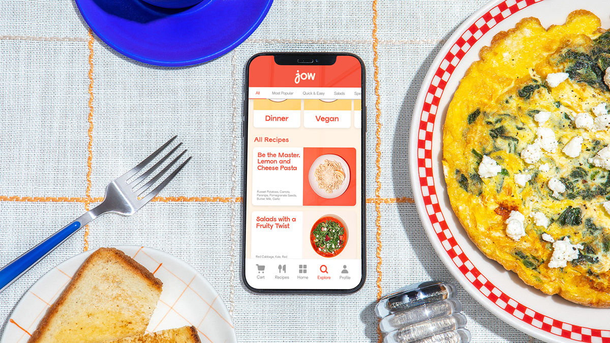
We retained the JOW orange but supported it with a palette that is both bright and warm. The color choices were inspired by colors that frequent home kitchens.


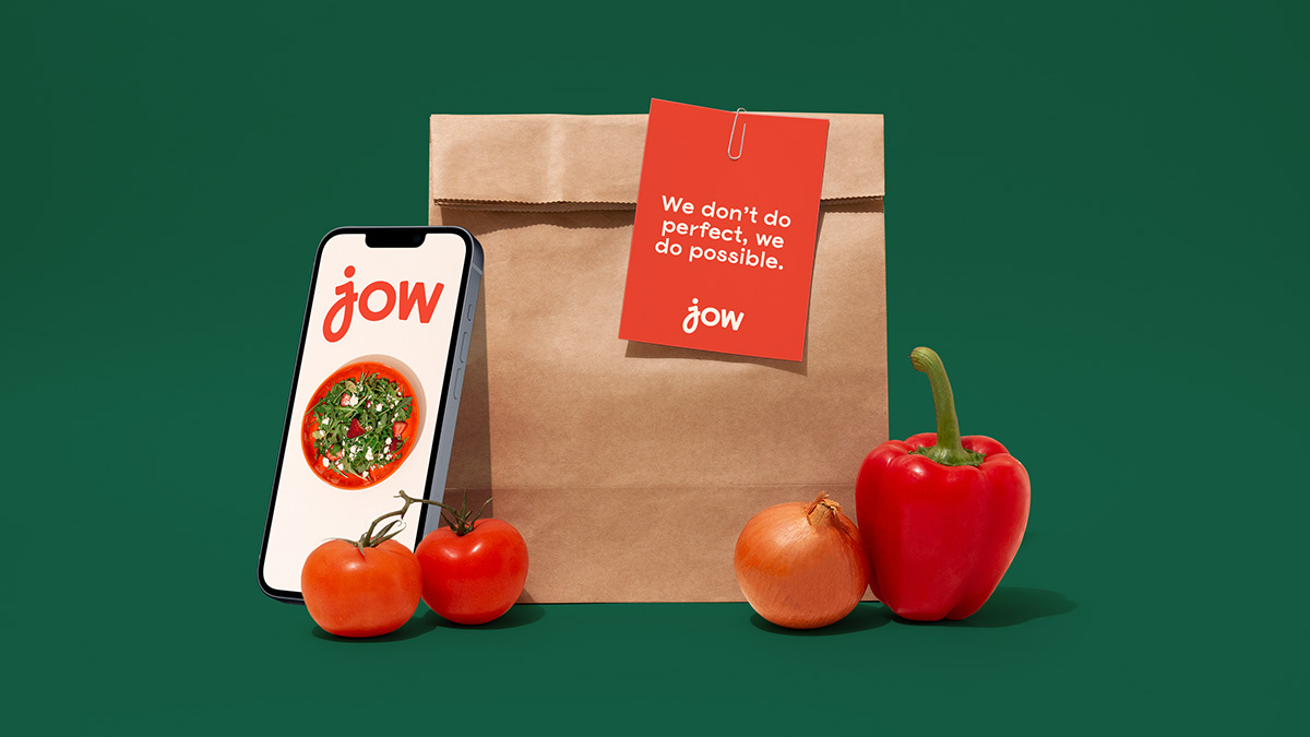


Imperfect graphic elements (uneven circles and lines) celebrate Jow’s simple outlook on cooking: “We don’t do perfect, we do possible”


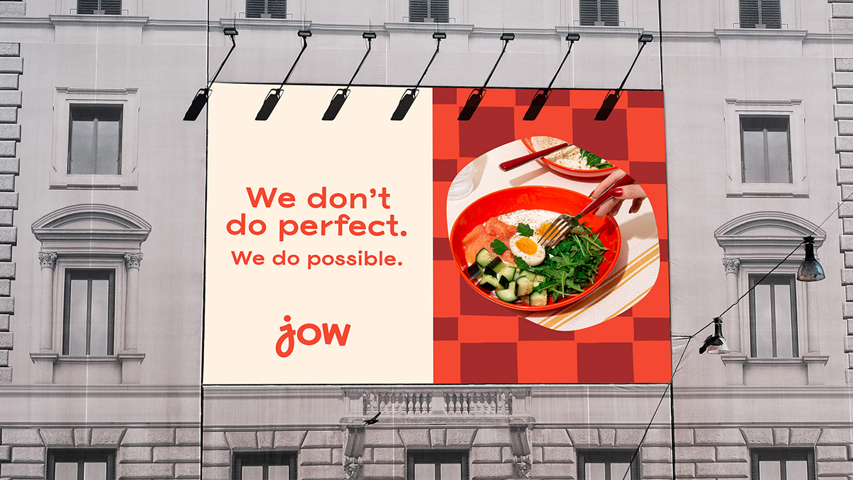
Inspired by classic kitchen tablecloths, we created a library of woven patterns that can be used as backgrounds, wallpaper, and frames for photography.