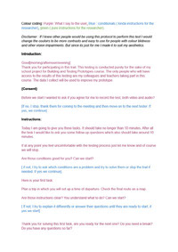
(2.1) Low-fi prototype
Mobile - traveling app - Low-fi prototype
Ideation process & final design

Preparation for testing
Protocol attached in the files.
Testing & results
My most important insights were that navigation is very confusing and linear. Very little space for error and if the user wanted to change something they would have to go all the way to the home screen by backing out screen by screen. Some options had no "back" option which led my users to get completely stuck. There is no option to choose a date when choosing time of departure/ arrival. Another feedback I did not expected but showed in all users was that the main button was not clear enough (just a big button with an arrow) and it was supposed to lead to the final overview of the routes.
Iteration
I added more "back out" arrows to the screens and made the navigation easier by changing it from completly linear so : Home>departure location>arrival location>time>home> final overview
I went to Home> DL>Home>AL>Home>Date and time >Home>final overview.