Lex is a welcoming space for LGBTQIA+ people to build relationships, queer community, and connection through conversation and expression. If it’s queer, it’s on Lex. Lex came to us for a rebrand to help them move from being perceived as a queer space for romantic relationships towards a queer space for platonic relationships.
We centered the brand direction around the idea of an ever-growing queer playground. A dynamic space that encourages exploration of all different kinds of relationships within the queer community. To capture this idea, we leaned into playful designs that are juxtaposed with imperfect patterns and raw textures. We wanted to avoid using rainbow tropes and instead selected fresh “spring” colors that are associated with growth, energy and well-being. In executing the rebrand, we built Lex’s messaging framework, visual identity, UX/UI toolkit, and website design & development.
&Walsh, 2022.
Visit our Case Study for more information.


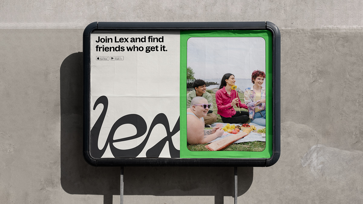
We retained the Lex photography but added a rounded-edge frame treatment to strengthen the sense of warmth and platonic intimacy present in each scene.


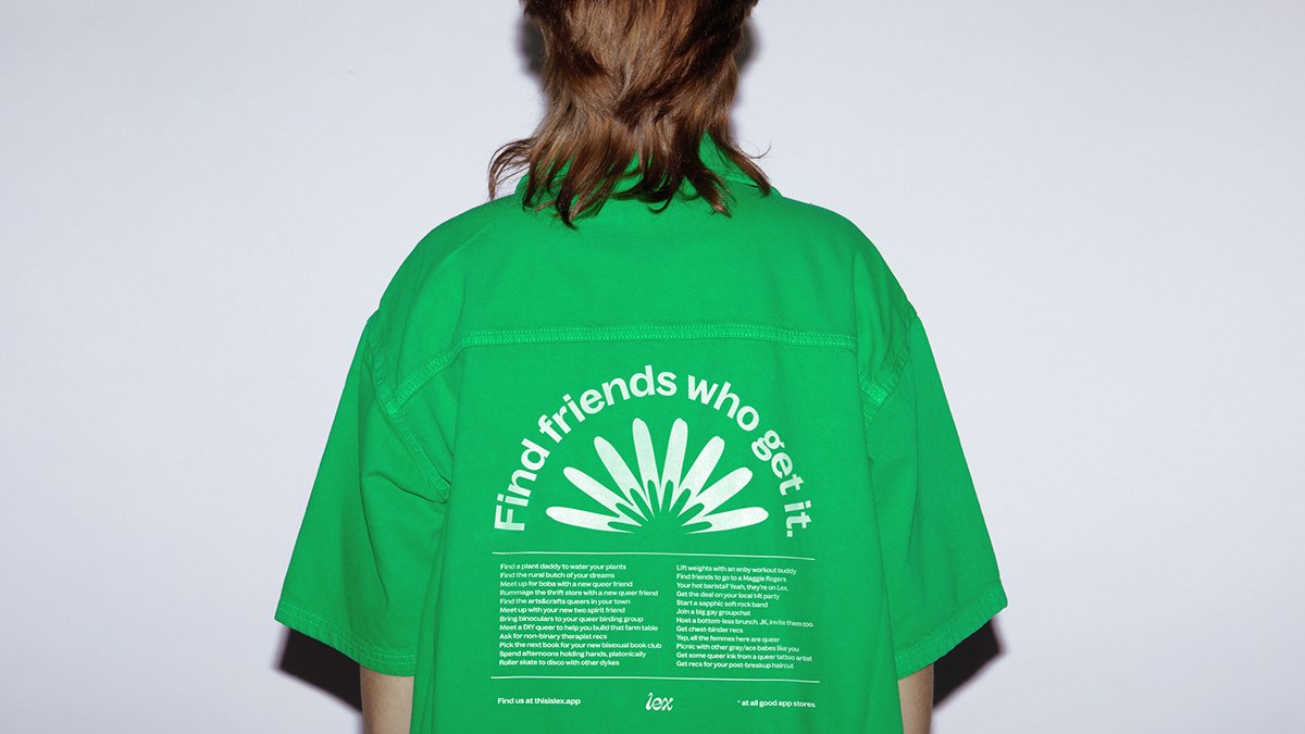
We delivered custom illustrations of flames, flowers, stars, mountains, and hearts, all of which create a feeling of growing and blooming. The illustrations were designed so that they may be easily combined to make new, playful compositions.


We chose the distinguishable, vibrant “Lex Green” as Lex’s main brand color and built a complimentary expanded palette of “spring” colors that are unique to the blooming space Lex has created.


Playful designs are juxtaposed with imperfect patterns and rough textures to champion the raw-edge that traditional social media platforms lack.


Outfitted with a lively color palette, catchy sticker sayings, and bursts of personality, the website serves as a simplified introduction to Lex and the main features of the app.


The whimsical strokes found in each curve of the logo is authentic to Lex’s joyful personality and we intentionally connected each letter to the other, representing the fluidity and connectedness present in Lex’s thriving queer community.


We designed and wrote relatable sticker copy lines for the brand and for users to communicate their pronouns, signal to other queer people, upgrade their water bottle or laptop, and to cultivate community off-line.