The Perth Wildcats are an Australian basketball club, competiting in the National Basketball League. Established in 1982, the Wildcats are the most successful club in the competition's history with 10 championships, and an unmatchable 35 consecutive post-season appearances.
This project is a rebranding concept for the club, who have been using their current logo & brand (in various formats) since 2000, and utilises aspects of the clubs logos and uniforms from across the past four decades for inspiration of the new brand.
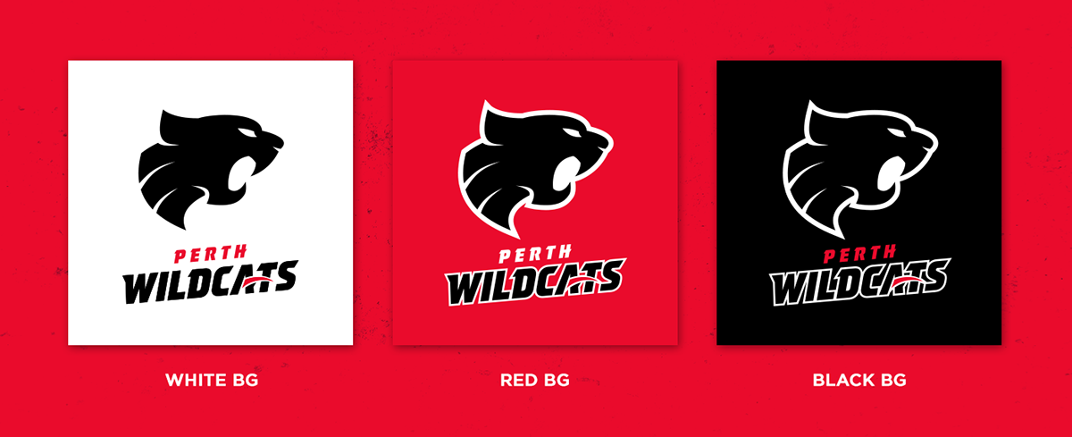
LOGO EVOLUTION
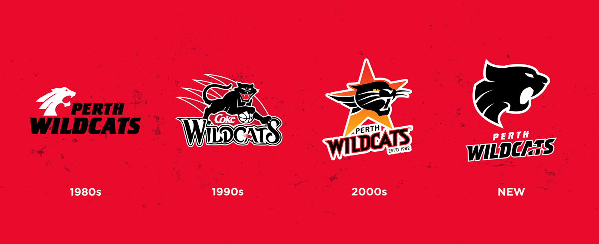
The concept behind the new logo is to take inspiration from their three most recognisable logos, in particular the logo used through the late 80s and early 90s, which because of it's simplicity and historical significance, is still associated with the club today. The proposed logo concept features the clean "single colour" style of the 80s logo, along with the three segments from the body, whilst incorporating aspects of the wordmark from the 90s logo, along with the rising slant of the 00s logo.
UNIFORM CONCEPTS
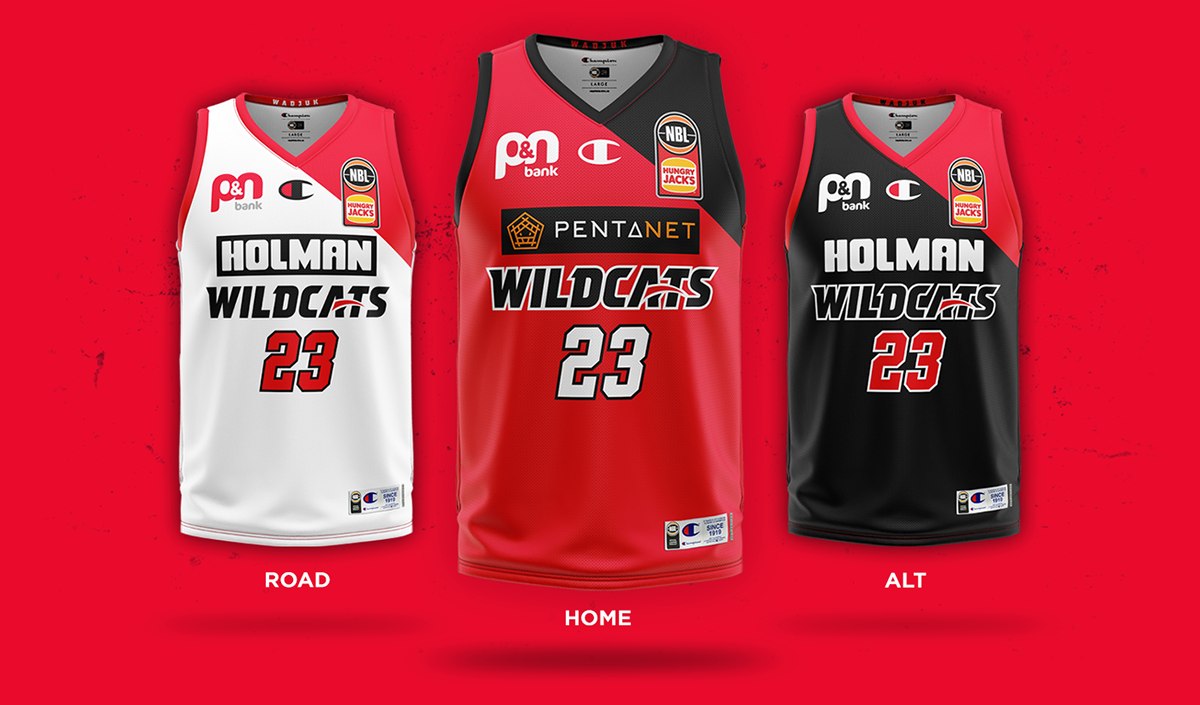
The jersey design is a throwback to the Wildcats uniforms worn from 1995 until 1999, which featured an iconic diagonal panel across the upper left side of the jersey - reduced in size to work better with the NBL uniform guidelines. The jerseys also utilise the new wordmark concept, with a standard colourway set of red & black for the home uniform, white & red for the away uniform and black & red for the alternate uniform, which ties into the aforementioned 1995 design.
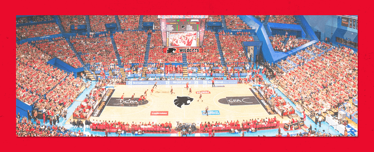
BRAND APPLICATIONS
PRIMARY LOGO
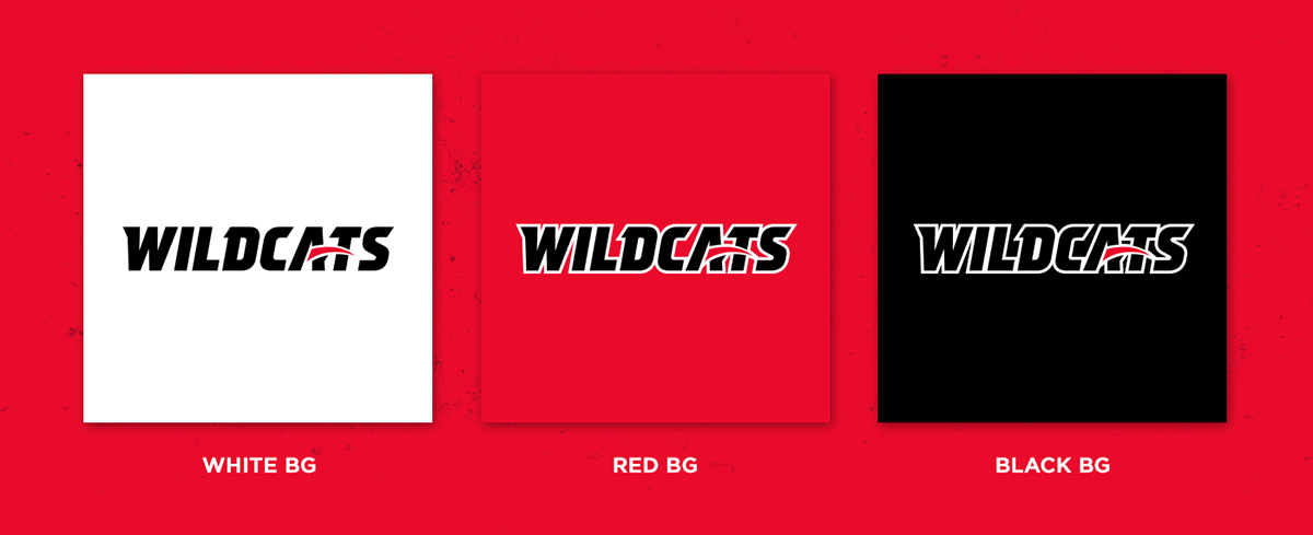
SECONDARY LOGO (WORDMARK)