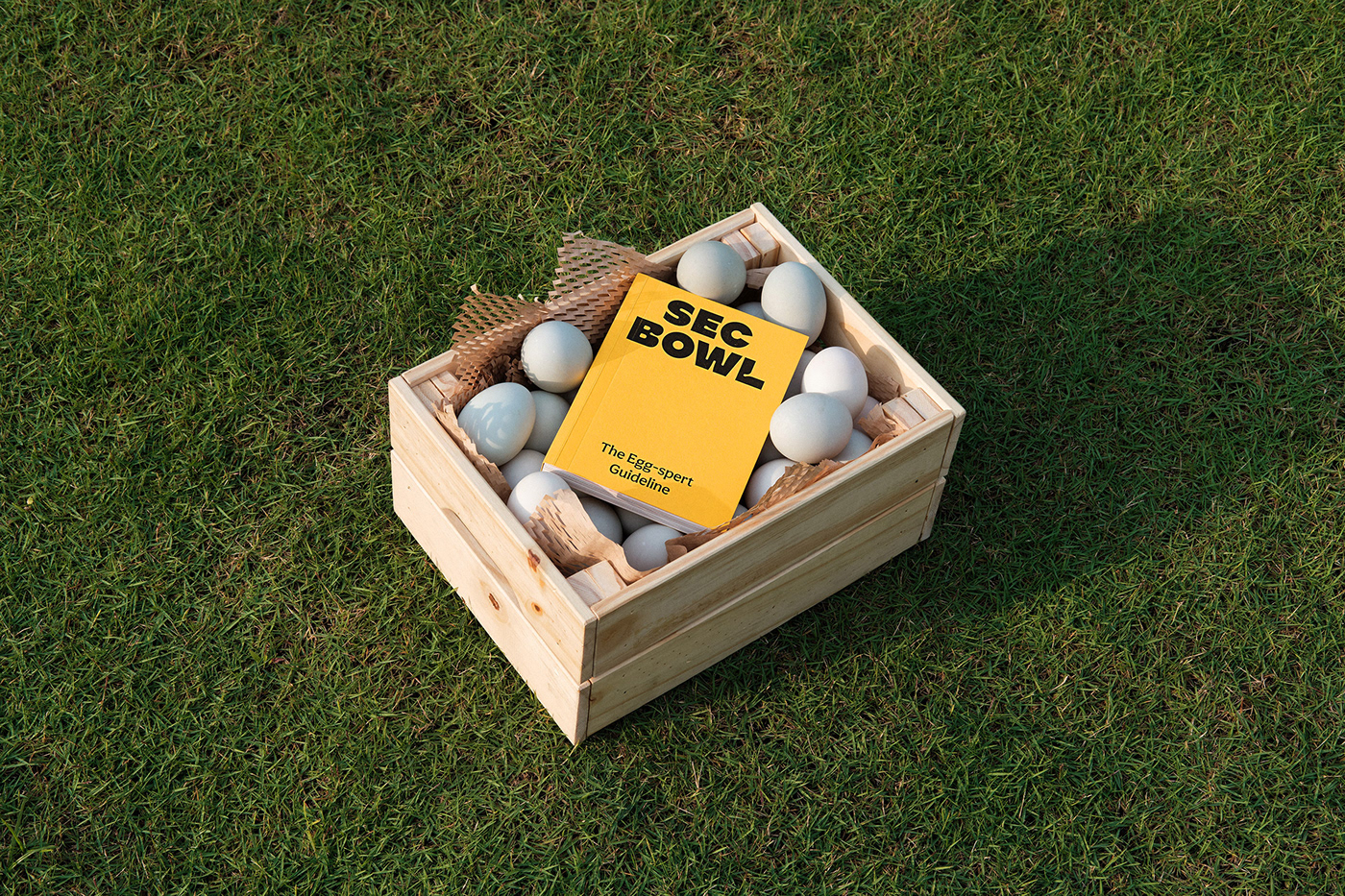
Founded in 2016, Sec Bowl introduced its Salted Egg Chicken bowl to the Indonesian market, along with variations of Asian comfort food flavors. But around this time, Sec Bowl was competing with multiple rice box & bowl brands. This period became quite the rise for the F&B genre, with numerous competitors offering plenty of other flavors and combinations to the enthusiastic market. The challenge was finding a way to stand out in a sector that offers countless tastes already.
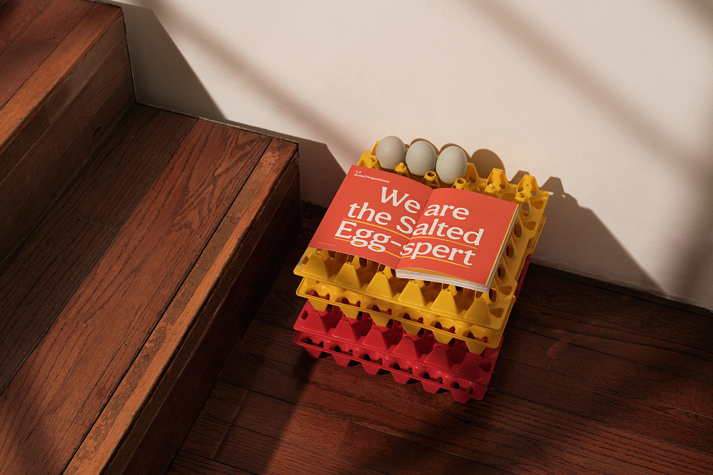
Sec Bowl already owns a particular strength worth calling people's attention to. A specific flavor the brand is confident with: the salted egg flavor. Pursuing the specialist path leads to Sec Bowl's other strengths. While Sec Bowl does offer comfort food bowls for good value, what also needs to be included is its efficient eating experience. With the brand's strengths laid out, a foundation is formed. It becomes clearer how this foundation can be applied to the brand's overall identity, communication, and development: it is inherently a Specialist, Efficient, Comforting brand. Sec Bowl becomes the Salted Eggspert.

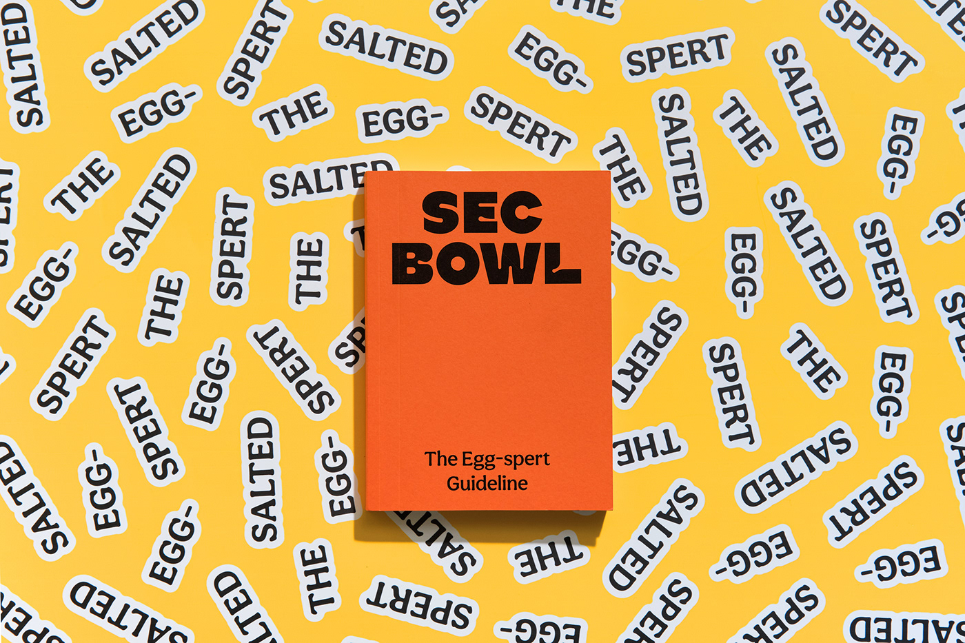

Derived from Sec Bowl's rich use of sauces in their recipes, the brand identity uses visual elements that ooze sauciness and juiciness.
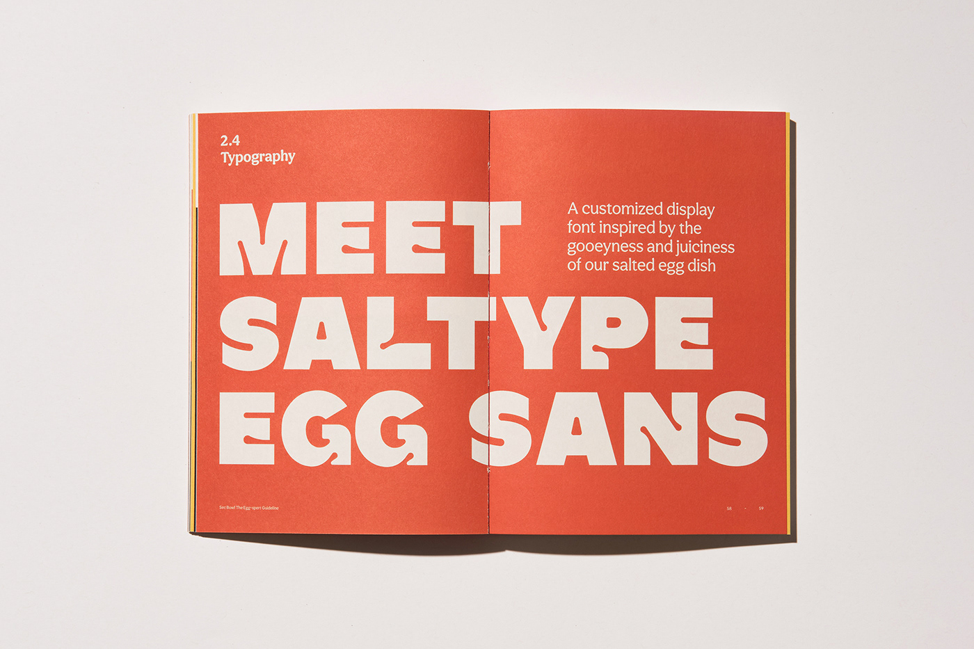
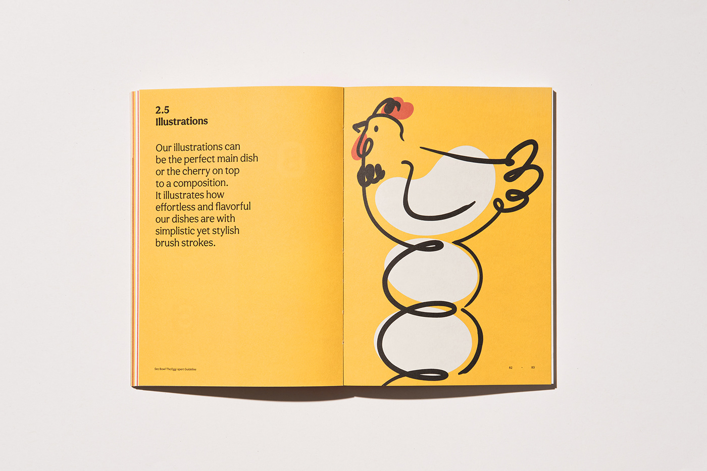
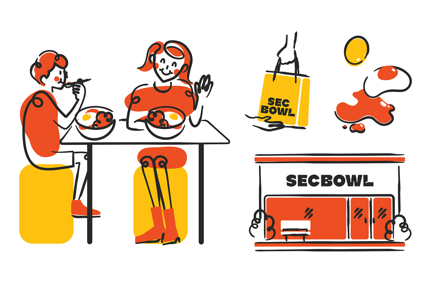
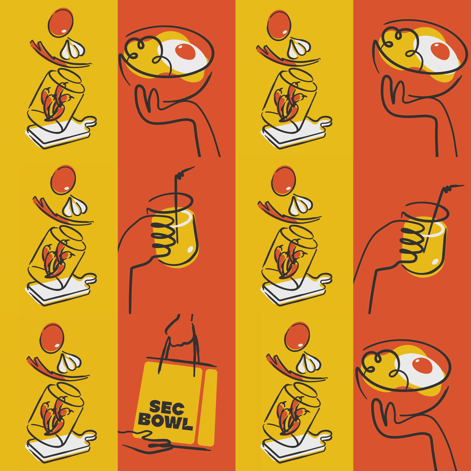
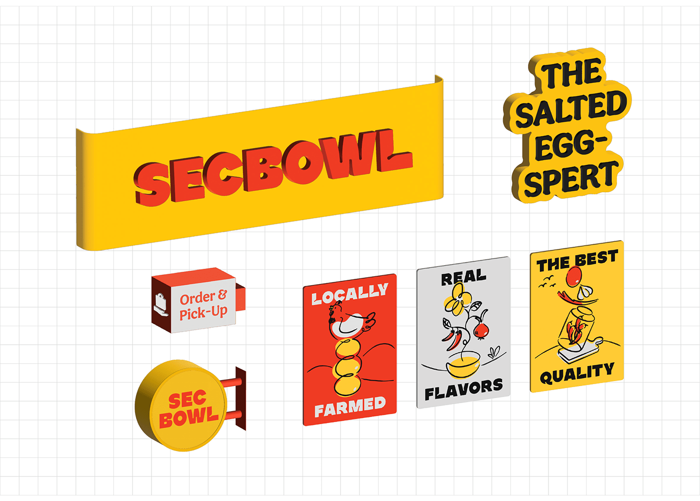
The heart of the identity lies in the typography. As seen in the logo, Saltype Egg Sans is a custom typeface with gooey edges and saucy ink traps without losing form, making it a sufficient display type to read. A type styling inspired by saucy goodness is created to welcome typographic explorations. Illustrations combine solid colors in gooey shapes with simple yet stylistic brush strokes to leave room for fluidity.


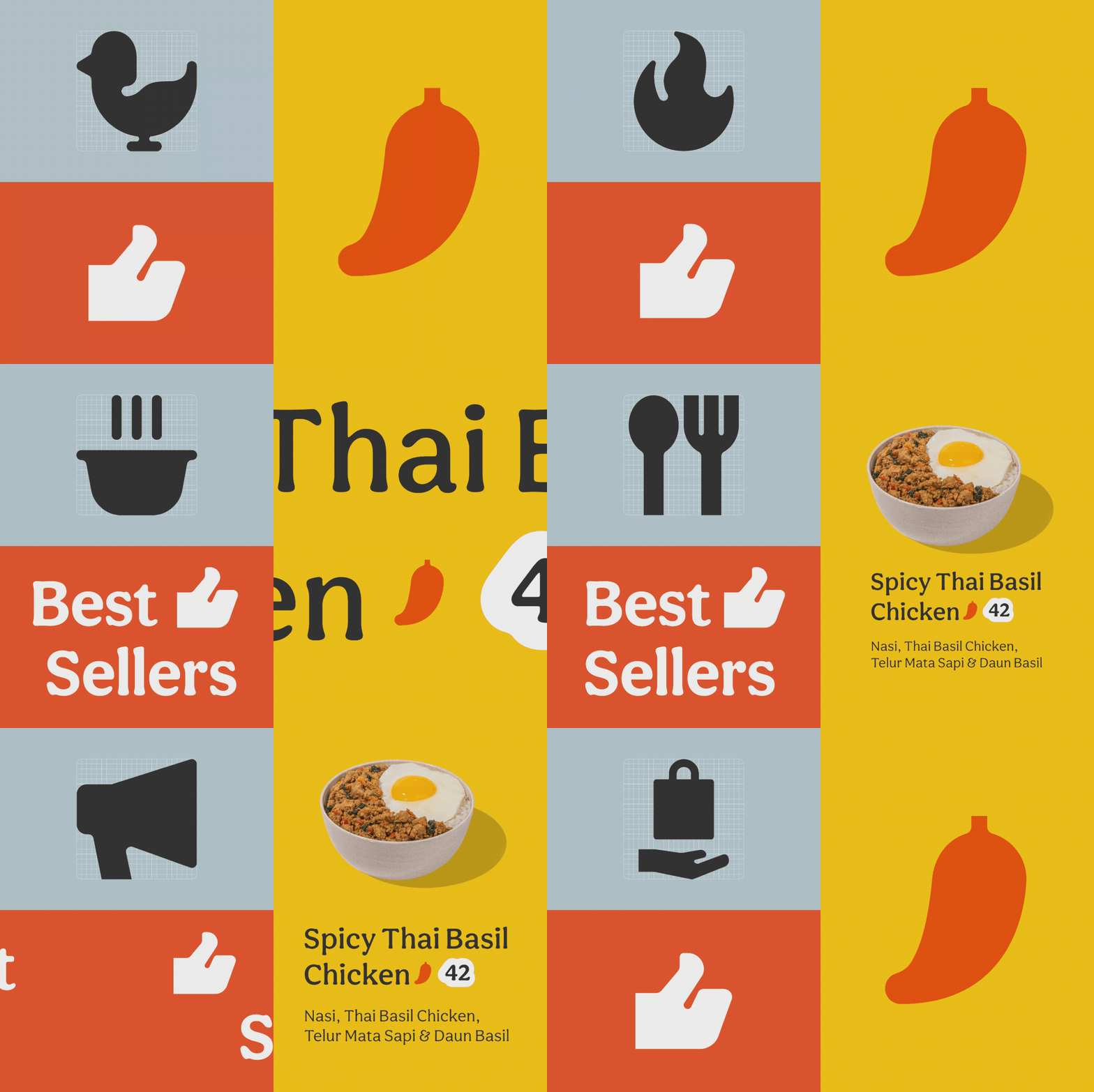
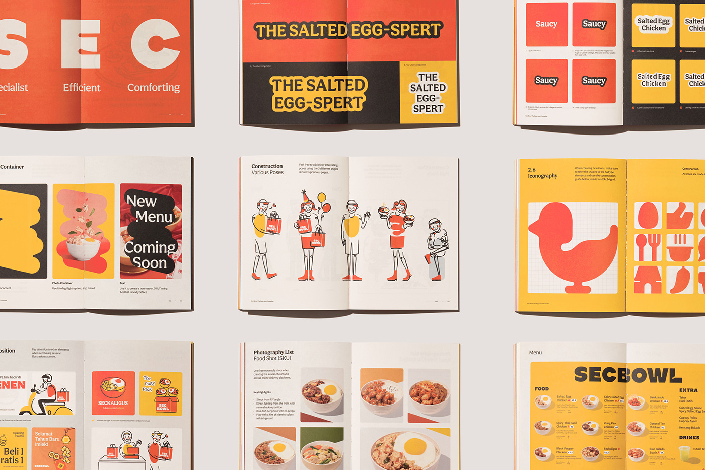
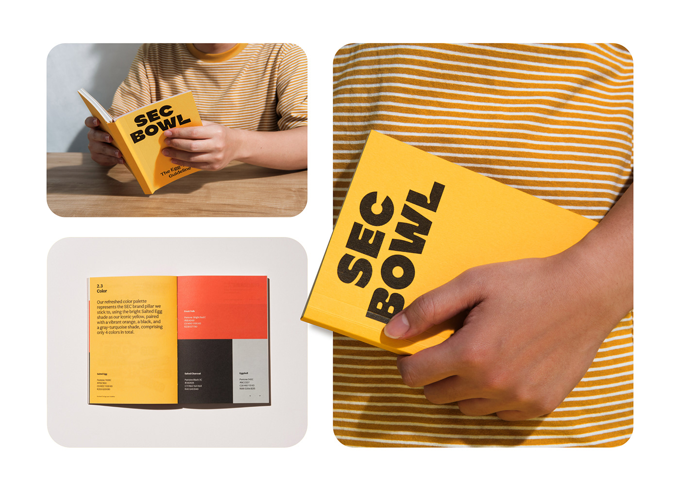
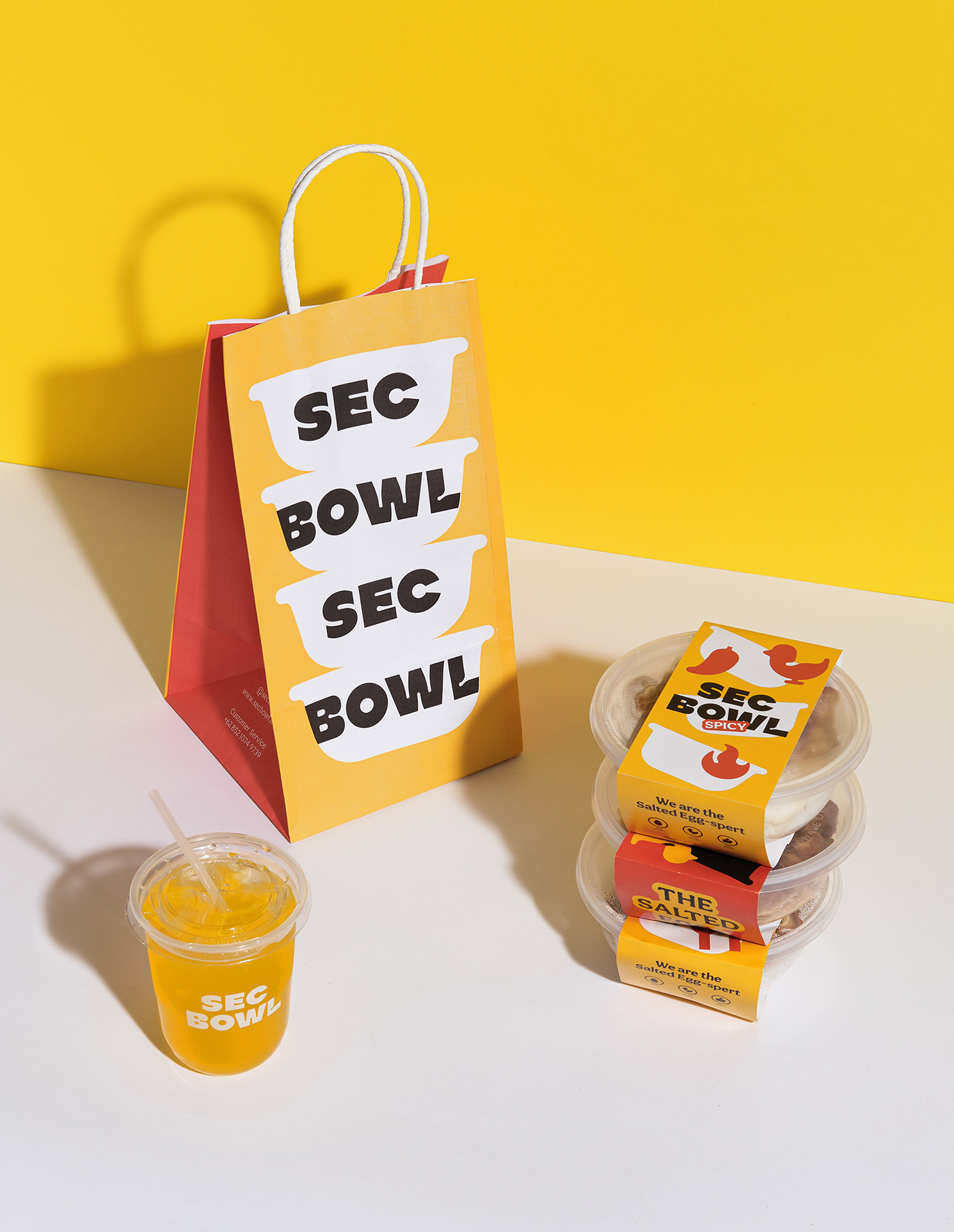
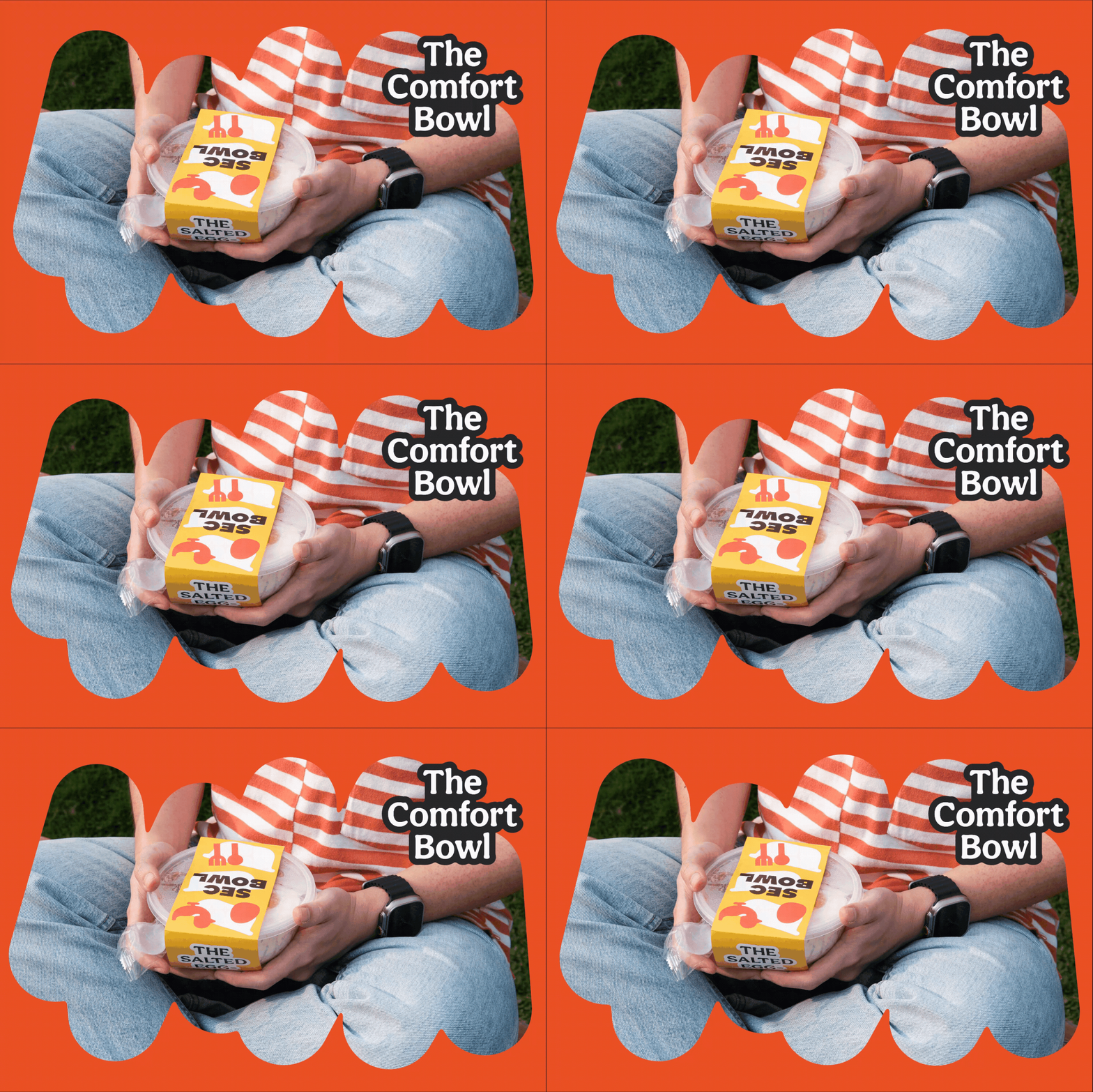
The refreshed color palette uses the color of salted egg sauce as the brand's iconic yellow, namely Salted Egg paired with egg yolk orange, charcoal, and a salted eggshell turquoise. To work with Sec Bowl's varied graphic assets, a "Shape Language" is created as a multi-purpose signature container.
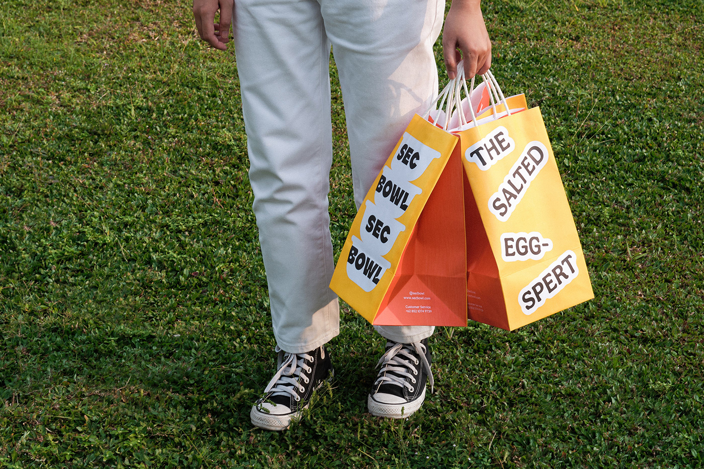
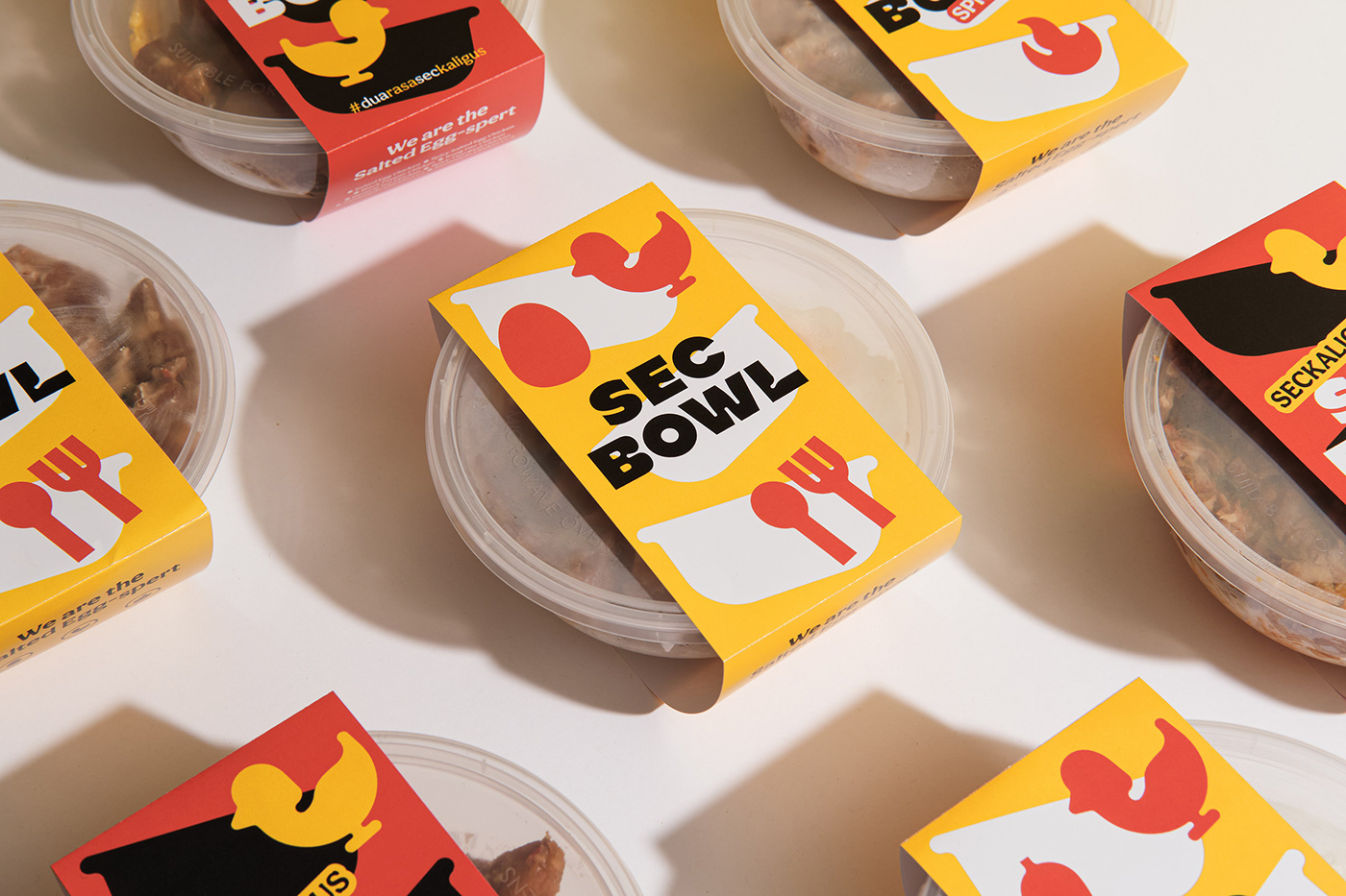
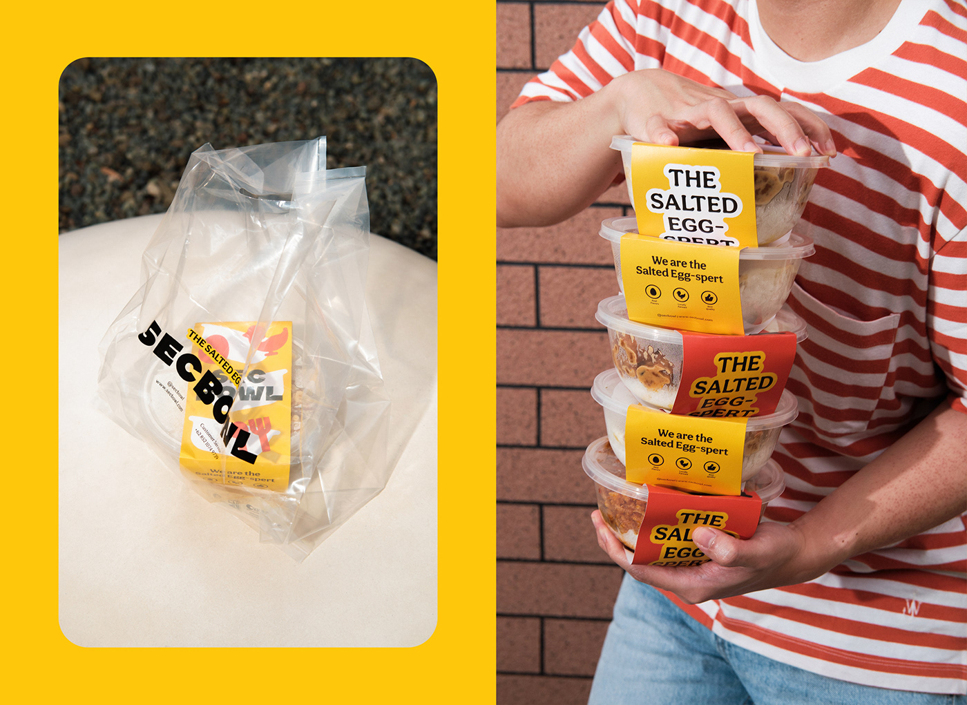
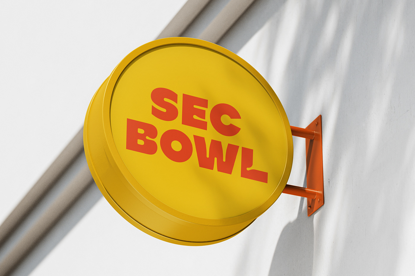
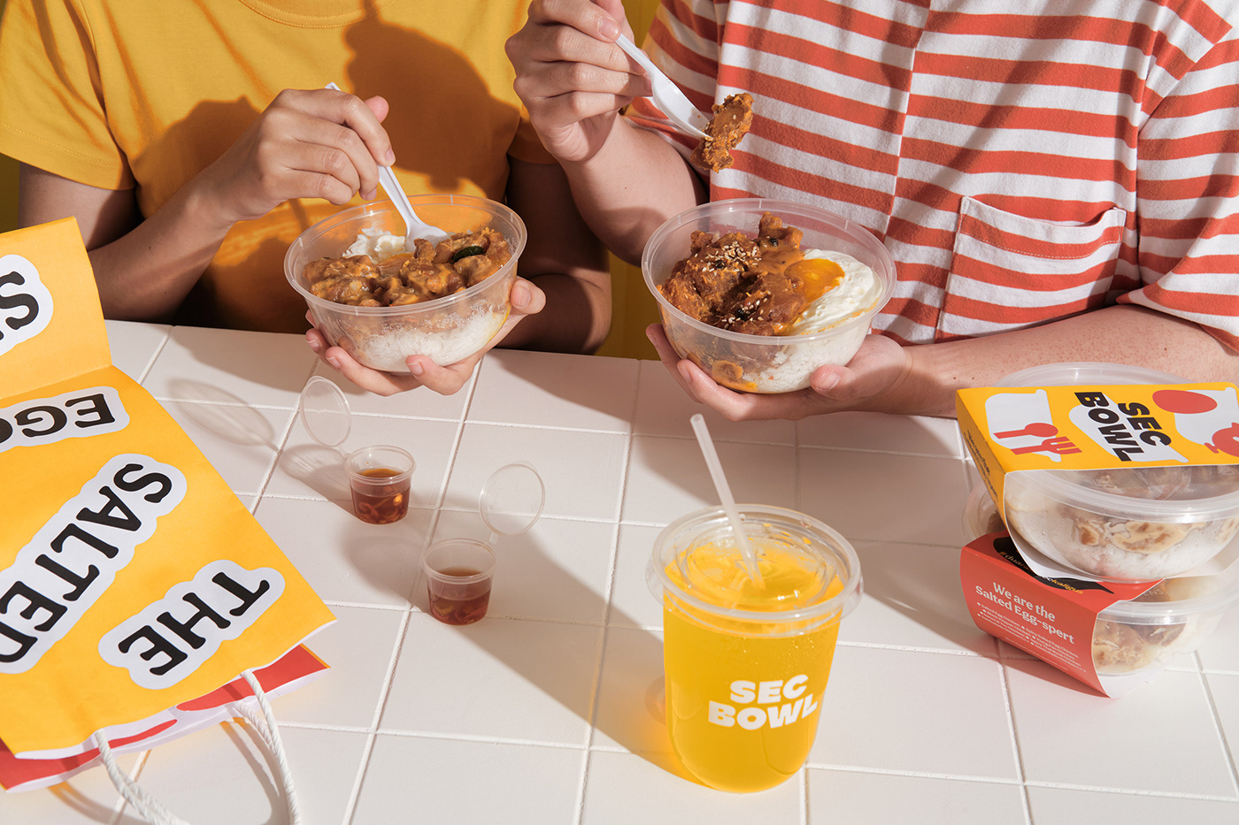
The brand's three values adamantly apply to packaging and environmental graphic touch points. In this case, each packaging is produced with eating comfortably in mind, while shop signages support designs that ease production and sustain an extensive life.

©Thinking Room 2021
All rights reserved
Creative Director: Eric Widjaja
Art Director: Ritter Willy Putra
Graphic Designer: Leonardo Laurensius
Environment Graphic Designer: Caroline Marta
Illustrator: Wanda Almira
Copywriter: Sasqia Pristia
Motion Graphic: Gerwyn Giovanni
Photographer: Vony Wong
Account Executive: Regitta Jasmine, Audrey Dea, Steven Cristian


