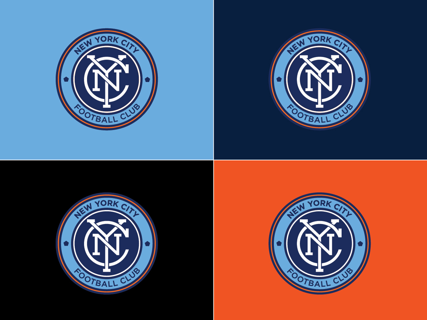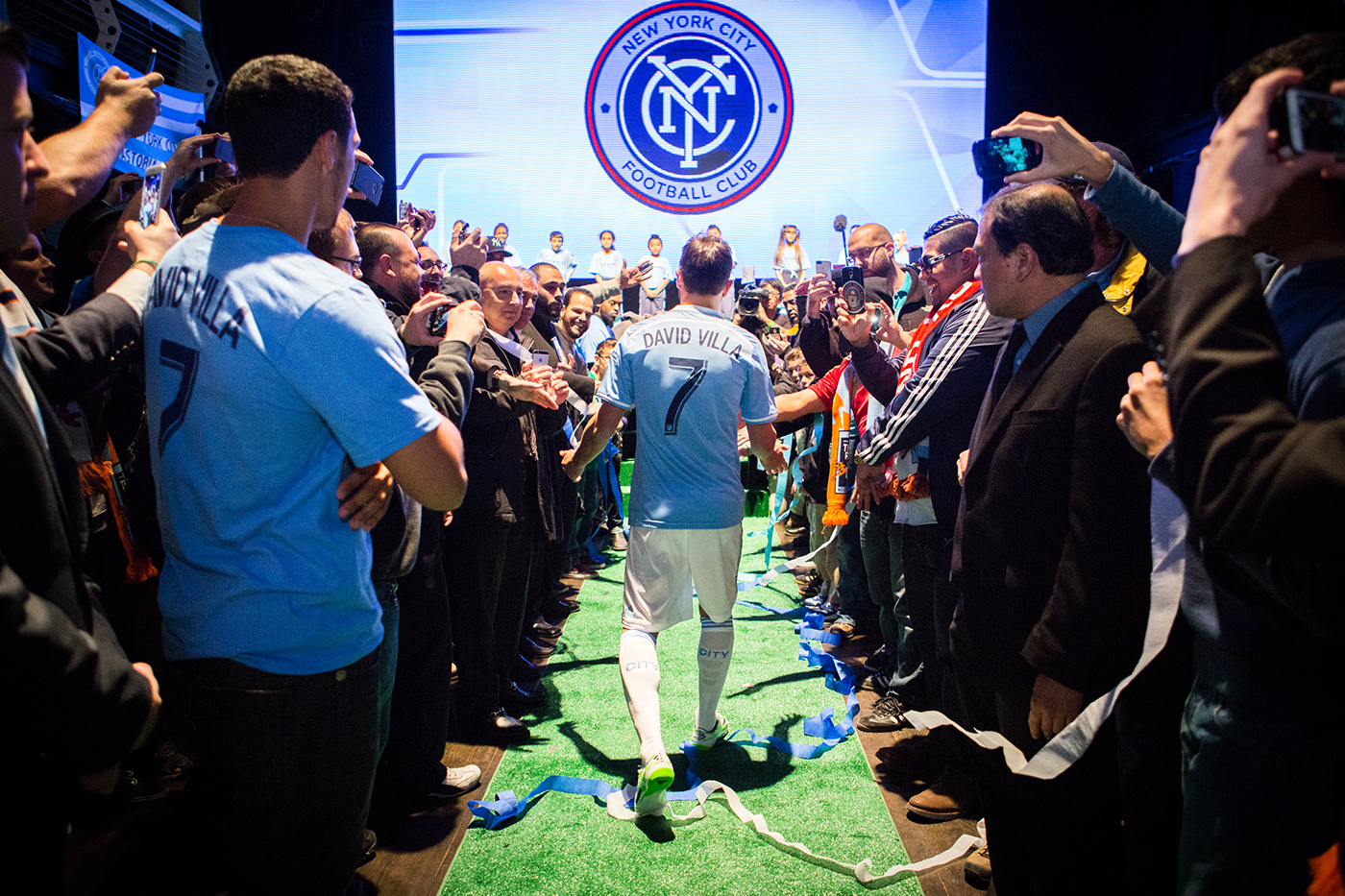
This was a watershed moment for New York: the time when the city—all five boroughs of it—got its own major league football club. As a proud New Yorker, Rafael Esquer was determined to represent New York City as a strong, bold, collaborative community, deeply rooted in and proud of its history. His direction to Alfalfa Studio: position the NYCFC’s badge as a genuine, authentic and timeless football badge—very NYC and, at the same time, with a presence to stand on its own in international contexts.
Inspiration for our NYC badge came from the rich graphic vocabulary that is so much a part of the boroughs of New York. Urban landmarks such as subway stations, theater marquees, industrial sites, and old store signage evoke the everyday life of the city. And urban artifacts such as manhole covers, the classic subway token, architectural details, vernacular typography, and historic photos and advertisements echo its rhythms.
Our research included the study of New York City symbols, landmarks and competitive sports teams. We studied heraldry, badges, coat of arms, New York City history—starting with the Native American cultures that lived in New York City for millennia—and the universal meaning of symbols. Since it was very important that the NYCFC badge stood on its own in international contexts as a genuine, authentic, and timeless football badge, we also looked at badges from around the world.
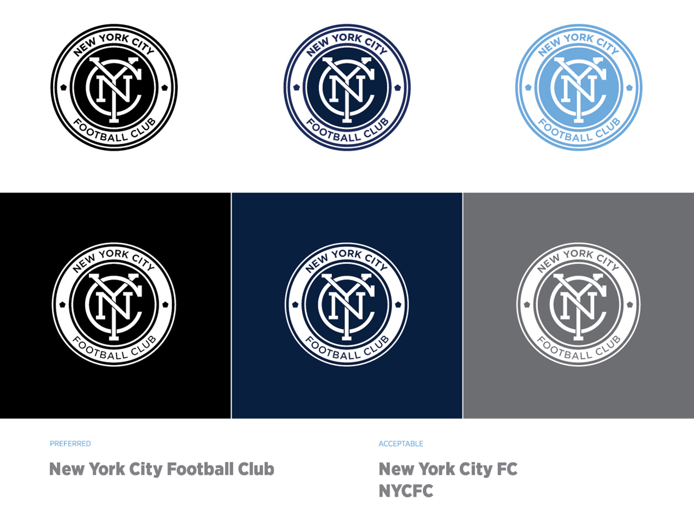
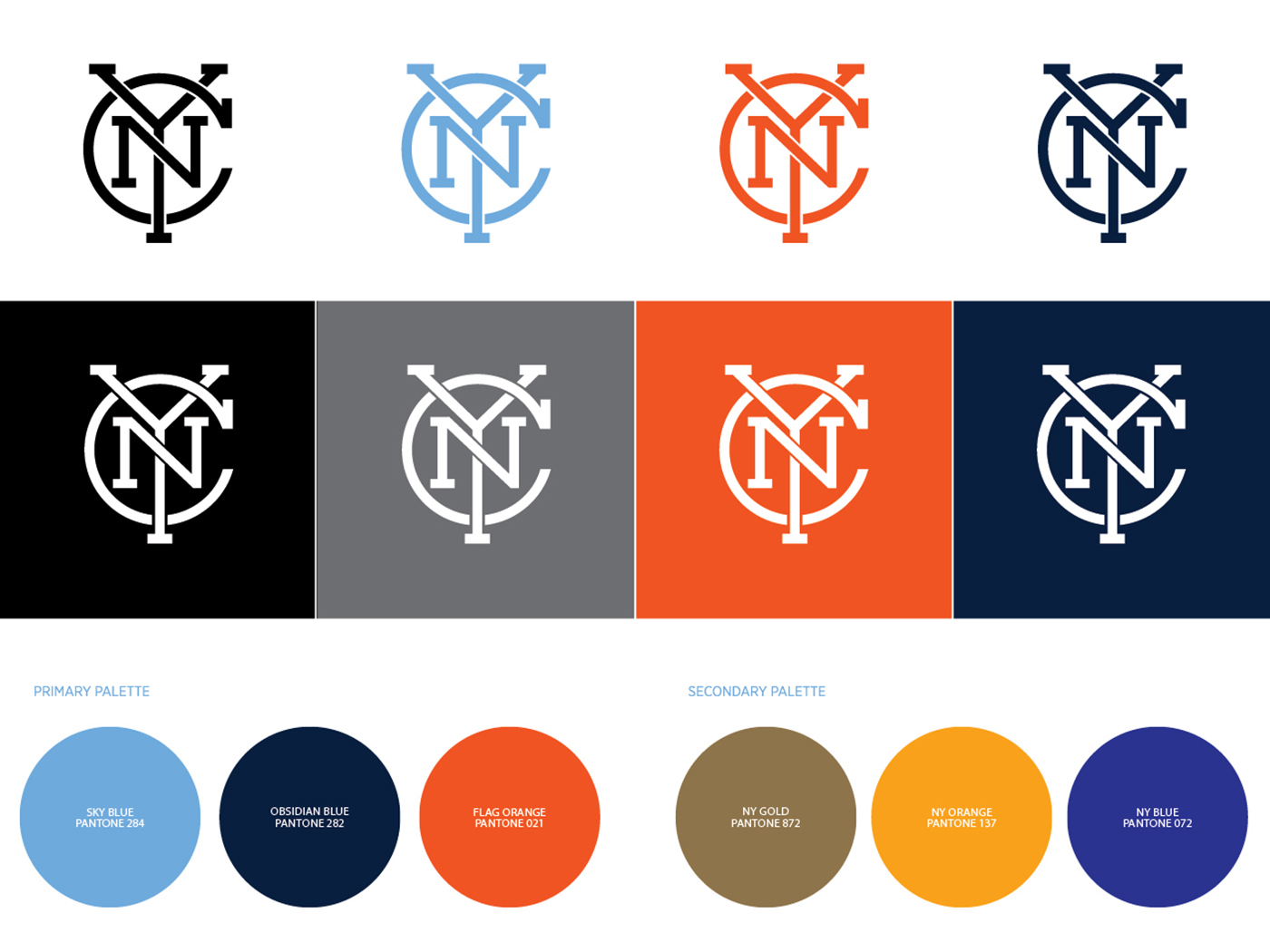
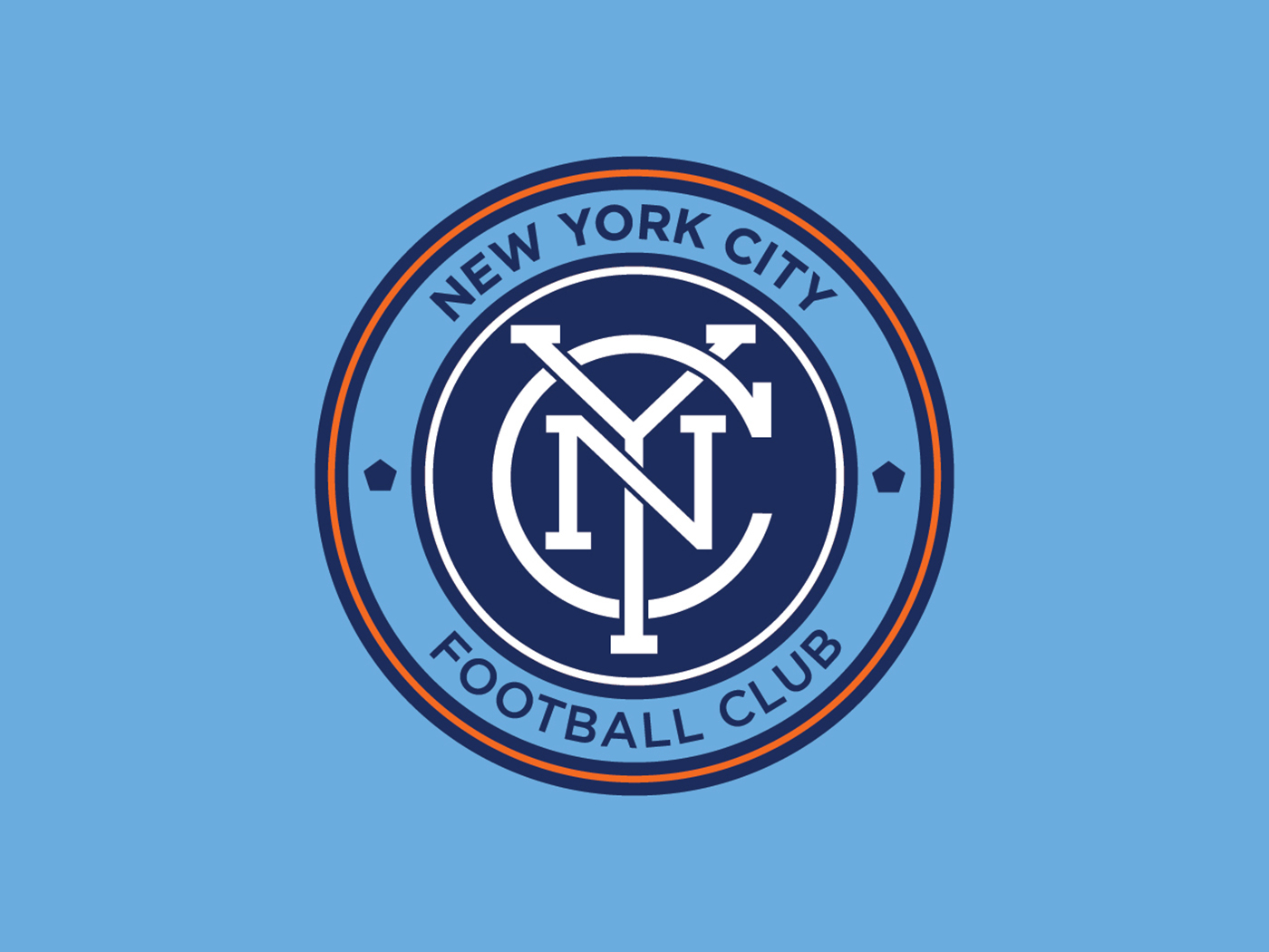
During the design process, we focused on achieving four key qualities: simplicity, legibility, memorability, and timelessness. We paid special attention to the design of a fresh and unique monogram; conceptually, the intertwining of the N, Y and C alludes to teamwork, strategy, harmony, and unity. The letterforms were custom-drawn to achieve the necessary level of geometry and balance.
In his article “NYCFC Seeking One Badge to Rule Them All,” Soccer News Day writer Nick Chavez best explains our creative goals with the design of the NYC FC badge: “...there’s a thin line between making something “New York,” and making it the same old run-of-the-mill Statue of Liberty and Empire State Building-laden images that have been done again and again. There has to be a certain classy style to the crest. One that combines the modern with the historic, creating an image of optimism and ambition, while also exhibiting pride in the considerable history and global relevance of the world’s most iconic city.”