we were in-charge of naming, brand identity, brochure, literature and stationary i.e. everything (and this is what we want). the idea took off the moment we laid eyes on the property- all we had to do was connect the dots.


next, we created 5 spaces in the heart-like organ to symbolise the human senses.

the next big challenge was in naming this ambitious project. we went down several roads. the obvious ones, including “chail holiday homes” triggered off only suicidal tendencies. we wanted to do something different, something fresh. we looked deeper and harder. and, the answer was a mathematical function.
hyperbolic functions.

creating a language through pattern.


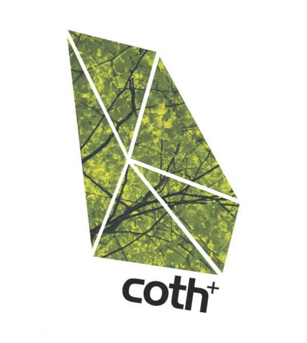
note: as a thumb rule in design, we always create a brandmark in black and white first. if it looks good without colour, homerun (the six of cricket in baseball).

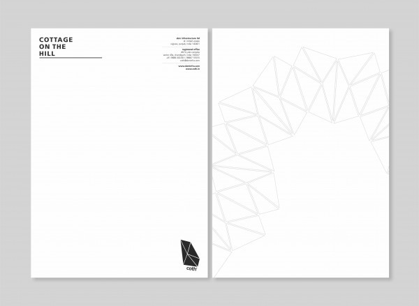
the stationary took shape.


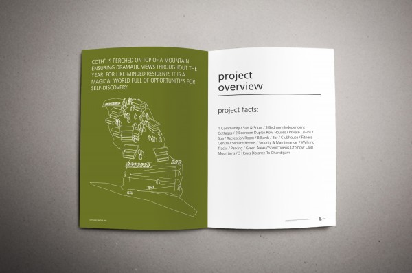
the brochure.


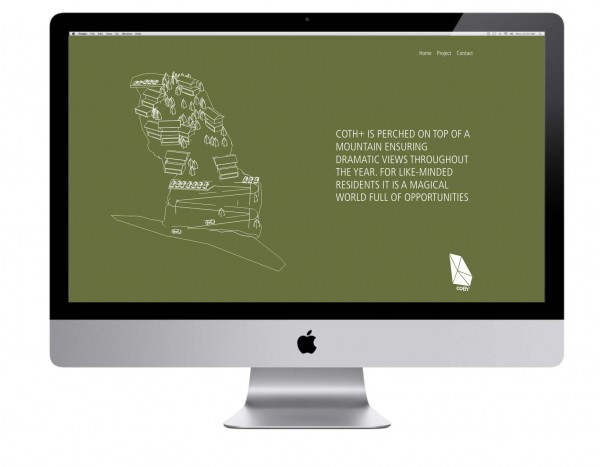
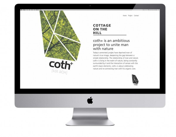
a single communication window was also created online for realtime feedback and foster queries.
Design Director: Harkirat Brara
Brand Strategy & Name: Paul Syng
Development: Shamsheer Bali

