\ru
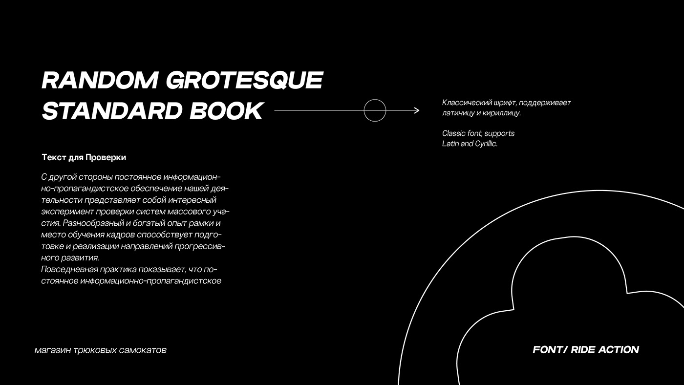
СОЗДАНИЕ ФИРМЕННОГО СТИЛЯ ДЛЯ БРЕНДА RIDE ACTION
Задача:
Создать и обновить фирменный стиль компании. Сделать его ярким, сохранить отражение профессионализма, и привлечь новую аудиторию.
Решение:
Был разработан фирменный стиль: в том числе типографика, полиграфия, графика и другие элементы фирменного стиля. Яркие, привлекательные и сочная графика всегда будет во внимании аудитории. Бренд остается узнаваемым и не теряется среди остальных. Главная особенность созданного дизайна то, что он остается легко адаптируемым под любые носители, от электронных до печатных.
Логотип читаем на 100% и отвечает заявленным требованиям клиента.
Разработана компактная версия логотипа для лёгкой адаптации на любой носитель
Фирменный стиль притягателен и заставляет взаимодействовать с клиентами при каждом столкновении с брендом.


\en
CREATION OF A CORPORATE Identity FOR THE RIDE ACTION BRAND
RIDE ACTION is a stunt scooter store. Riders community.
Task:
Create and update the company's corporate identity. Make it bright, maintain a reflection of professionalism, and attract a new audience.
Solution:
A corporate identity was developed: including typography, printing, graphics and other elements of corporate identity. Bright, attractive and rich graphics will always be in the attention of the audience. The brand remains recognizable and does not get lost among the rest. The main feature of the created design is that it remains easily adaptable to any media, from electronic to printed.
The logo is 100% readable and meets the client’s stated requirements.
A compact version of the logo has been developed for easy adaptation to any medium.
Corporate identity is attractive and forces you to interact with customers every time they encounter the brand.