Némesis, by Intermezzo
ALBUM CONCEPT AND DESIGN
___
After working with them in a videoclip from their previous album, we worked together again to create something unique for their newest acoustic album, a totally do-it-yourself disc, self-recorded and self-produced. We wanted it to be as non-expensive to produce as possible, but without compromising the quality of the presentation.
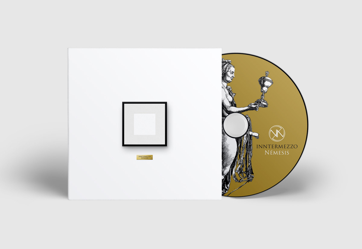
Using the title of the EP as the starting point, I started to play with the idea of using two opposite approaches to a same subject, given that Nemesis represents the opposite to something. I wanted to represent the pureness of the music as a form of art, and that evolved to a more general vision of art, a frame that could carry any form of art. At first I was going to use a totally photographic art, shooting an old frame in a dirty destroyed wall against a brand new one on a clean white wall, but that didn't stayed for long. Instead I decided to use all black and all white clean versions of the first idea, and then the final idea was born. The rest was easy.
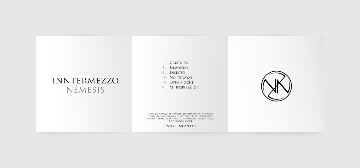
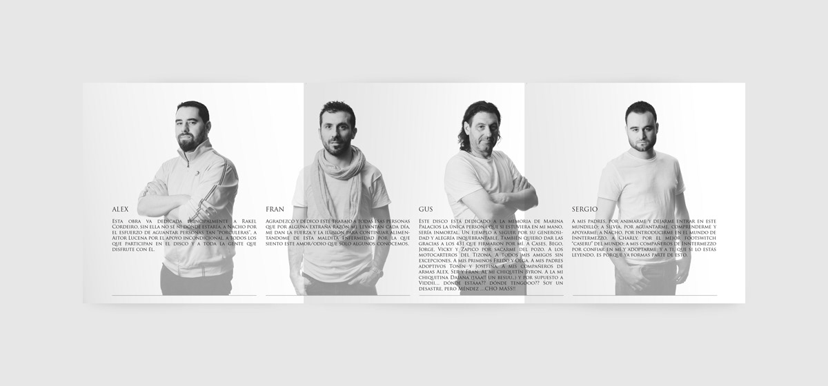
Being a limited edition of 100, I proposed to print the slave in 2-sided glossy paper, with one side black and the other being white, playing with the Nemesis title; and the booklet was printed on black on A4 paper. We had to cut every case, fold the booklets and store it in plastic bags by ourselves. I also did a photoshoot with them on black and white background and clothes, matching the theme of the album. The result was 50 copies in black and 50 in white, while keeping the mail color in gold for both of them.