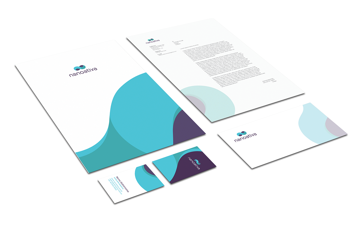
Rafaela de Conto's profileMariana Pöpper's profile

Nanoativa


DNA


The new logo shows a brand that is always moving, but at the same time is balanced. The curve in the form of an N refers to the initials of the company, while symbolically resembles to the nanoribbons used in their scientific compounds.


Thanks for viewing!
Nanoativa
Published:

Nanoativa

This is an academic project that intended to rebrand a local nanotechnology company, from the logo to their brand strategies.

Published:

Creative Fields