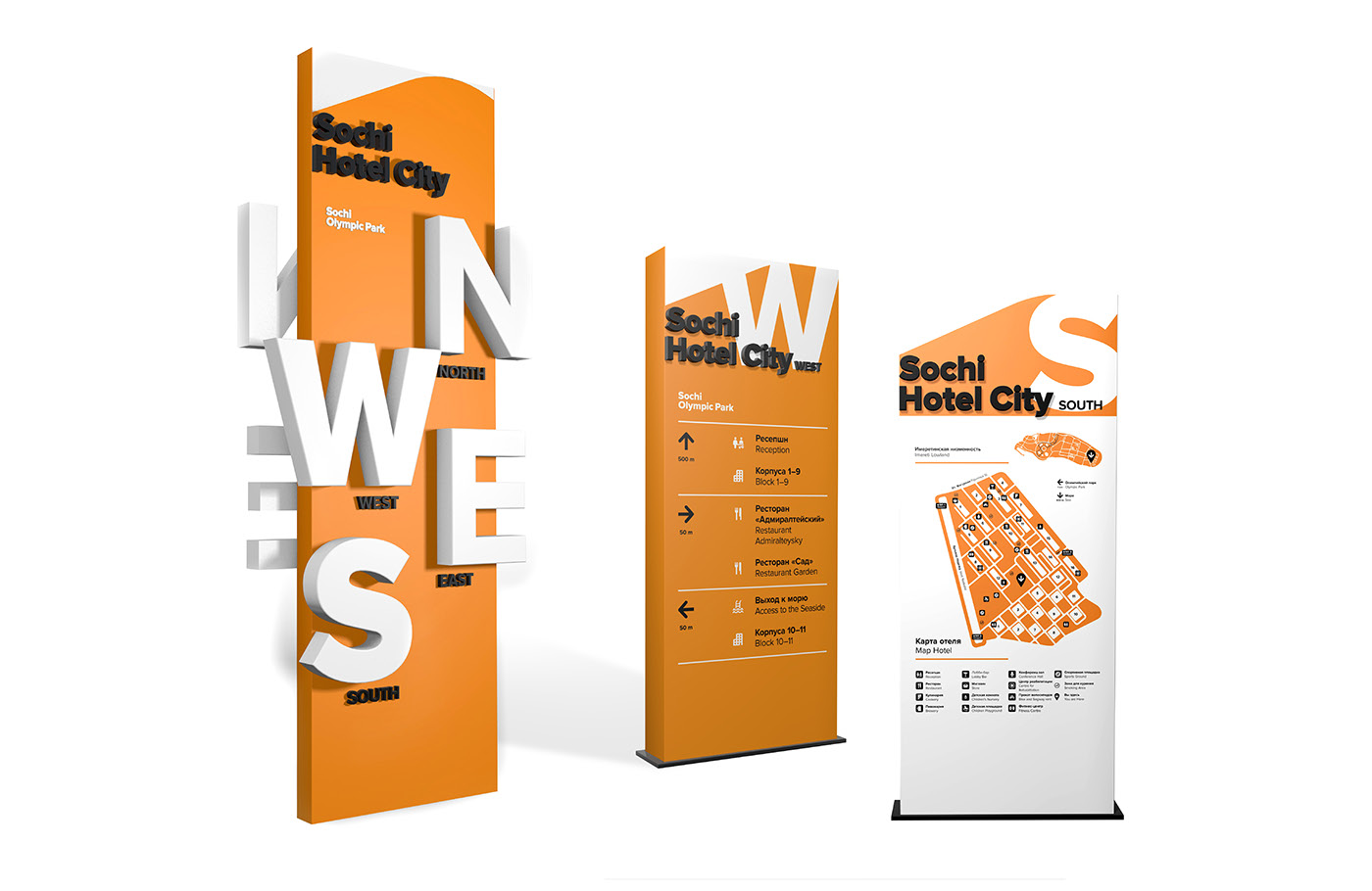
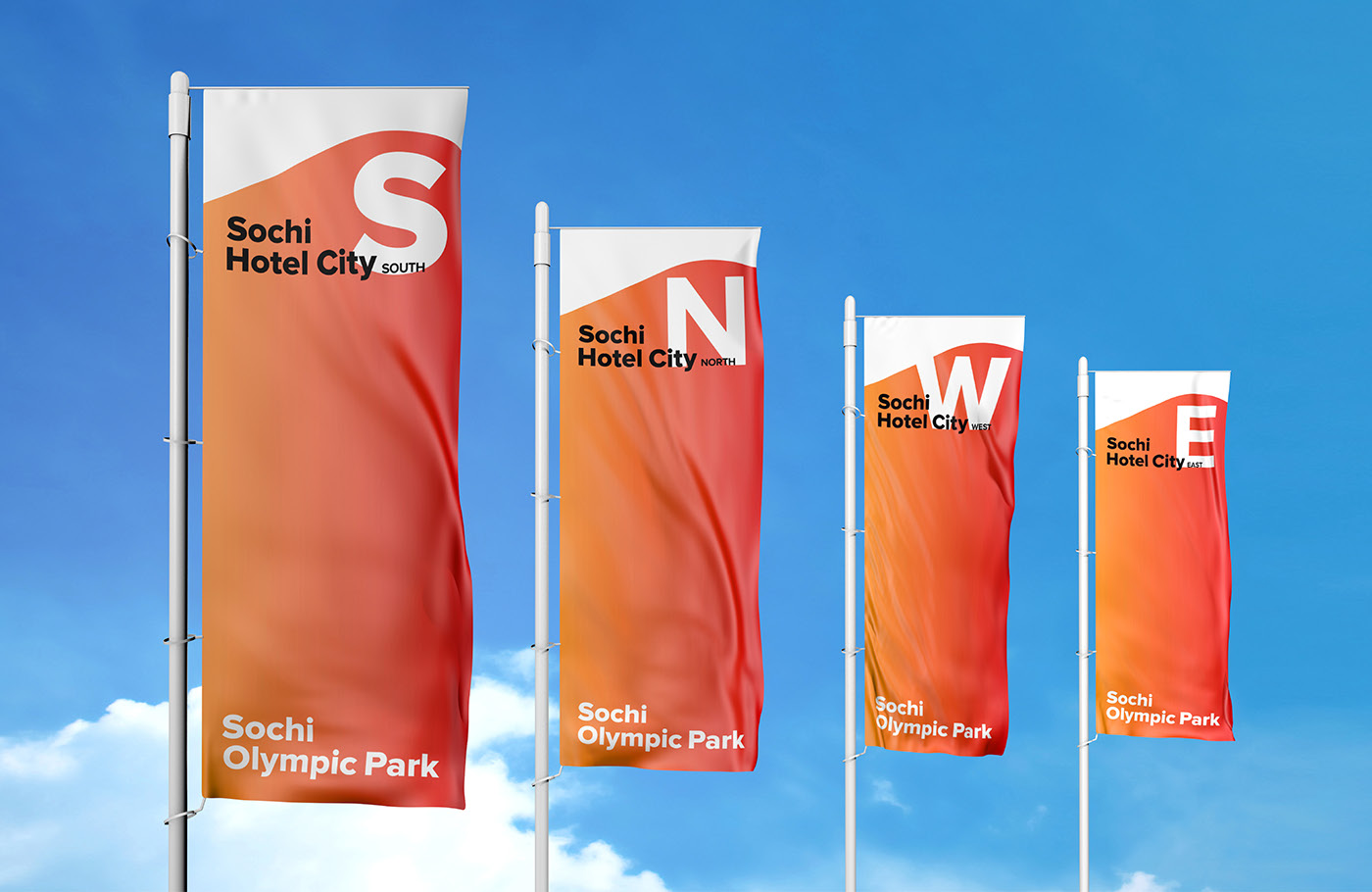
Hotel complex of the Olympic Park firstly was a range of separate independent objects each with its’ own corporate style. For guests’ comfort we created the special concept of Sochi Hotel City, which includes four placed on each side of the world hotels, each with its’ own index - N (North), S (South), E (East) и W (West).

Being a part of the umbrella-brand – Sochi Olympic Park, Sochi Hotel City heirs its’ graphic features: the idea of planned construction and the layering.


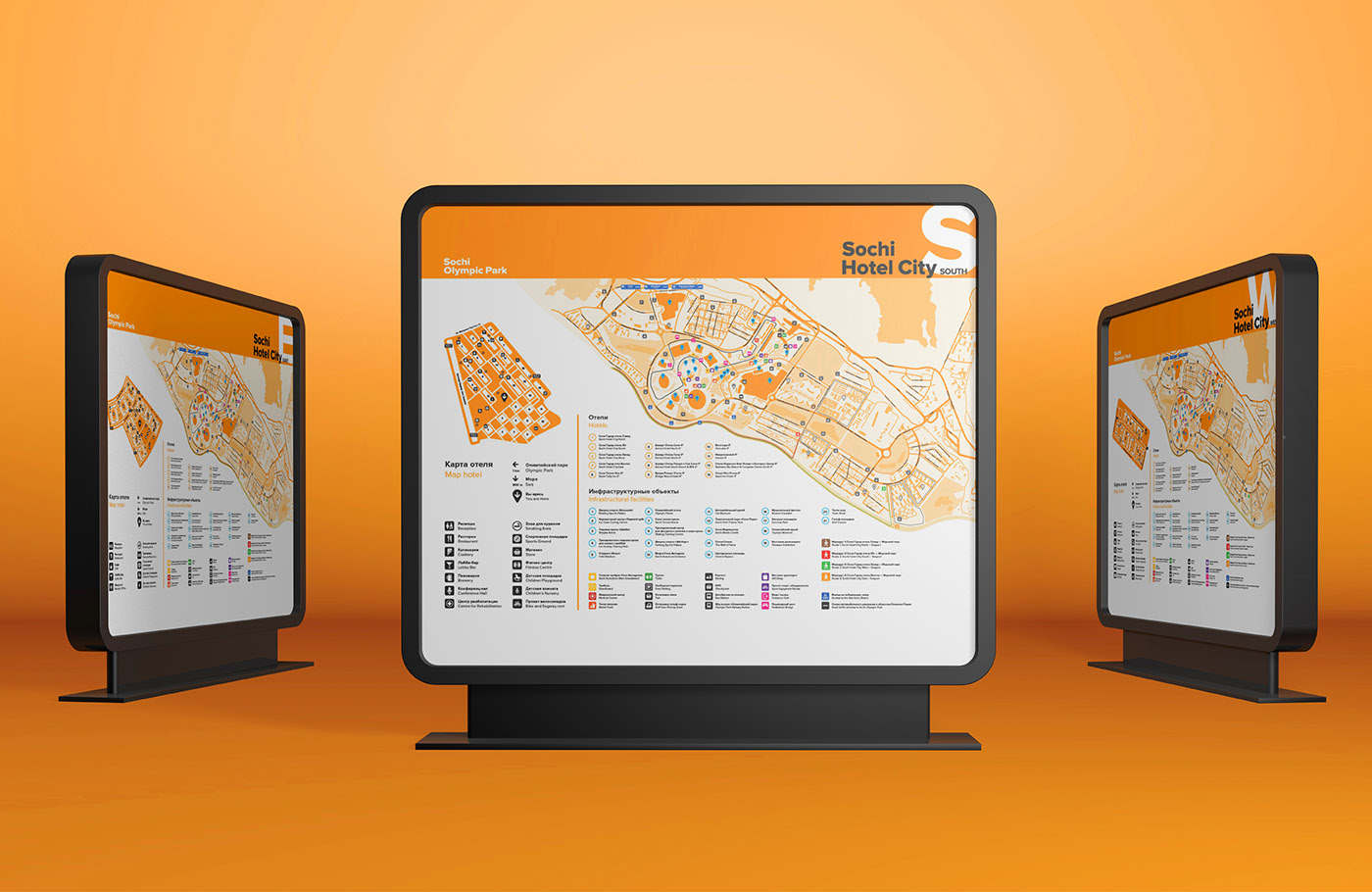
We solved the problem of connection between different blocks of the Sochi Hotel City with the help of well-projected navigation, which makes life simpler for every guest of the complex. Understandable and stylish maps with infographics demonstrate where the person finds himself either in the exact block where he lives, or in scale of the whole city-hotel and even the Imeretin lowland.