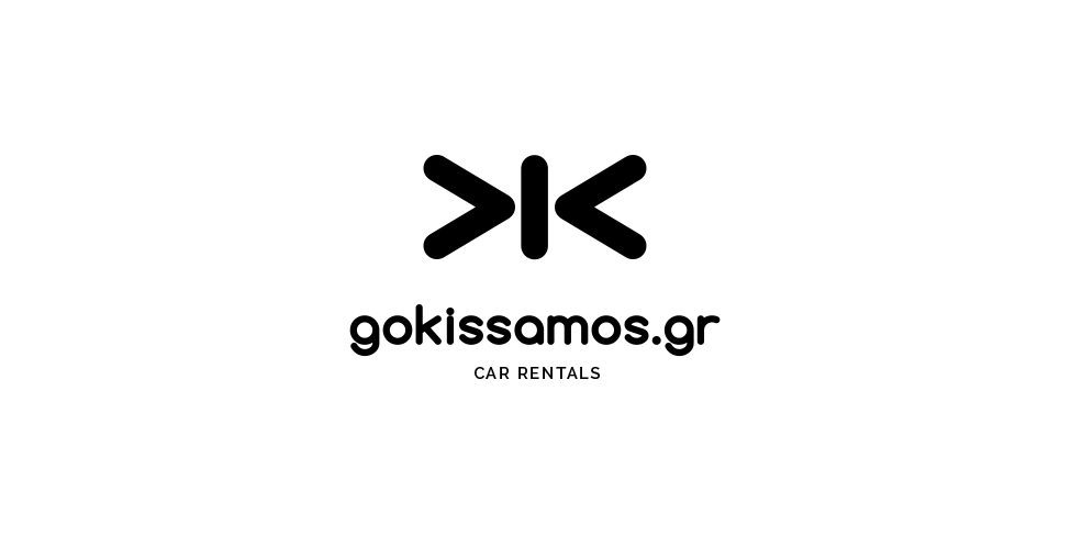
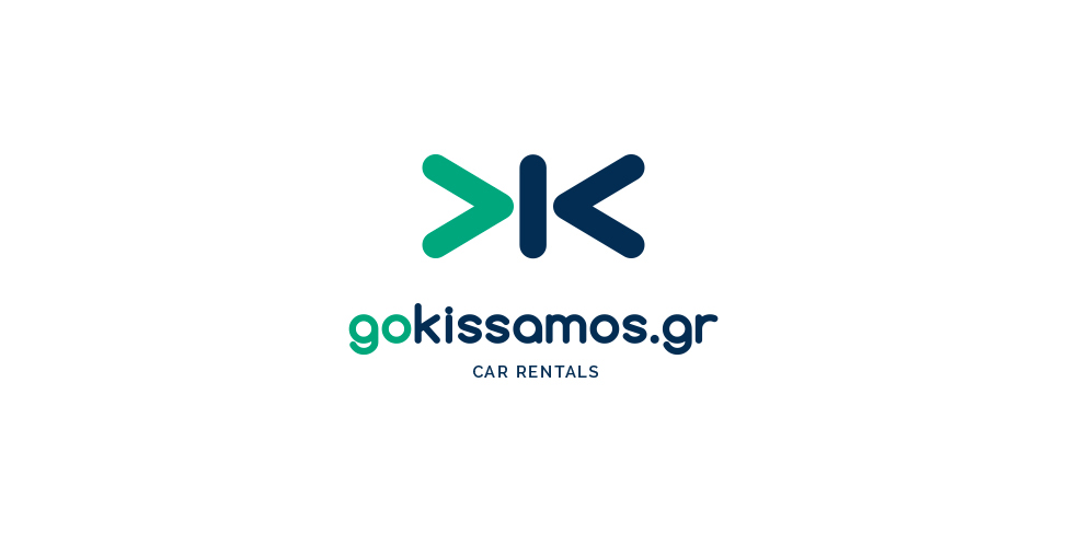
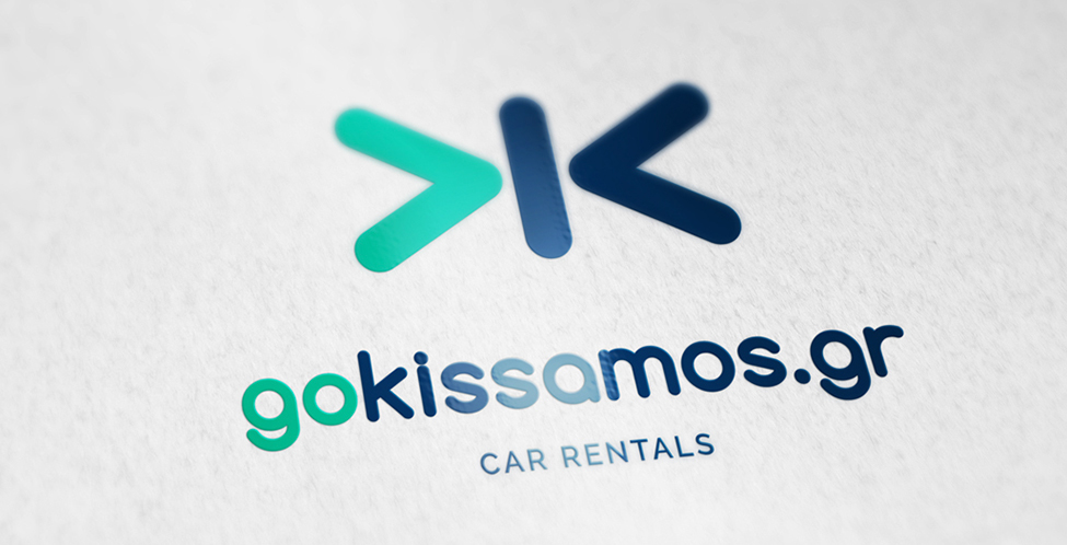
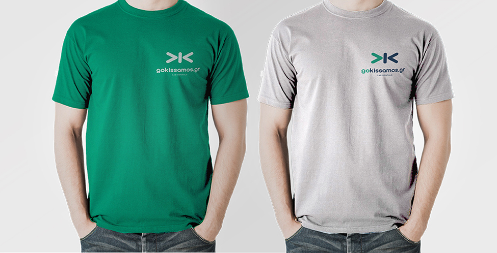
Logo and identity design for a car rental company in Kissamos, Crete. We used simple shapes to recreate the meaning of “go Kissamos” on the logo. So there is an arrow (go) and a “k” (Kissamos) in a symmetrical balance.
Join Behance
Sign up or Sign into view personalized recommendations, follow creatives, and more.
or
Join Behance
Sign up or Sign in to view personalized recommendations, follow creatives, and more.