FastCast+ Podcast is a travel planning podcast focused on Disney Parks. They provide a fun information gathering option for people who may feel overwhelmed with the many different options at Disney.
Goals
A logo that stands out among other similar podcasts, communicates honesty, fun, and a sense of story, and appeals to a target audience of tech-savvy 21–45 year-olds.
Research & Exploration
As with any project, I began with research. One of the helpful things I found out was that almost every single podcast that came up under “Disney” in iTunes filled the entire available area for their podcast art. I realized that a design with extra whitespace could break that rectangular shape, and draw people’s eyes to FastCast+.

After the research phase, I began sketching out several different directions, exploring various points of emphasis with the podcast’s name and its connection to Disney Parks and traveling.
The layout was inspired by passport stamps, supporting a visual association with world travel that is appropriate for the podcast’s occasional movement into non-Disney travel topics.
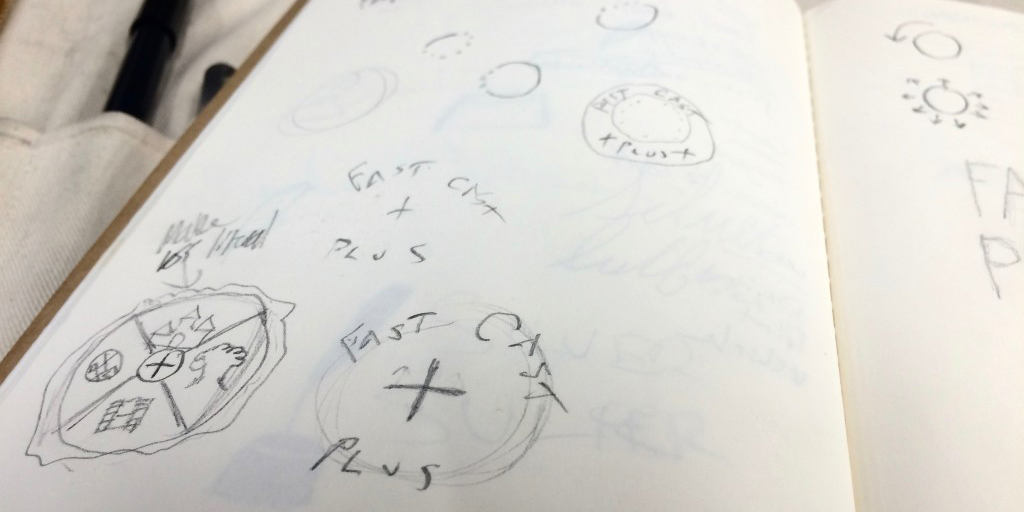
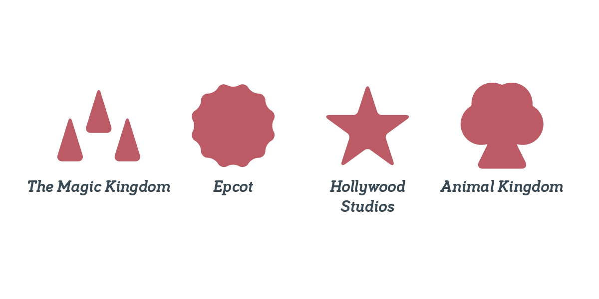
I also explored different iconography to communicate the podcast’s topic, since “travel” and “Disney” are not part of the name. Simple icons built using basic shapes worked well for this, and prevented visual clutter.
A major key to unifying the elements was found in the selection of Bariol and Bariol Serif as the typeface for both the logo and supporting elements. Bariol has a range of feels across its different weights. The light and thin weights are technical, modern, and formal, providing a confident voice that knows what it’s doing. The regular and bold weights are fun and relaxed, ready to be a kid again as soon as vacation starts!
Final Concept
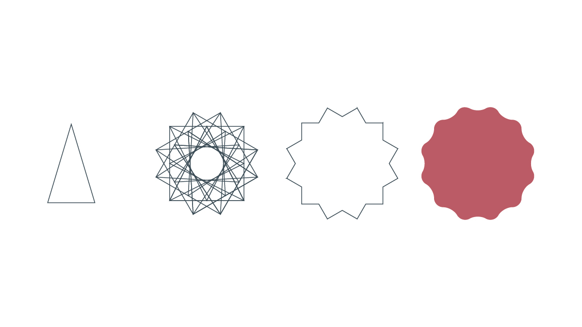
Once the concept was established, the design progressed through many iterations to find an effective balance.
The graphic elements in the logo were refined, taking cues from the Bariol Bold letter forms to create a complete lock-up unified in weight, contour and proportion. Two “plusses” are hinted in the bounding circle, symbolizing the podcast’s two hosts and the value they bring to their listeners.

There are four icons within the logo, each representing a park at Disney World. The icons are simple enough to hold together in the brand mark, but are also fleshed-out enough to stand on their own and support park-specific content.
The color palette establishes visual hierarchy between the logo’s elements, and communicates honesty, fun, and excitement with blue-sky imagination and Mickey-Mouse-shorts happiness. The combined americana feel of the colors together primes listeners for the storytelling mindset of the podcast.

Finally, the type arrangement is designed to allow for flexibility with both current and future offerings under the FastCast+ brand.