


Alegreya is a typeface originally intended for literature
Among its crowning characteristics, it conveys a dynamic and varied rhythm which facilitates the reading of long texts. Also, it provides freshness to the page while referring to the calligraphic letter, not as a literal interpretation, but rather in a contemporary typographic language.
The italic has just as much care and attention to detail in the design as the roman and make a strong emphasis in the paragraph. The bold weights are strong, and the Black weights are really experimental for the genre.
Not only does Alegreya provide great performance, but also achieves a strong and harmonious text by means of elements designed in an atmosphere of diversity.
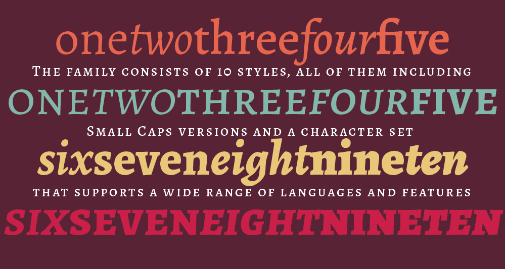
The pro version of this family consists of 10 styles, all of them including Small Caps versions and a character set that supports a wide range of languages including those from western, central and south eastern european, also afrikaans, vietnamese, pinyin and more.
• • • • • • • • • • • • • • • • • • • • • • • • • • • • • • • • • • • • • • • • • • • • • • • • • •
Awards and distinctions
✭ ATypI Letter2: chosen as one of 53 “Fonts of the decade”
✭ Tipos Latinos 2012: certificate of excellence
✭ Typographica.org: Our Favorite Typefaces of 2012
✭ Selected in the 2nd Bienal Iberoamericana de Diseño. 2010
• • • • • • • • • • • • • • • • • • • • • • • • • • • • • • • • • • • • • • • • • • • • • • • • • •
Designed by Juan Pablo del Peral for Huerta Tipográfica.
Get the fonts at www.huertatipografica.com/fonts/alegreya-ht-pro
Get the fonts at www.huertatipografica.com/fonts/alegreya-ht-pro
