Marco & Chamorro
Marco & Chamorro is a dental clinic formed by two partners and a few number of specialists who use high technology and pioneer marks to offer a high quality service. In addition, they have very accessible prizes. The clinic also offers special care for disabled children.
This singular concept needed a different graphic solution to both, modern franchises’ and low cost clinics’ typical style.
The assignment covered the design of the corporate identity, the stationary and the signage, and it was developed together with the architectural and interior design project, which became a great chance to benefit the teamwork’s advantages and to have a better control over all the indoor decisions.
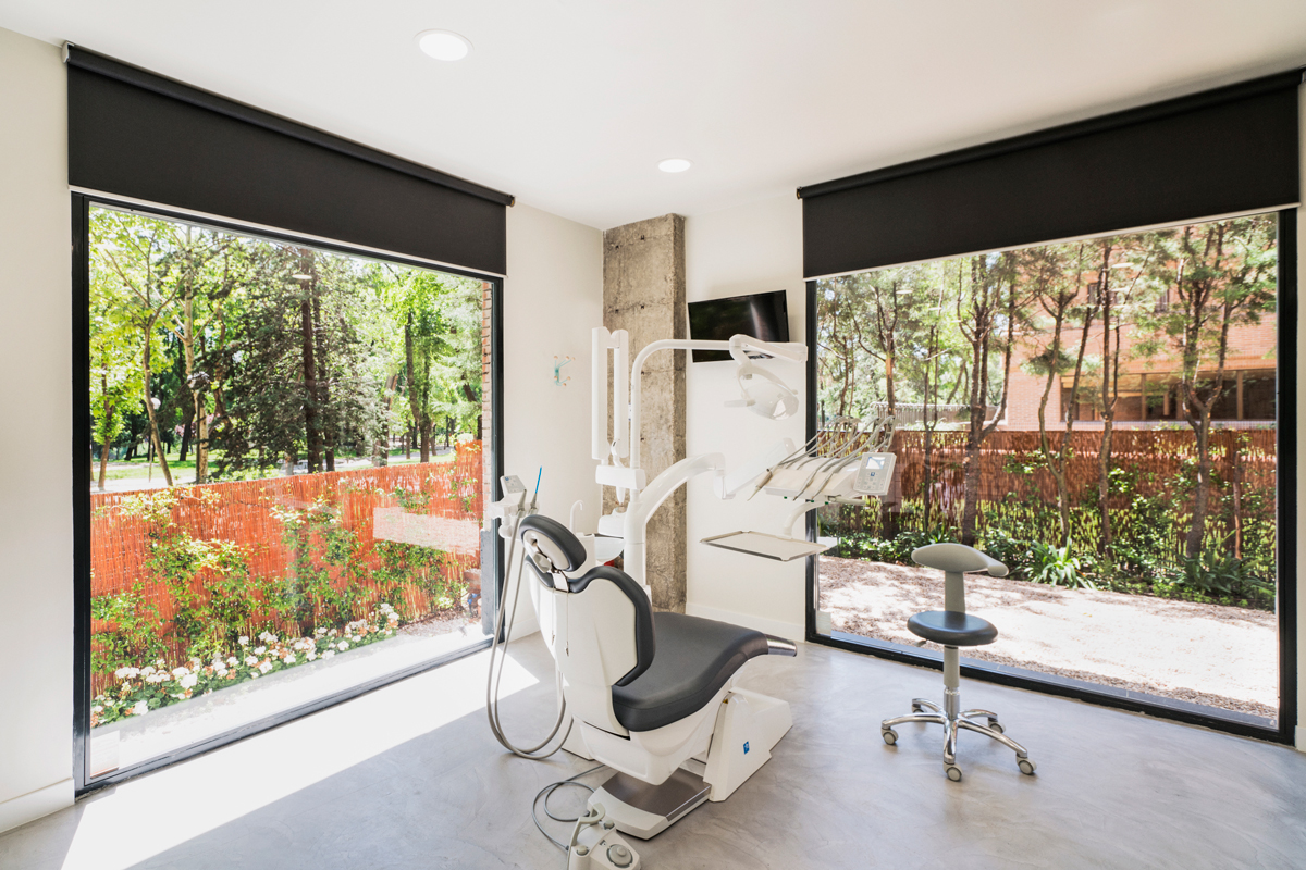
The space was divided in two distinguished areas: on the one hand we have the reception and the waiting room, with a warm and homelike Scandinavian appearance. On the other hand, the working zone, where several big windows bring on a lot of light and spaciousness feeling, and where the patients enjoy seeing a large park and a well kept garden.
The starting point for the mark construction is quite simple: the four axis of the clinic’s trademark (health, esthetics, human value and technologic value) were represented by a square and, with a single cut, we got the symbol, which contains both partners’ initials. By chance, these two shapes remind to minimal expressions of a tooth and a smile.


The symbol works as a unifying thread for the signage and even for the decoration. For example, the pictograms which mark each space of the clinic, contain those outlined shapes and other ones. Even the pictures of the reception and the white vinyls fixed to the window panes are made using both shapes of the symbol as geometrical patterns.


During the research process we got some ideas from Wes Anderson’s cinema style, like the chromatic pastel range and the liking for retro appearance. And here’s a little story: the reception area contains allusions to some scenes of The Grand Budapest Hotel, in the lighted sign and even in two of the wall’s pictures, reconverted using the corporate typography.


Regarding to the stationary, it should be pointed out that the business cards contain a die-cut symbol which allow us to see the corporate colors through it. We also used this technique to some signs at the outside part of the clinic.

The children's waiting room is a place for fun!

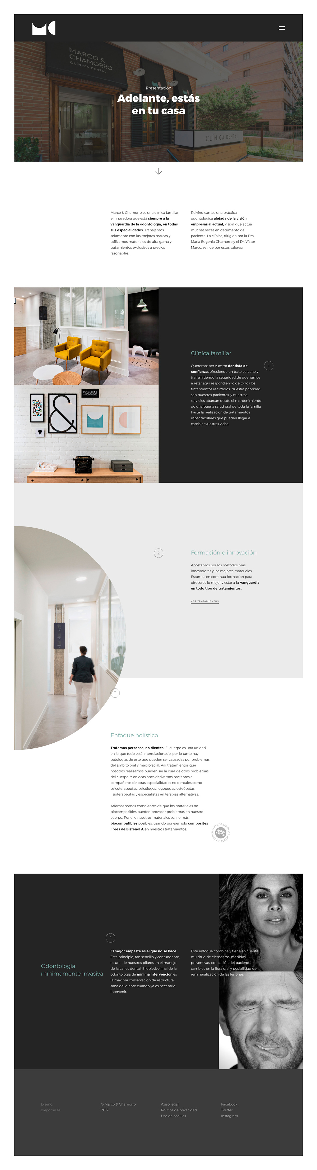
Website design.


Project made with Cristina Latorre.
Architecture and interior design: Space Maker Studio.
Photos: Namaste MJ.
Logo animation: Animatomic.
Architecture and interior design: Space Maker Studio.
Photos: Namaste MJ.
Logo animation: Animatomic.
Follow me on Instagram

