


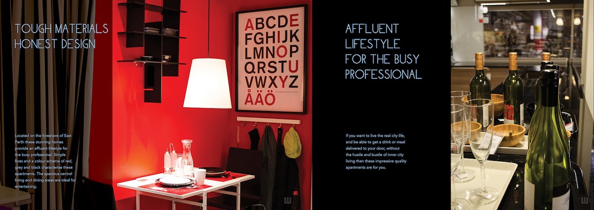
The brief is to create a high end and up market branding for Riverside Apartment targeting young executives. The concept of Stirling Tower branding was inspired by the lifestyle in high rise apratments at the waterfront. The strategy is to showcase the modern and contemporary lifestyle that would attract young professionals to live within East Perth.


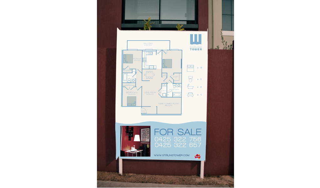
The logo has two elements which are the typography and the graphic element wich was derived from the typography that symbolizes the high rise apartments with the three rectangles and the waterfront is symbolized by the wavy lines. This graphic element forms the letter “w” in th word tower to customize the typography to work with the branding.
The colour I chose is light blue that is refreshing, calm and very professional to represent a modern and clean living in East Perth. The logo is also used as a graphic device with photographs to create an overlay effect with the photo. I also used white spaces sparringly in all of the layout of the brochure, sale sign, and billboard to further emphasize the exclusivity and up- market branding of Stirling Tower.

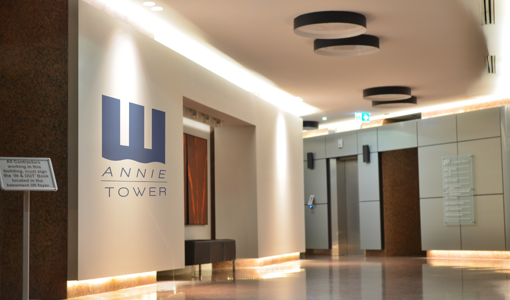
The exterior signage is made up of a textured dark blue marble stone with an embossed glass logo to create a sense of grandeur when entering the building which is supported by the glass tinted design for the foyer. The apartment title in each floor is also kept consistent with the typography and graphic element used to keep a coherent branding throughout the establishment.

Thanks for viewing.


