8Minutes
A leading solar energy solutions company in India, dons many hats at a time to ensure you get the best experience while transiting to and staying solar. While we focus on availing latest technology and highest quality products for your solar energy needs, we also strive to offer award-winning professional service to our clients based on our expertise and passion in the most competitive and cost-effective manner.
8Minutes has now emerged as a leader in the Indian solar energy market. It has become your one-stop solution provider for all your energy needs, relentlessly advocating embracing solar energy and becoming independent in energy resourcefulness.

Old logo


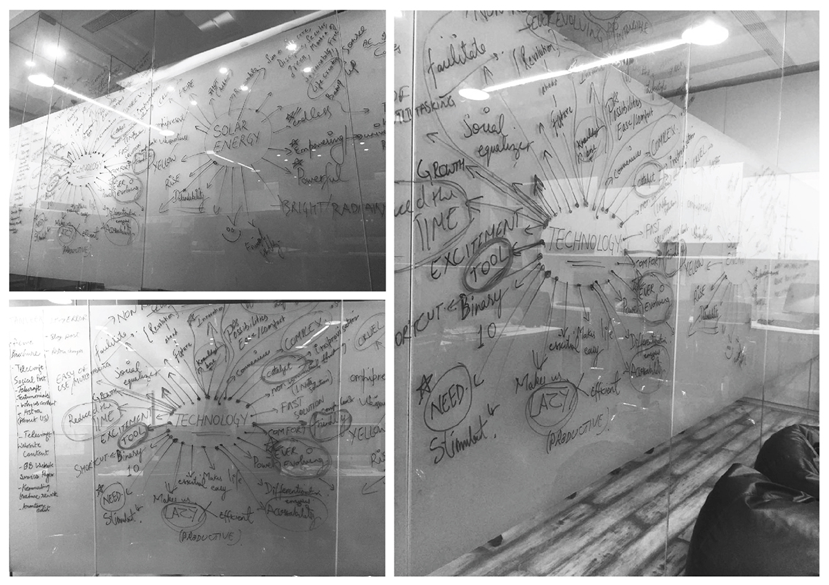
Snapshot from brainstorming session


Set of rejected logos

Option 1
The logo, a synthesis of a power icon with that of symbol '8', signifies the power in the hands of user using solar energy, made simpler and accessible by 8 minutes. It represents self-reliance and independence from the regular woes of power supply. It strongly establishes 8 minutes as a facilitator of the vision of more power in the hands of consumers. The image of electric bulbs within the logo also refers to power, allegorically, and in the sense of solar energy.
The font used is clean, sophisticated and friendly complementing the visual character of the logo as clean and accessible, yet bold and authoritative. The color scheme and gradient have been derived from the many hues of sun which depicts strongly dynamic and evolutionary character of the solar energy.


Option 2
Taking cues from the icons of infinity (representing limitless solar energy) and that of sun in concentric circles, this logo evolves into a fluidic form of symbol '8'. Due to its neat flowing design, it has a potential to be creatively animated, assimilating forms of infinity, sun and finally developing into an '8' symbol.
The font used is neat, contemporary and ably represents technology which is a forte of 8 minutes. The color scheme and gradient have been derived from the many hues of sun which depicts strongly dynamic and evolutionary character of the solar energy.
The logo is an expression of endless form of solar energy made accessible by 8 minutes.


Option 3
The logo in the form of number '8' conjoins various natural elements to communicate, simplistically, the process and power of solar energy. The upper half in blue colour represents the sky, with sun's energy in the form of yellow rays. The lower half in green color represents earth. The image of two electric bulbs, joined in between through a power on/off icon, signifies the usage of solar energy to generate electric power and also control in the hands of and empowerment to the consumers. The logo, while highlighting the number '8', stands for the complete cycle of solar energy in relation to earth.
The font used represents technology and the soft basic colors render the logo a pleasing look. It is simple, clean and communicative.