Wrapping Paper
In 2011, Talbots launched its holiday campaign "Wish & Tell". The purpose of the campaign was to re-introduce and position the brand as the gifting destination of the season.
I started by deconstructing the "Tell" part of the story - playing with different visual approaches that would complement the narrative theme. The solution would have to support not only the re-defined character of the brand, but also highlight a large variety of product across different channels.
I started by deconstructing the "Tell" part of the story - playing with different visual approaches that would complement the narrative theme. The solution would have to support not only the re-defined character of the brand, but also highlight a large variety of product across different channels.
The Execution
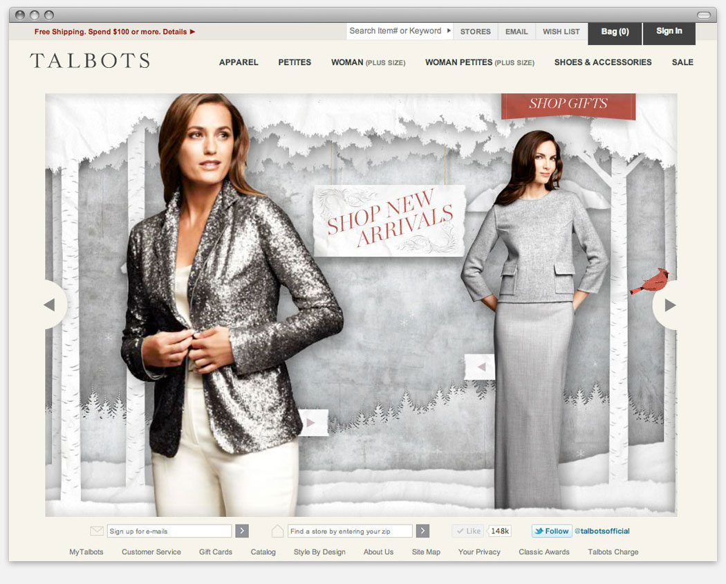
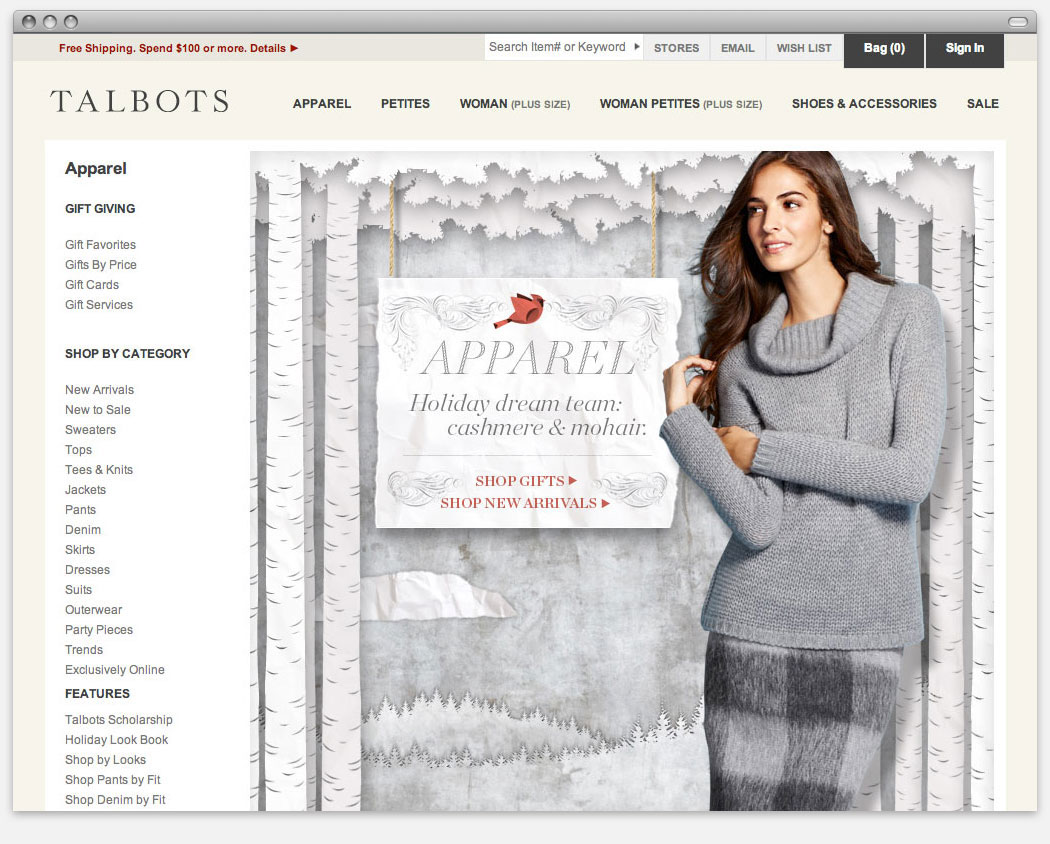
I designed different kinds of environments that would evoke a nostalgic, if not an emotional response. I was looking to capture a sense of wonder akin to the one shoppers experience when looking into fantastical department store windows during the holidays. The challenge was to re-create that online.
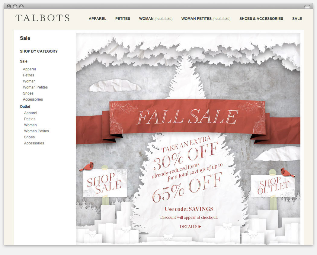
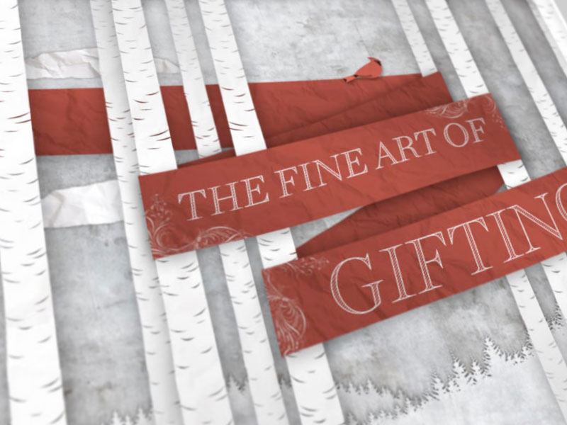
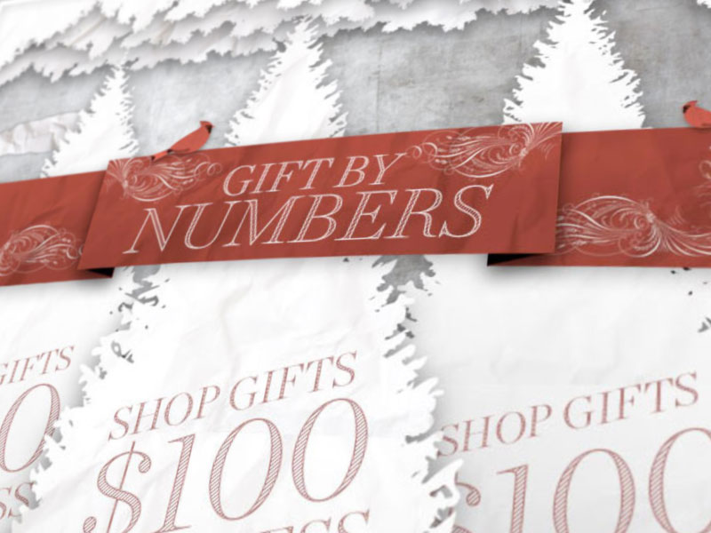
The "Papercraft" art direction naturally evolved out of this process. It would make the brand approachable by lending the campaign a touch of whimsy. Textured paper has a sentimental and tangible quality - perfect for the holidays.
To keep the campaign brand-consistent and to avoid feeling “crafty”, I opted to go for a subdued monochrome palette paired with the paper's laser-cut edges. The white backgrounds also allowed the mostly metallic and red product to pop.
To keep the campaign brand-consistent and to avoid feeling “crafty”, I opted to go for a subdued monochrome palette paired with the paper's laser-cut edges. The white backgrounds also allowed the mostly metallic and red product to pop.
To engage the user even further, I designed various interactive scenes punctuated with animated details. Users were encouraged to engage with the products inside these environments, thereby being drawn deeper into the experience.
The Papercraft art direction for web was well received and informed the other brand channels, appearing up in stores and in the retail catalog.
The Papercraft art direction for web was well received and informed the other brand channels, appearing up in stores and in the retail catalog.