

THAT PRINT SHOP
LOGO | IDENTITY | BRANDING
That Print Shop merges the hospitality of a cafe with the creativity of design, and production of printing.
Customers are able to come in, have a chat about their printing and design needs, help themselves to the self-serving stations, all whilst enjoying a delicious cup of coffee.
The logo was designed to be minimal and clean, reflecting the high-tier third-wave coffee scene of Melbourne, and the quality of services offered. The color palette was chosen to pull back the corporate feel of the logo and bring in the warmth of hospitality.


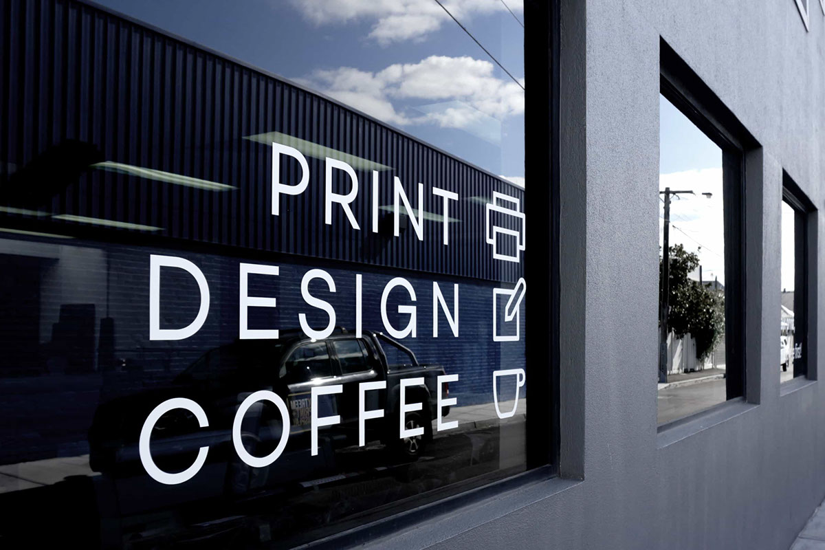
Shop front signage

The colored squares feature TPS' color palette, giving a nod to color bars used in pre-press. The back doubles as a loyalty card for regular coffee customers.


Custom icons were designed for signage and promotional material


A style guide was necessary to provide guidance to new interns and current staff


