NEW ROUTE - Visual identity concept
Concept:
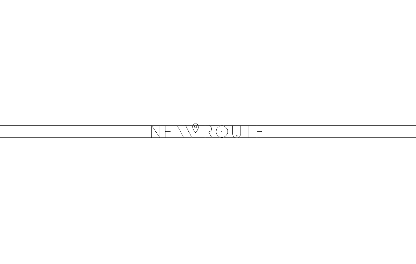
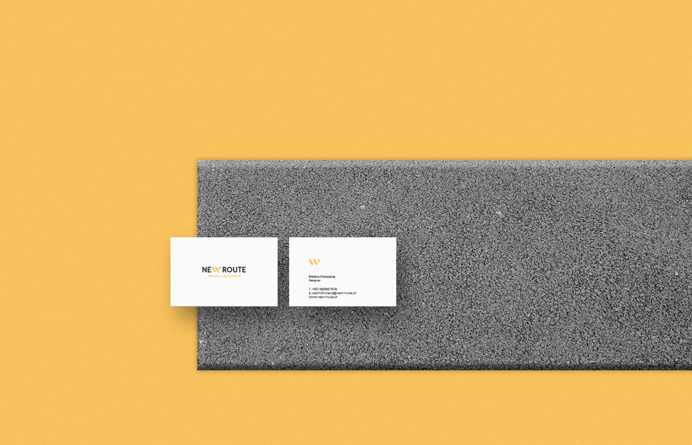
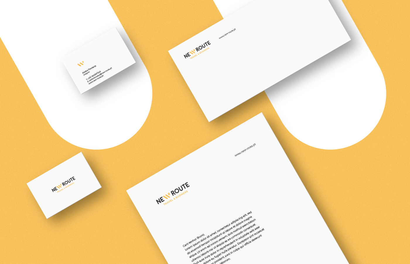
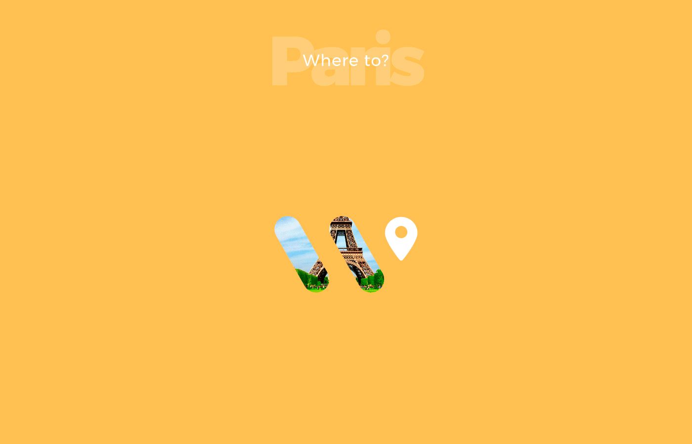
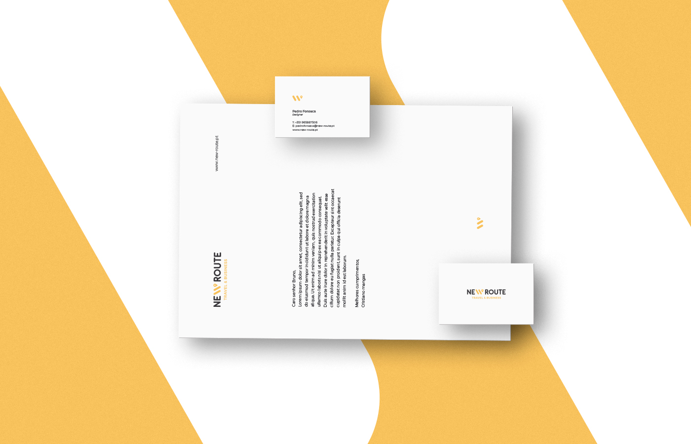
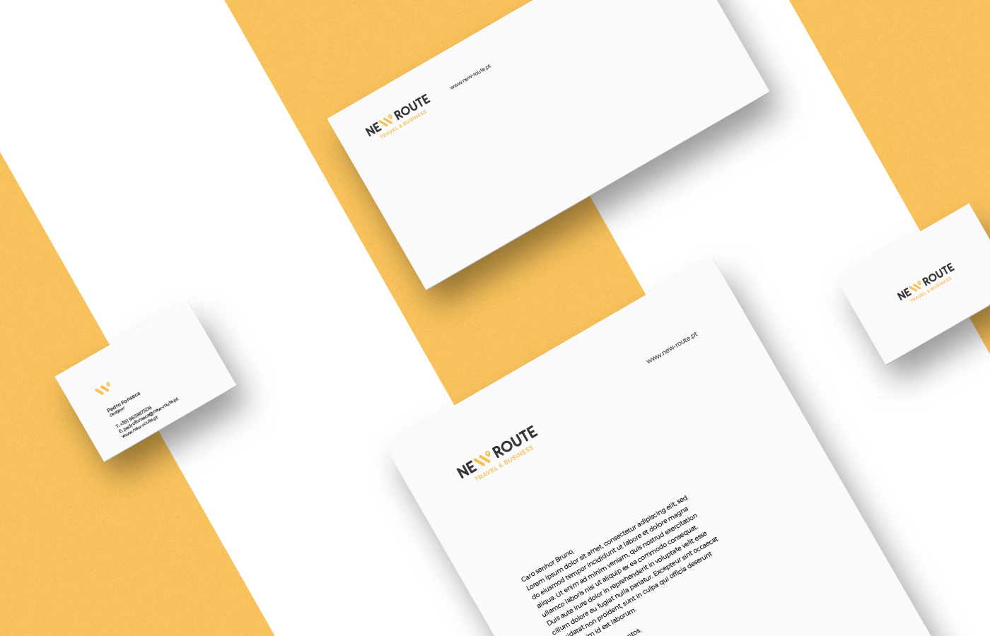
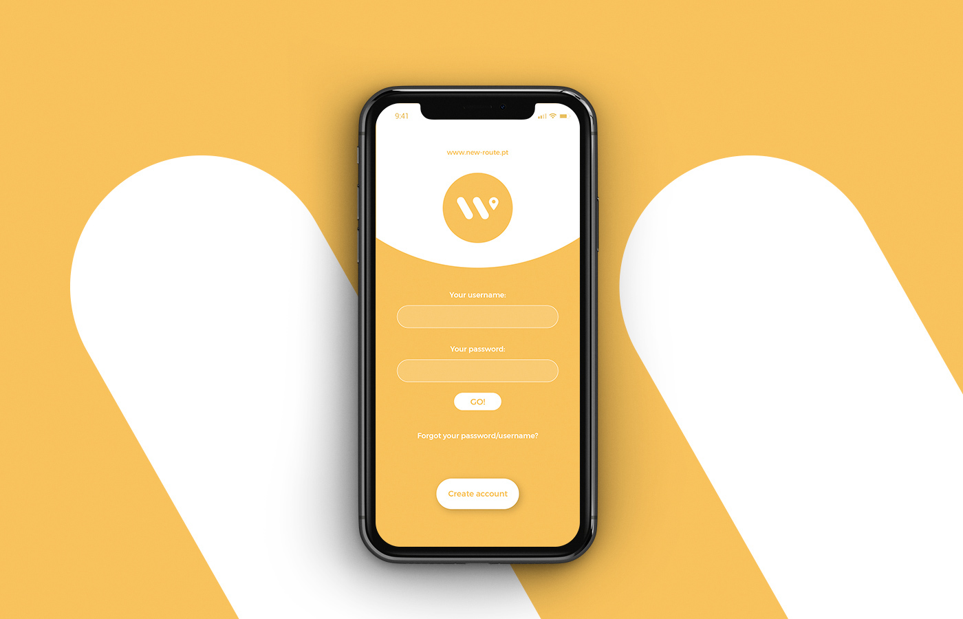
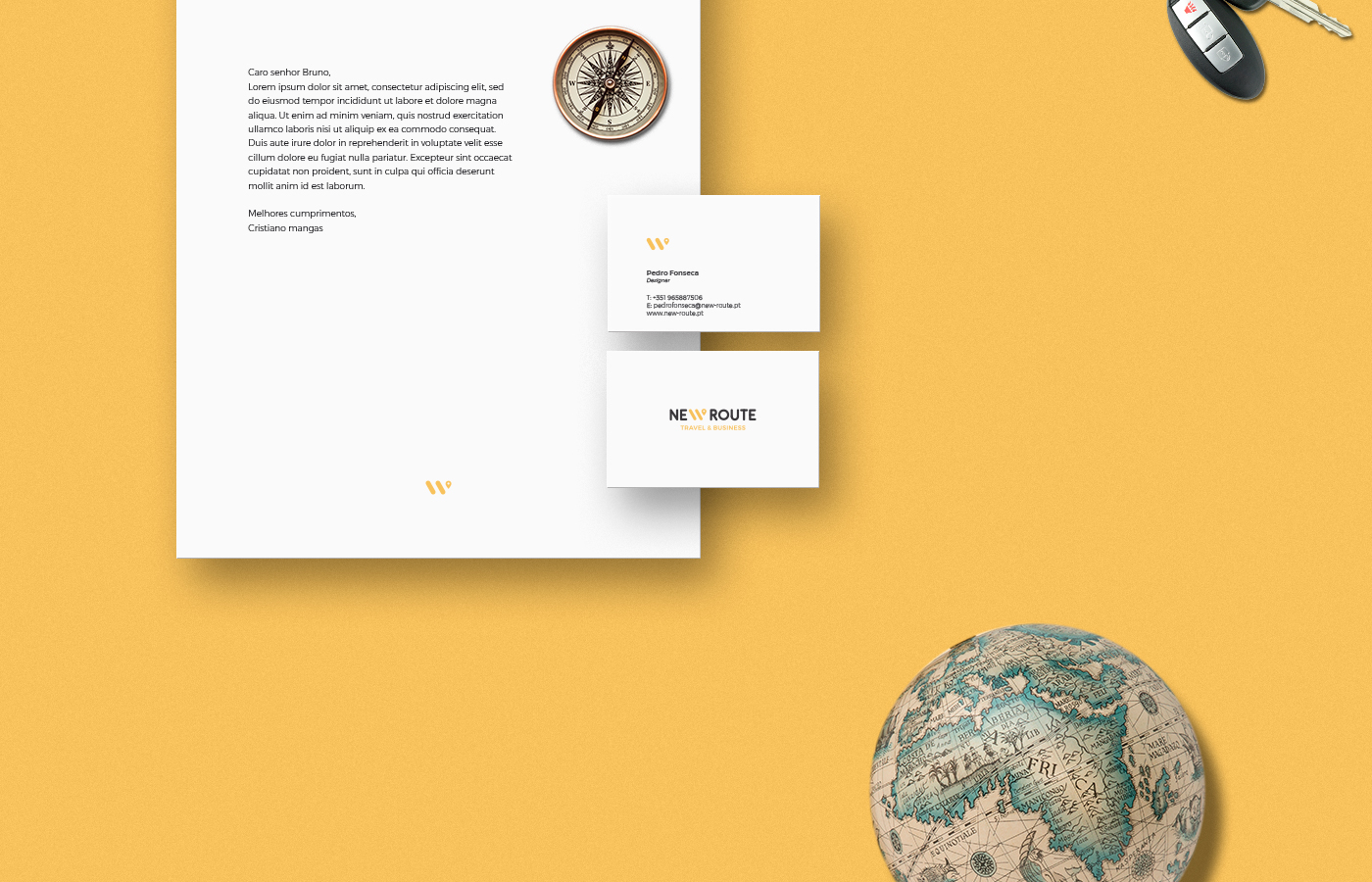
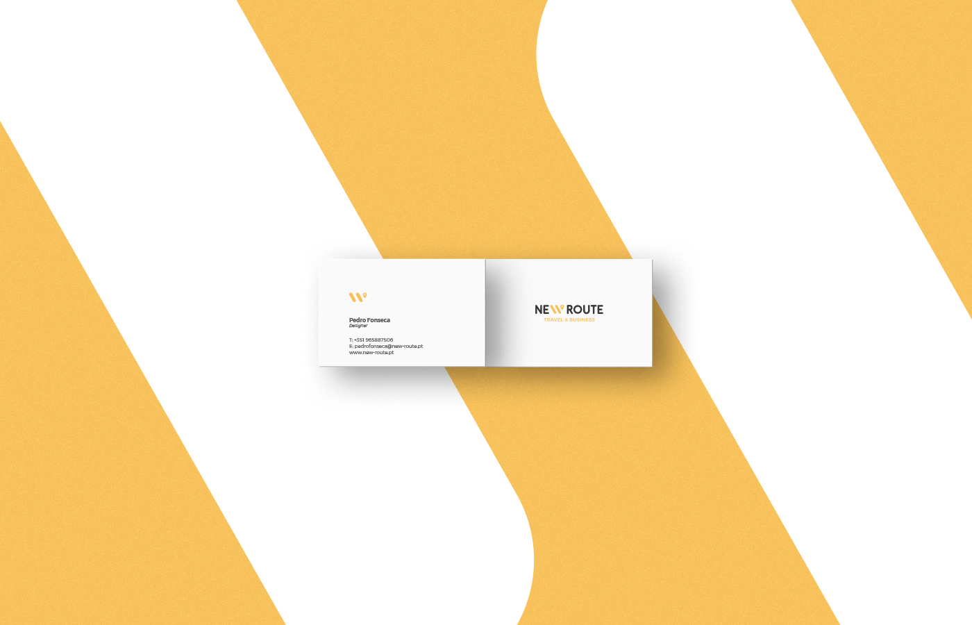
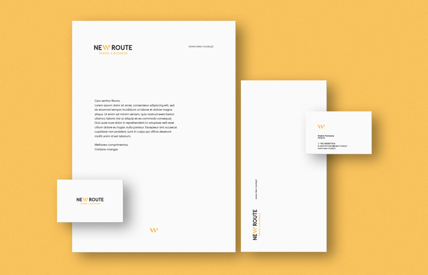
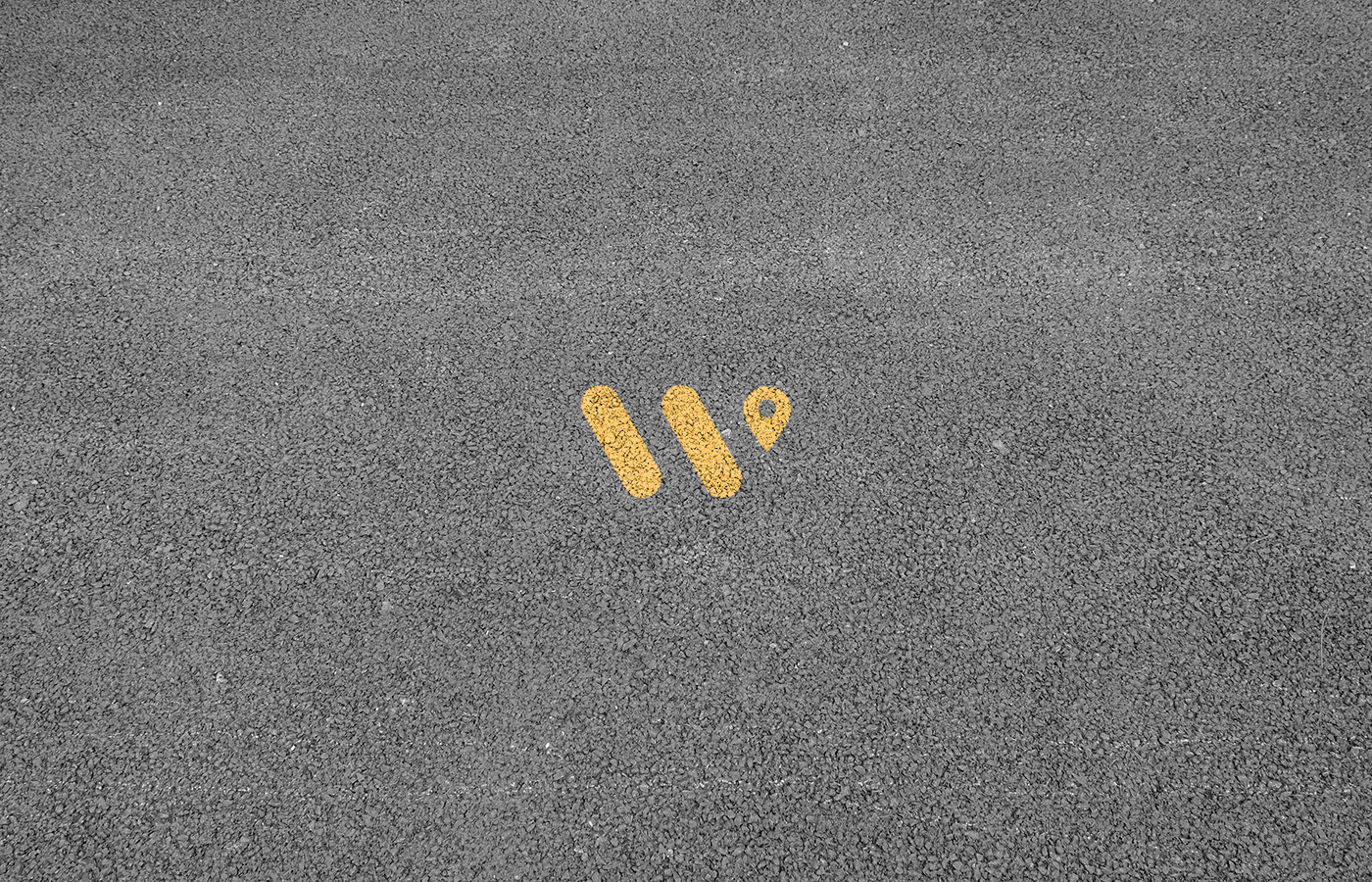
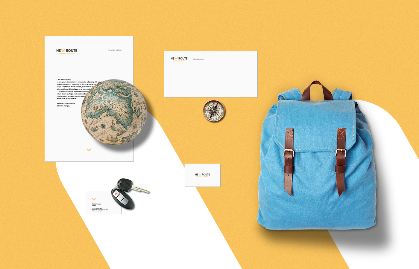
The letter “W” is formed by lines that visually communicates paths, ways, crossroads, passage, routes and so on. That is why the “W” was turned into the protagonist in the logotype. Therefore, a minimal symbol / mark along with the localization icon was created to support the brand voice and be used solely across multiple brand collaterals.
A friendly and clear visual identity for new route, a young travel and passenger transportation agency.


Brand design by: Pedro Almeida
Contact: pedro.workdesign@gmail.com
Contact: pedro.workdesign@gmail.com