


The "Centro NINA" is the Neonatal Training and Simulation Center of the University Hospital Company of Pisa (Azienda Ospedaliero Universitaria di Pisa, AOUP), an advanced research establishment working with augmented reality technologies and innovative training methods inside the neonatal medical field. Behind the Center, the NGO "ANDIAM!" kickstarts new ideas, activities and charitable projects to fuel NINA's ones.
The first request by dr. Armando Cuttano, chief of Centro NINA, has been a new logo — the old one, a Clip Art with a happy baby wasn't up to date with 2018 aesthetics (neither 2010's too...).
The idea came in just a second. When a family welcomes a newborn, a rose or blue bow is hanged on the house's main door: it's the traditional and international sign which tells that a new little baby has come to life. So the bow, this powerful symbol, flashed in my mind since the beginning, and the characters forming the word "NINA" were just perfect: a unique ribbon inherited from the bow flows up and down writing N-I-N-A.
From this early idea, I iterated dozens of trials, edits, adjustments — and just the few final ones are listed here below...

...arriving at the end at the final_logo.ai. I developed a full color version and two monochromatic version, white and black, all of them both in an extended version with the tagline "Centro di Formazione e Simulazione Neonatale" and without it.

Brand Guidelines
The next step was to create a consistent and broad brand manual to ensure that every design and project born in the Centro NINA would have been coherent, recognizable and trustable.


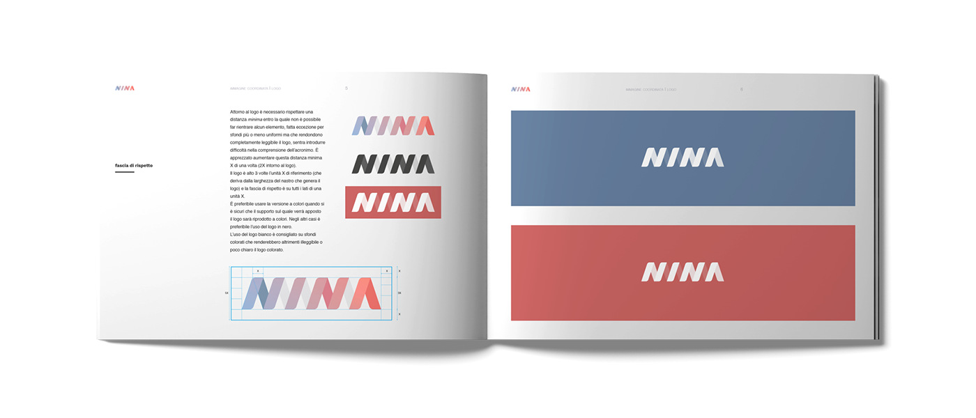
Starting with the logo, its application, clear spaces and variation, I set up a clear how-to guide to use correctly the logotype "NINA" in every support.
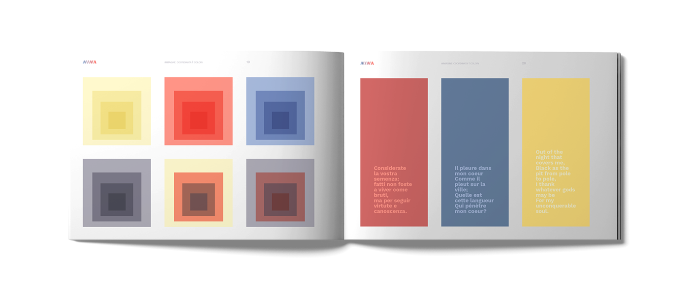
Then an in-depth focus on color, as fundamental vehicle to connect emotionally with people, to create a consistent visual language and to communicate precise informations.

Follows a very detailed guide, but still easy to execute and remember, on how to create printed layouts, use typography, grids and spaces in the most common paper formats and on online projects.
The brand font chosen is Work Sans, free and perfectly working both online and on print products. Work Sans is accompanied by Helvetica in body copy and in all the cases where Work Sans is not available — in the medical and hospital field, it's not unrare to see Windows 98!

Ends the booklet a series of examples of possible layouts to be used and suggestion on how to use imagery and photography correctly.

Website
The core of NINA's comms is the website: while still under development, you can check out the main pages at centronina.it and enjoy some readings about counseling and about the Center's innovative learning methods, inherited from astronauts and pilots trainings.

☝︎


