We were in charge of redesigning the Pull&Bear newsletters. Our aim was to create a new visual language to be used as templates for the upcoming season. An experimental design with the use of different typographic compositions to convey a strong and modern identity.

The redesign of the menu separates by genres, placing two upper buttons on top of the newsletters and four categories. A design with a clean approach and simplification on the navigation between the different options.


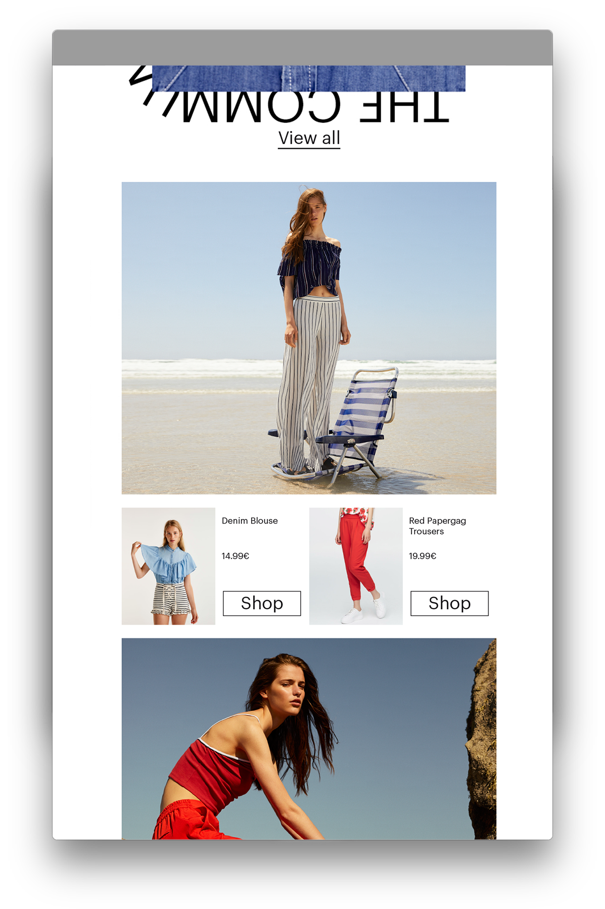
A module was developed with a layout consisting of two to four columns. The placement of the clothe’s information takes place underneath or next to pictures depending on the image. This module is prepared to allow replacement of the pictures and text for the newsletters.


Different examples of the proposals for the distinct newsletters for Pull&Bear, presenting a variety of typographic compositions for each theme. Use of a single image for the banners following the titles, with different effects, graphic elements, or layouts.


