After / Hours: Branding Process

Creative Direction
I start my creative direction with deep research of brand metaphors and attributes.

Exploration
I started visual identity work by exploring fonts and symbols that represent both the target audience but also what sets them apart from their competitors. The concept of "time" played a big role in our exploration.
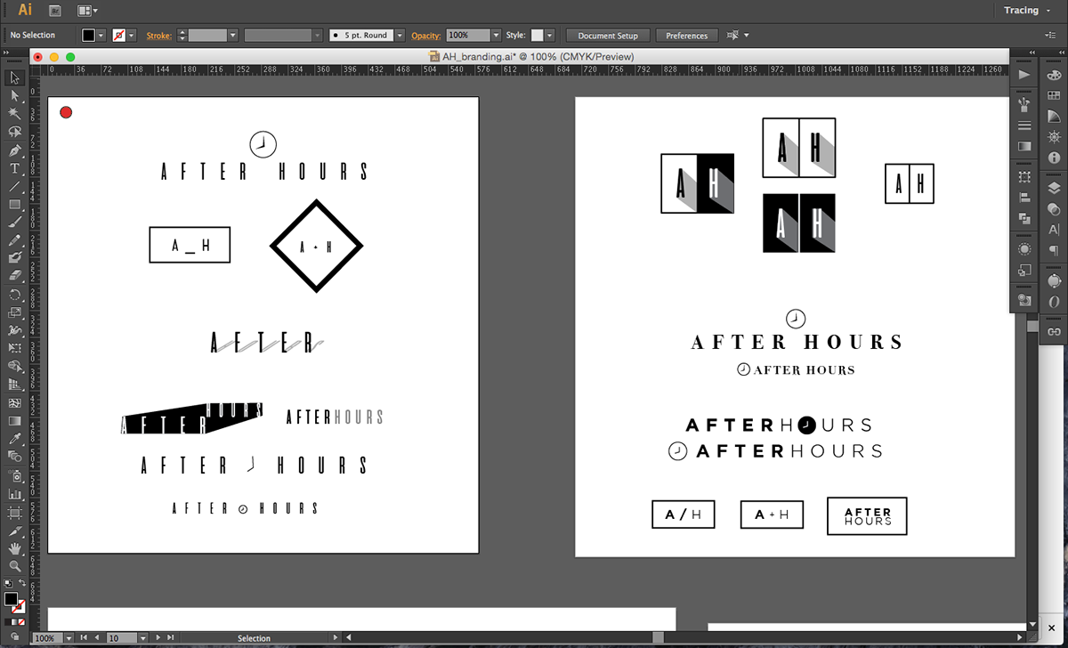
Concept 1
This concepts is a contemporary play on a sundial and the sun going down suggesting that it is "after hours".


Concept 2
This concept is clean, modern and sophisticated. The font would work across many platforms,
especially when accompanied with bold photography.


Concept 3
This concept had a more high tech approach that the client wanted to explore.
The motive was to show it working as a symbol or an app form.


Concept 4
This concept was going for more of a hip minimalist look. More of a apparel symbol.


Concept 5
This concept was a play on light and dark. The contrast would be interesting in both digital and print mediums.


