Wilson Works Irrigation helps homeowners on the northeast side of Indianapolis set up, maintain, and repair their existing home sprinkler systems. When Tony decided to start his business, he contacted me to help create a brand and website that would appeal to his audience and help him meet his business goals.
Partners
Goals
To convey Wilson Works Irrigation as aspirational, trusted, specialized, and friendly, to an audience of upper-middle class homeowners in their 30s and 40s living on the northeast side of Indianapolis who see their lawn as a valuable asset to themselves and their community.
To reduce costs, improve services, and create new processes for customer communication with a branded web site that can receive contact requests, and allow online scheduling of appointments.
"Ben helped me and my business start from scratch. He helped me brainstorm ideas for business names and gave incredible insight as to what a name means and how to differentiate myself and my business from the competition. He continued to work and built a website that is incredibly easy to use and contained all the features I need. The website is easy to use for my customers as well, which makes running a business easy! Ben puts great thought and deliberation to all aspects of design and development to bring a quality product with incredible value!"
—Tony Wilson
Brand Story
When I work with clients on their brand’s message, I have two requirements in every case: the message must be both compelling and true. Put it another way: the brand’s message and values must connect with their audience on the basis of truthfully benefitting them.
Tony and I talked about a couple ways we could potentially speak to his audience about their lawn and his services. On the one hand, we could say something like, “You’ve worked hard to get where you’re at, now you should have the home and lawn you deserve.” Compelling? Yes, and it was even consistent with experiences he’d had with customers. But we didn’t go there, because telling people that their success is primarily about benefitting themselves does not help them flourish.
Instead, we decided to speak from the standpoint that success is primarily about benefitting others. So, you care for your lawn because it’s a place to enjoy your family, welcome your neighbors, and build friendships. With this core message, we could tell his customers something true, AND give them a reason to do business with him.
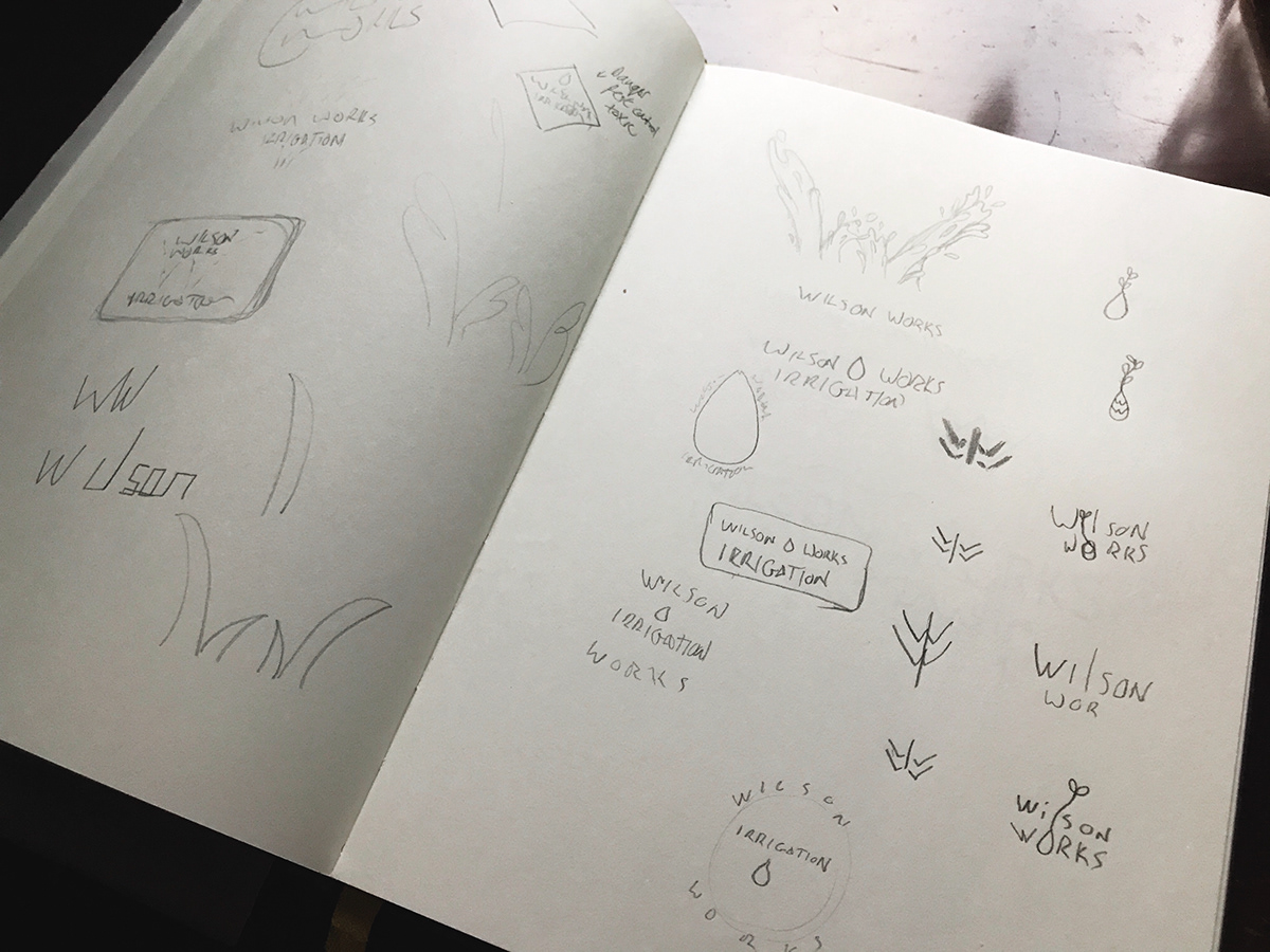
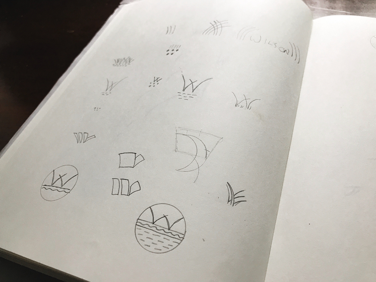
Research & Exploration
Research began with taking a close look at Tony's audience and closest competitors to help take the guesswork out of design decisions. Brand audits, visual research based on the brand attributes, and other activities created a well-rounded understanding of the situation to bring forward into visual explorations.
The overall learning for this business space and audience was that I needed to strike a balance between a clean, optimistic feel typical of current lifestyle brands, and a more utilitarian professionalism typical of most outdoor service companies.
Rounds of broad exploration and refinement eventually brought me to a concept that addressed those two directions with a clean logo and optimistic color palette, balanced with a typeface that conveyed a trustworthy and professional voice.
Final Concept
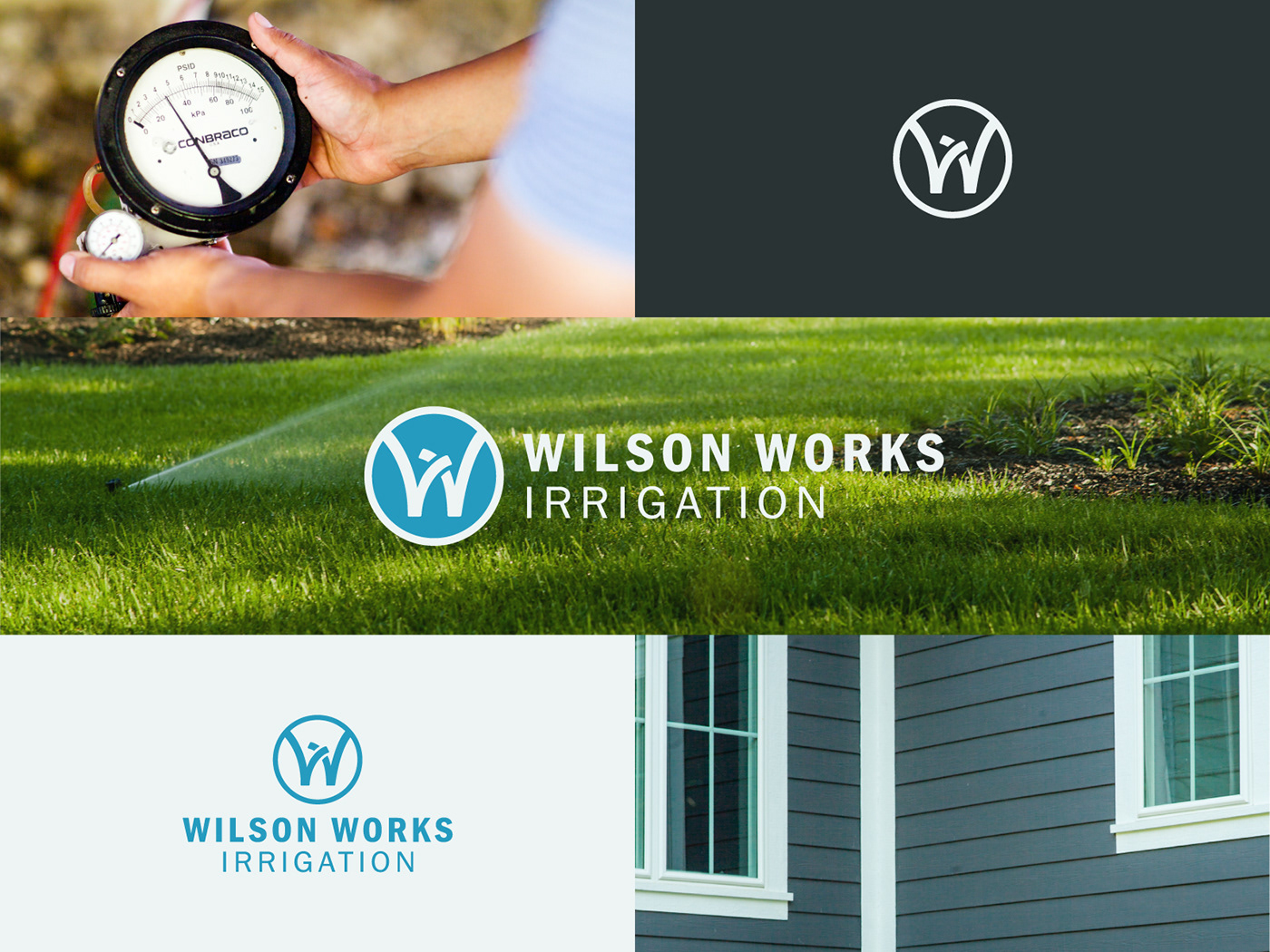
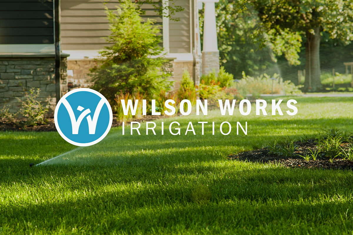
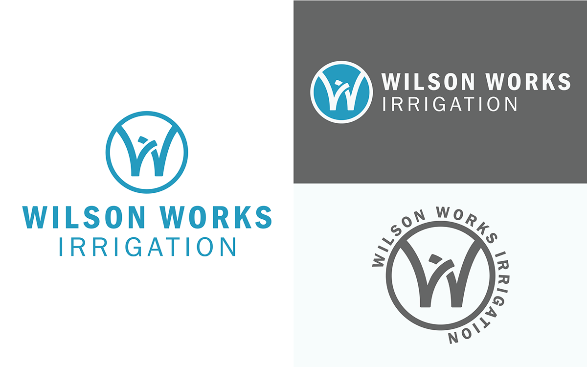
After rounds of broad exploration, developing and refining many ideas, I selected a monogram that uses the "W" letter form with a sweeping upward motion to convey a friendly, aspirational optimism, and represent the business's work. Pairing this with the machine-age Franklin Gothic typeface adds a strong professionalism and communicates a specialized expertise that Tony's customers trust.
Photography
I knew from my research that beautiful brand photography would be important to connect with the project's audience, so I relied on Jessica Carr of Space Flower to compose the images. Jessica was an obvious choice for her photography’s high-end, yet accessible lifestyle aesthetic that supported the brand's aspirational, specialized feel, and clearly differentiated my client from the competition.


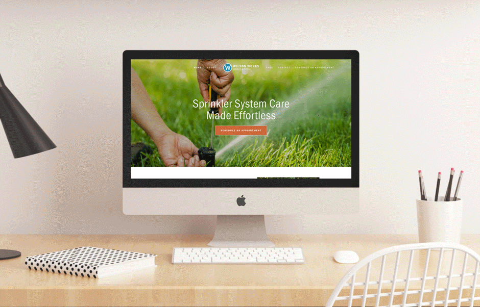
Web site & content
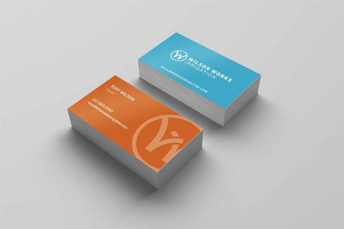
Tony needed a web site that would help communicate his brand and services, and make customer scheduling and communication faster and more convenient. So, I put together a branded site and partnered with Zoe Erler for content that would succinctly show Tony's unique value to his customers. The site also includes an online scheduler that will eliminate the endless back-and-forth that had become the norm for managing appointments.