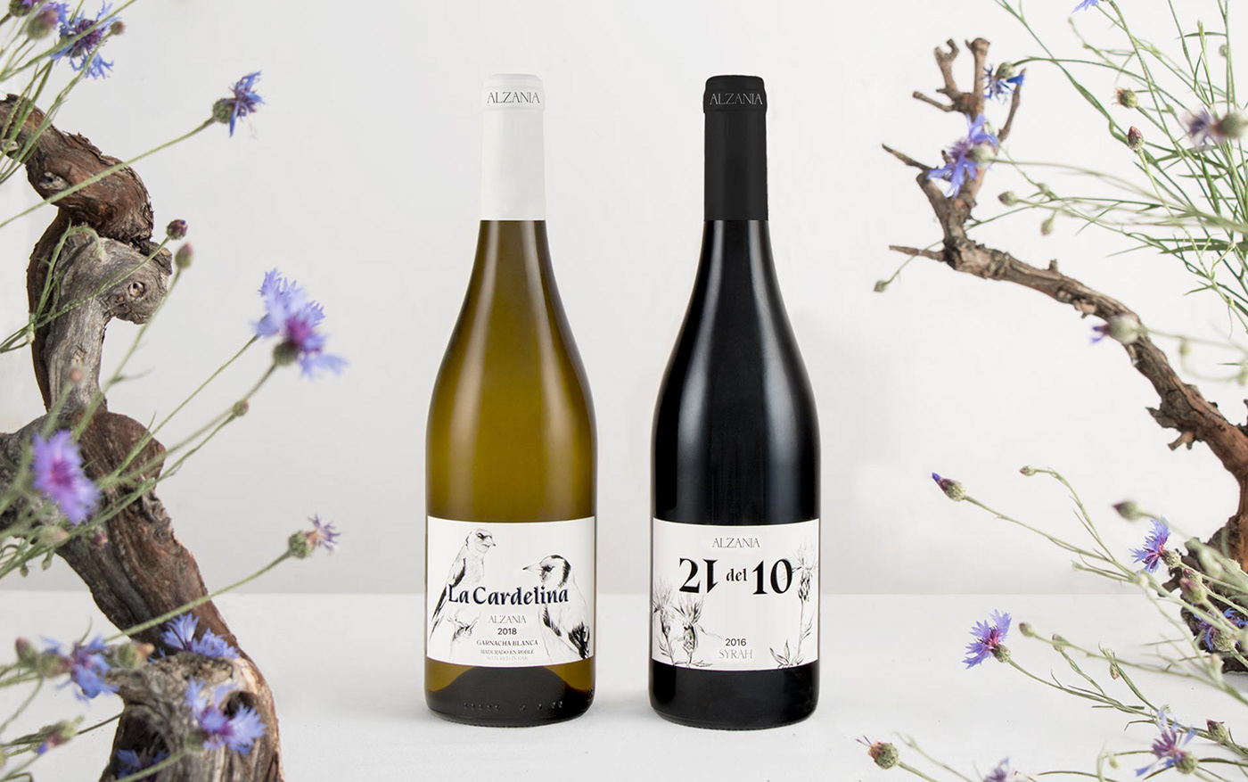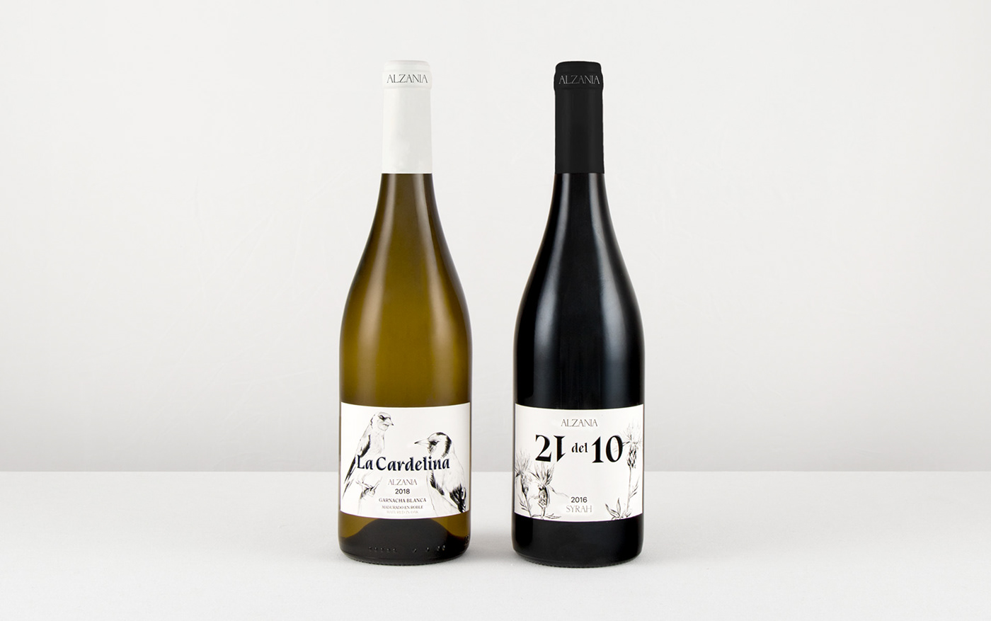
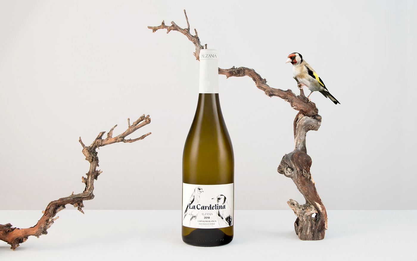
Bodegas Alzania quería rediseñar uno de sus vinos, 21 del 10, y a su vez sacar al mercado un nuevo blanco que lo acompañase, La cardelina. Se pretendió seguir un mismo estilo en estas dos etiquetas con una ilustración manual, un fondo blanco limpio y una tipografía con carácter, creando así un conjunto muy especial, elegante y atemporal.
______
Bodegas Alzania wanted to redesign one of its wines, 21 del 10, and at the same time launch a new white wine to accompany it, La cardelina. The aim was to follow the same style in these two labels with a manual illustration, a clean white background and a typography with character, creating a very special, elegant and timeless set.
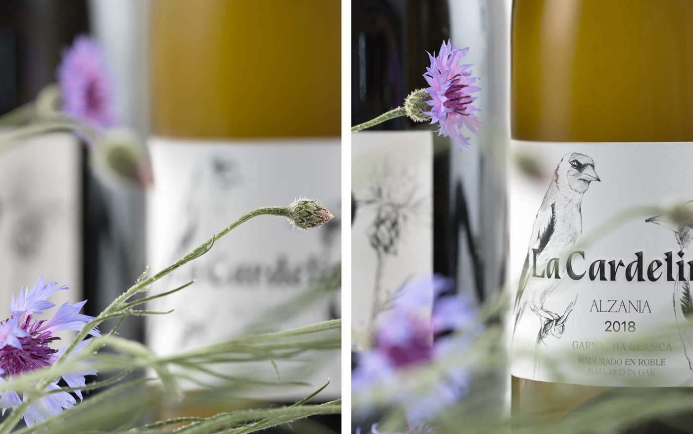
Para hacer referencia al jilguero común se utilizó la cardelina, Carduelis carduelis. Optamos por representar una pareja de aves con una composición equilibrada y asimétrica.
______
To refer to the goldfinch we used the cardinal, Carduelis carduelis carduelis. We chose to represent a pair of birds with a balanced and asymmetrical composition.

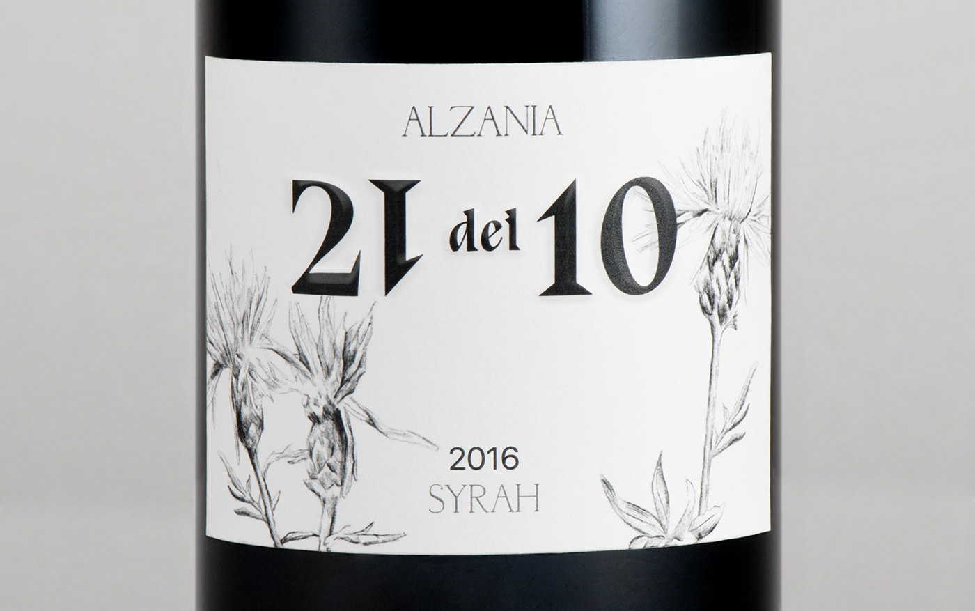
Para el vino 21 del 10 necesitábamos representar un elemento que fuese femenino y delicado, ya que esta fecha hace referencia al nacimiento de la hija de los dueños de la bodega; por ello elegimos la centaurea, una flor silvestre que suele crecer cerca de campos de cultivo y viñedos, entremezclada con las cosechas.
______
For the wine 21 del 10 we needed to represent an element that was feminine and delicate, since this date refers to the birth of the daughter of the owners of the winery. That’s why we chose the centaurea, a wild flower that usually grows near fields and vineyards, mixed with the harvests.