

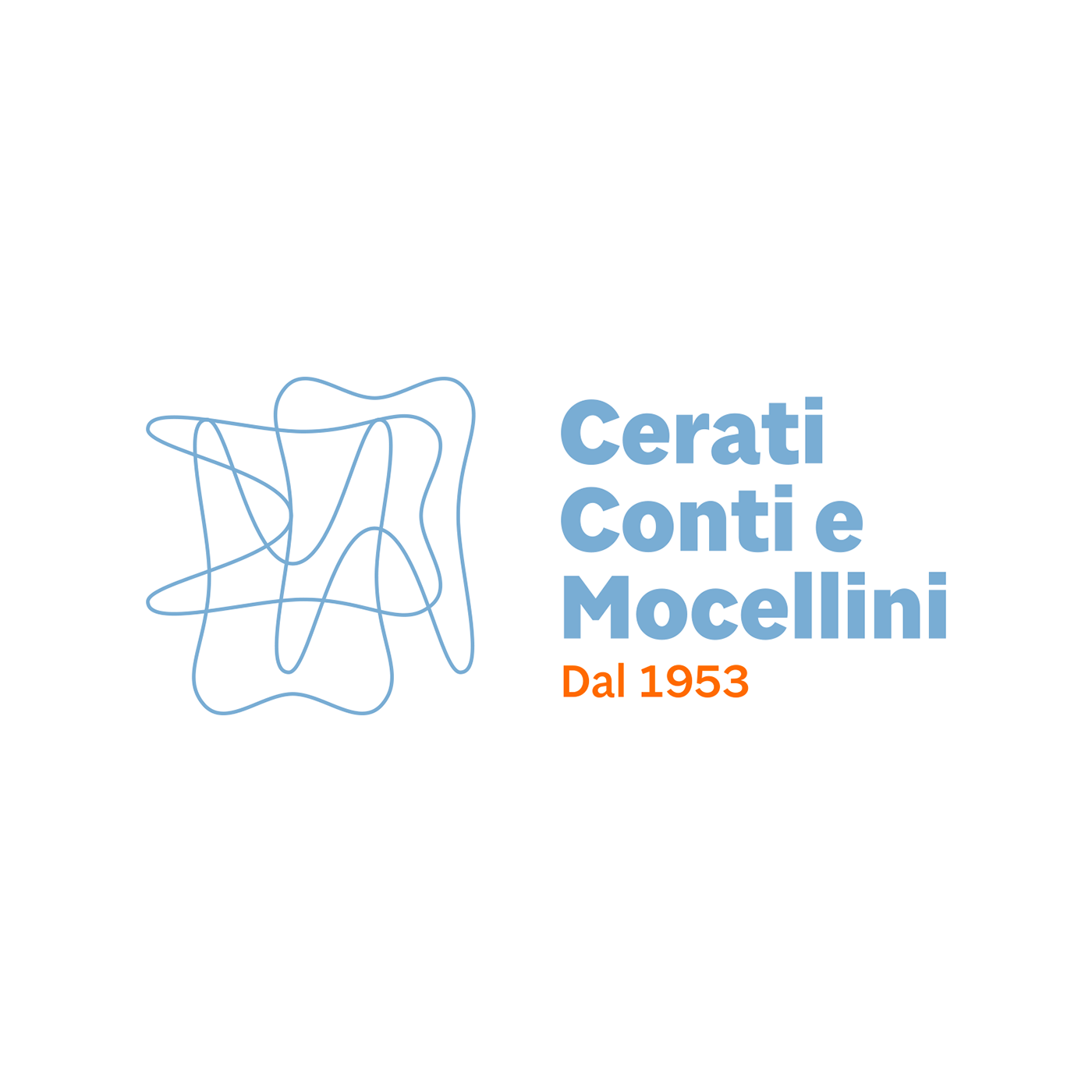
Logo / Horizontal version
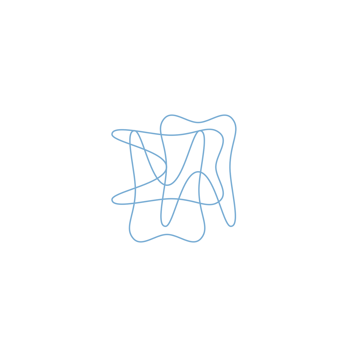
Pictogram
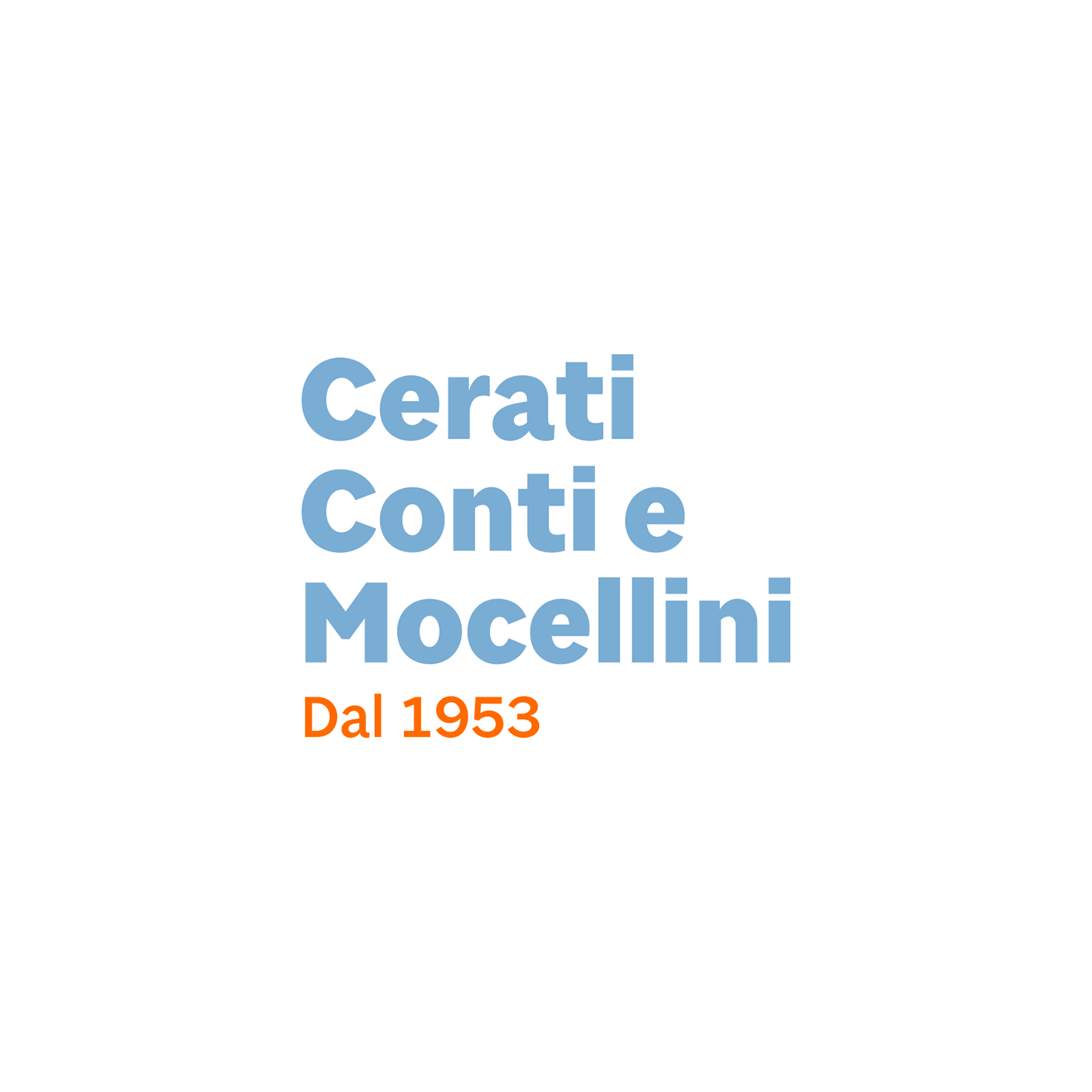
Logotype
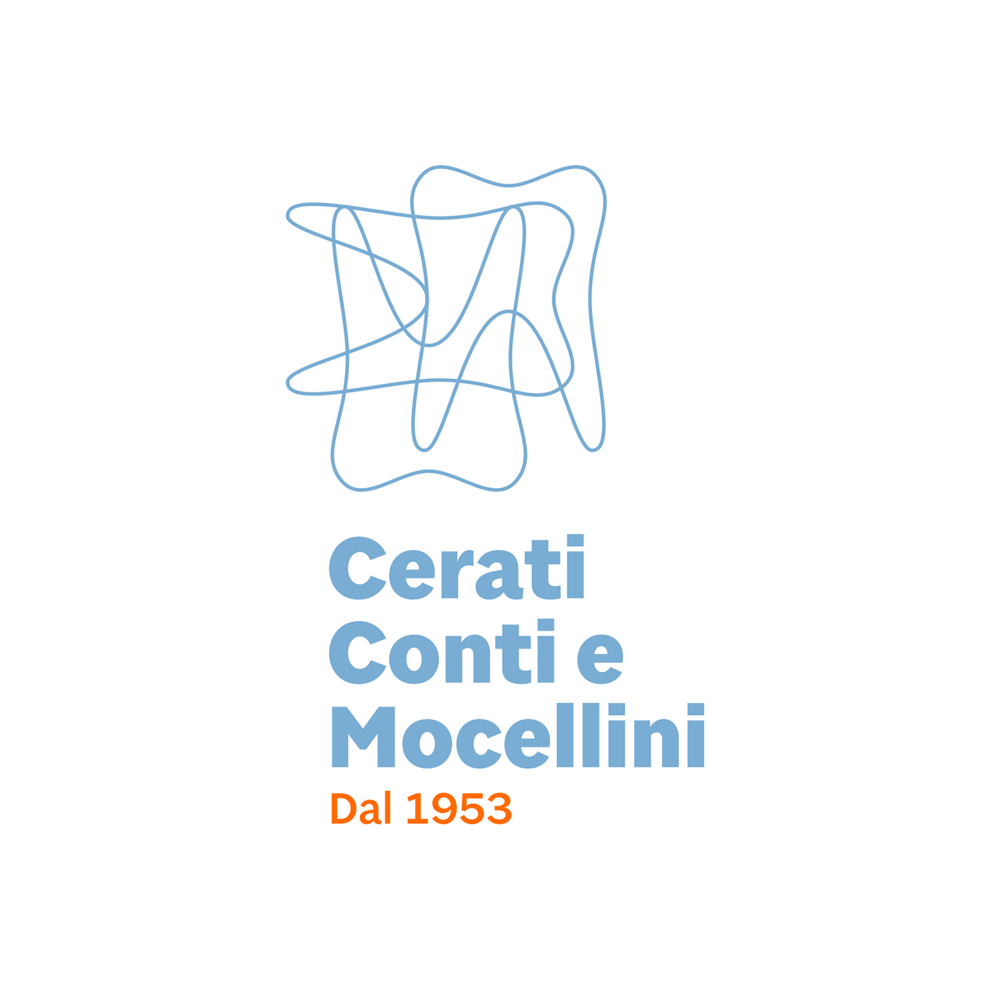
Logo / Vertical version

Pattern
Payoff
Studio Cerati Conti e Mocellini
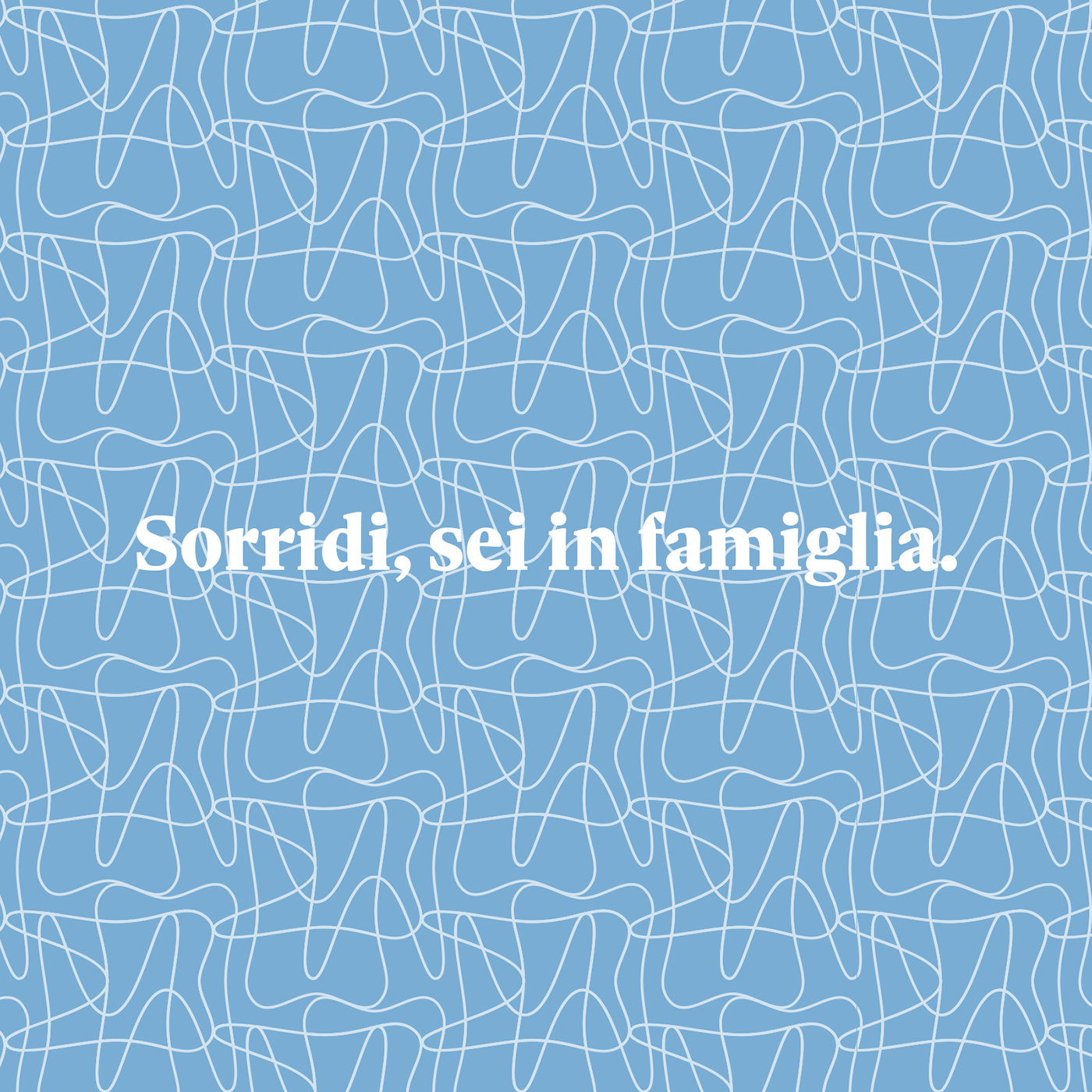
Sorridi, sei in famiglia
The three fundamental values highlighted during the initial workshop were the following ones: the patient is always at the centre, narrative medicine, family atmosphere. From these values, we started to design the new brand identity.
For the pictogram, we started from the first logo the practice had, the silhouette of a tooth. Now there are three crossing silhouettes — the medical practice has 3 surnames in its official name — designed to easily generate a pattern that can be used in different communication materials.
The payoff, short to be easily memorable, contains two elements that are fundamental for the medical practice. The smile, that is at the centre of the practice mission. And a familiar environment, plus the importance of always listening to the clients to guarantee a relaxed climate.
The importance of the family atmosphere also emerges through typography. Sole Sans and Sole Serif, the two typefaces we used, are part of the same typographical family.
The brand has two main colours: blue and orange.


