

From the outset, Diego already had a name for the brand and suggested the use of certain symbols that he wanted to be cointained in the final logo image. After a solid investigation, we became aware of which kinds of signs that were already being adopted in the brewing field and selected the ones that raised a distinct aesthetical impression by conveying the "aura" of the various Diego's personas, while being a multitalented creator himself.
Logotype: I wanted to incorporate a particular type family to this brand new identity, which possessed intriguing pictorial attributes that dialogued with my visual language. It was created by Hendrick Rolandez and it is called GLAMOR.
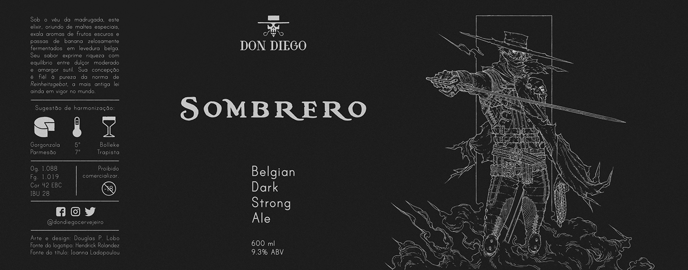
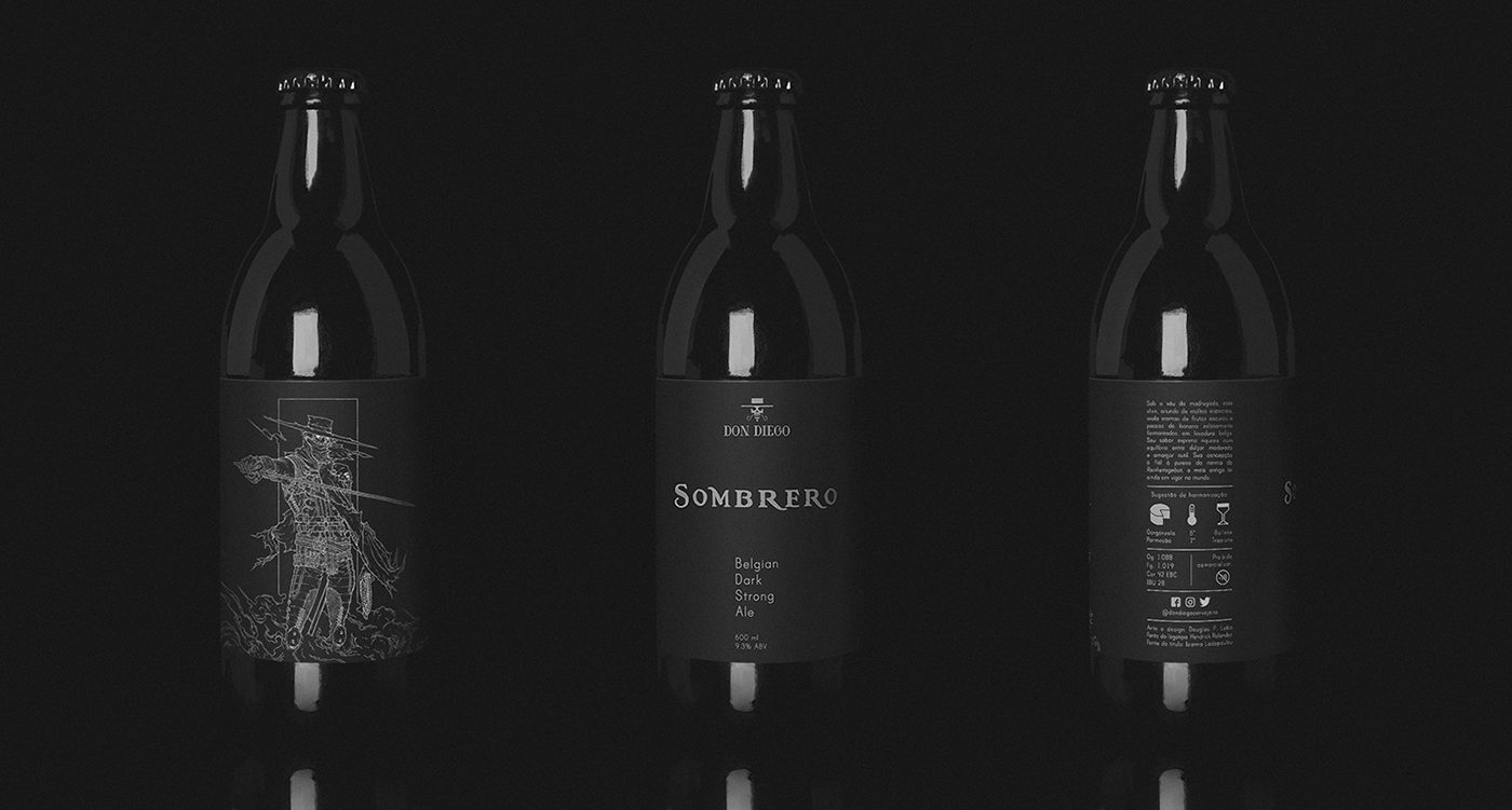
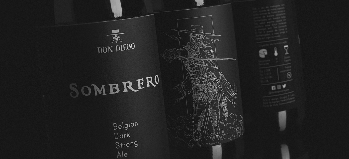
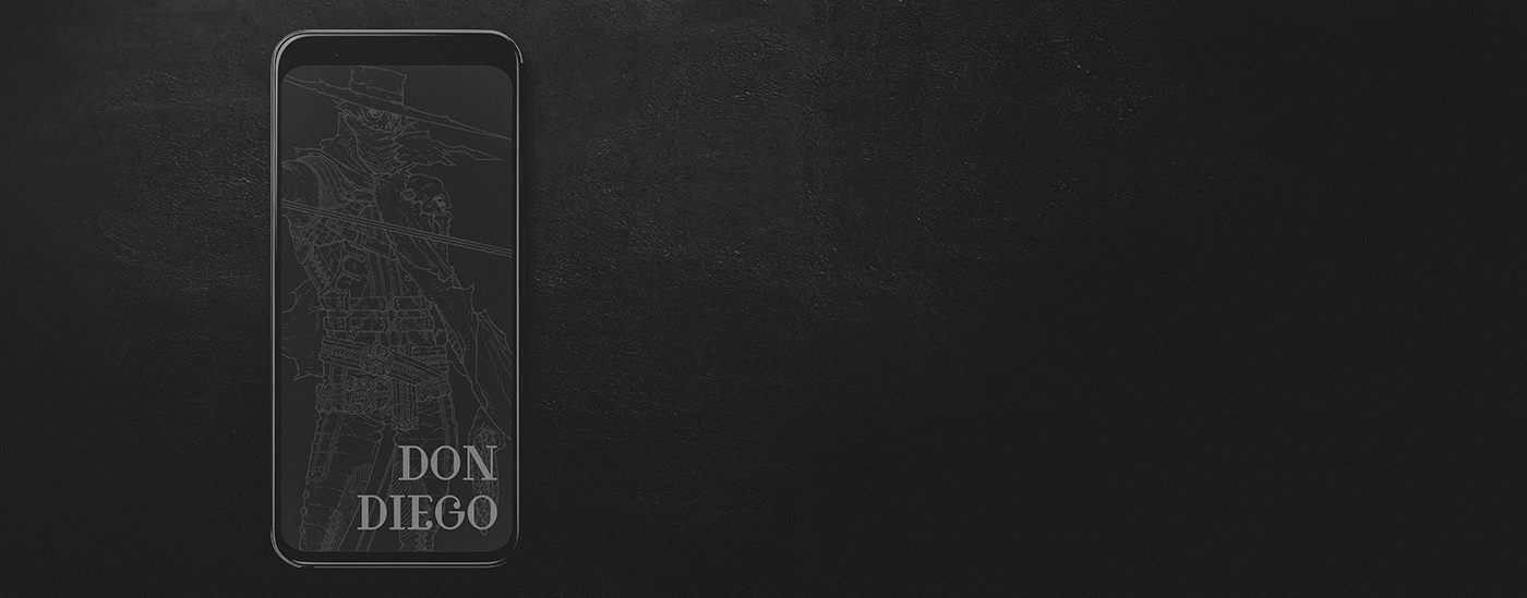
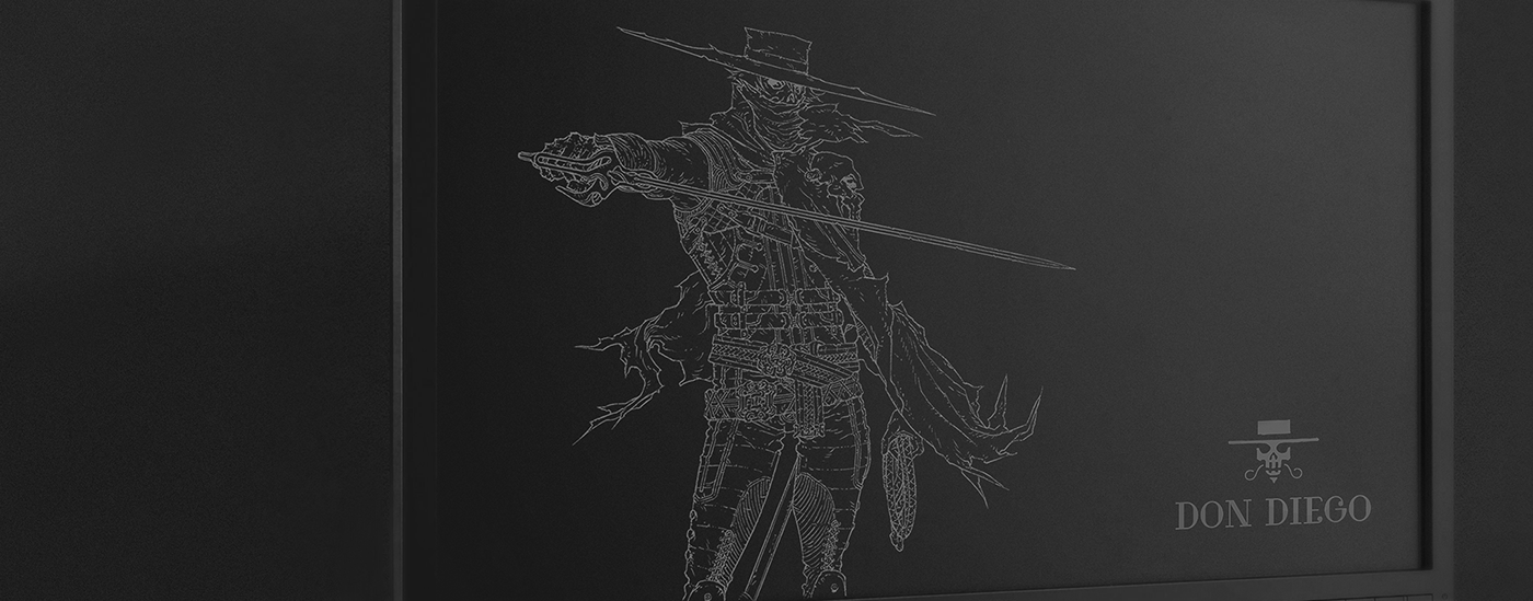
As the elements converged into the visual vocabullary, I adopted illustration techniques based on negative linework over a minimalist empty space in order to evoke the dark fiction theme aspects that would help me translating the brand narrative into graphics. The otherworldly, combatent and mysterious qualities proposed in the concept design establish the obscure ressonance initially intented and convey the idea of strength and dark tonality, which is characteristic of this beverage. The collection of patterns in the costume have its place as an interpretation of the Belgian brewing school, notable for its exploration of different methodologies and the generation of a vastness of flavours.
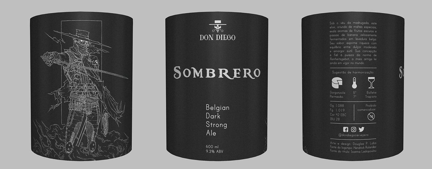
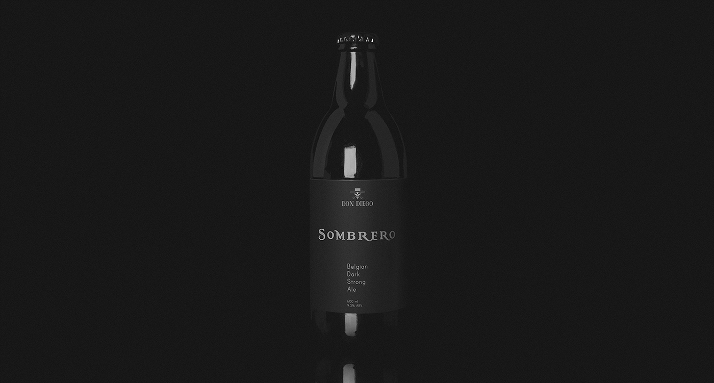
Selection of the name: While researching a word to accommodate the ideas behind the established visual vocabullary, I opted for keeping the brand title's original idiom as the ground for the creative process. "Sombrero" virtually happened as a natural choice throughout the exploration of ideas and it reflects the essence of the overall concepts. The type family that was chosen for the title's depiction is called "Black Pearl" and it was created by Ioanna Ladopoulou. Its particular pictorial characteristics help arousing the notion of artisanal qualities, which are present in the brewing manufacturing process while provoking the subjective notion of something which is forbidden and fascinatting at the same time.
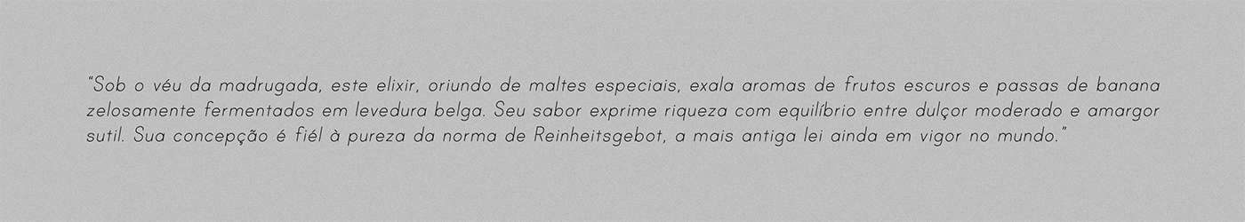
“Under the veil of dawn, this elixir, which comes from special malts, exudes aromas of dark fruits and raisins of banana jealously fermented in Belgian yeast. Its flavor expresses richness with a balance between moderate sweetness and subtle bitterness. Its conception is true to the purity of the Reinheitsgebot standard, the oldest law still in force in the world.”
While formatting the information regarding the qualities of the beverage, I wasn't afraid of aiming the poetics. The family type that was adopted for this section was developed by Jess Latham and it is called "Print Clearly". This type design promotes a palpable reading to the eye and, while arousing contemplative senses, it does not escape its purpose.


Creative Direction, Art Direction, Design and Illustration: Douglas P. Lobo
Type Design: Hendrick Rolandez, Ioanna Ladopoulou and Jess Latham.
Client: Don Diego Cervejeiro


