


ExpertUp
Role: UX/UI Designer
Duration: 8 months
Software: Axure RP, InVision
Purpose
Expertup aims to bridge the gap between the user's knowledge and their expertise. This means that whatever question the user can't find an answer for, they can go to Expertup and ask the community of experts. View prototype
This case study focuses on my process from taking ExpertUp from an idea to a flushed out functioning prototype. I chose to take on ExpertUp because it would emphasize the importance of structure and organization in creating an app that the user will be able to smoothly operate and navigate through. It would feature a wide array of information in different categories.
Feel free to scroll on through! I tried to make my study as short as possible but it still ended up pretty lengthy.
The design thinking process was central to ExpertUp's development.

Empathize
Understanding the User
In order to create a platform that people are interested in using, I needed to understand who the people who would use ExpertUp are and what they need from the app.
This is the basis for User Centered Design, which is based around the user's needs, not the creator's, and what I kept in mind throughout the rest of the process.
At this stage, I wrote and conducted user interviews, surveys and discovered pain points.


Major Insights:
• People felt that search engines are incredibly reliable, although they do fail them from time to time.
• When search engines do fail, they rephrase the question and/or go to another search engine.
• People seek advice for things that they have no experience in. If it's an interest or hobby that they are familiar with, they see no need to look for help with it.
• When search engines do fail, they rephrase the question and/or go to another search engine.
• People seek advice for things that they have no experience in. If it's an interest or hobby that they are familiar with, they see no need to look for help with it.
Define
Clarifying the User Needs
After keeping the insights from the interviews in mind, it was confirmed that people wanted an app that would assist them in their pursuit of whatever information they were lacking.
This led me to create two distinct user personas, John and Nayeli:


Problem Statements
John wants the ability to find a place to go to for advice when his tutorials and google searches fail him.
Nayeli needs a fast and efficient way to find the solution to her problems as she has a lot on her hands.
The next step in the process was creating user journeys to better understand what John and Nayeli would be facing in achieving their goals. They helped define the thought processes and emotions that would occur.


Ideate
Finding Solutions
Before I could start wireframing and prototyping, I needed a blueprint. The blueprint came in the form of user flows. User flows became an incredibly useful tool for me because they define exactly what users like John and Nayeli would need from each screen to execute their goals.


Before the site map could be finalized, I wanted to make sure that it would make sense to most users. I went to Optimal Sort to consult the wisdom of card sorts.
A couple of patterns emerged that caused me to switch up my site map:
• Users preferred Review Onboarding to be in the Profile as well as View Messages.
• The Settings category was all over the place.
• Perhaps Settings and Profile could be combined.
• The Settings category was all over the place.
• Perhaps Settings and Profile could be combined.


Prototype

Crystallizing Solutions
Now the time has come to create prototypes. With all the insights that I have gleaned from rounds of card sorts, interviews, user journeys and user flows, I started to sketch out the screens outlined in the site map screen by screen. Sketches and wireframes had to happen before the prototype.
Using the user flows, I made sure that the main features of ExpertUp could be executed.
The Three Features:
Chat, Browse, and Upload


Test
Evaluating the Results
After creating the low fidelity wireframes, it was time to test it on real people and see how they performed. The goal here is to see if users would be able to navigate through the app, identify pain points where they couldn't, and then rectify them.
I started off with a usability test, gathering two in-person participants and 5 remote.
The results were compiled into an affinity map to identify patterns.
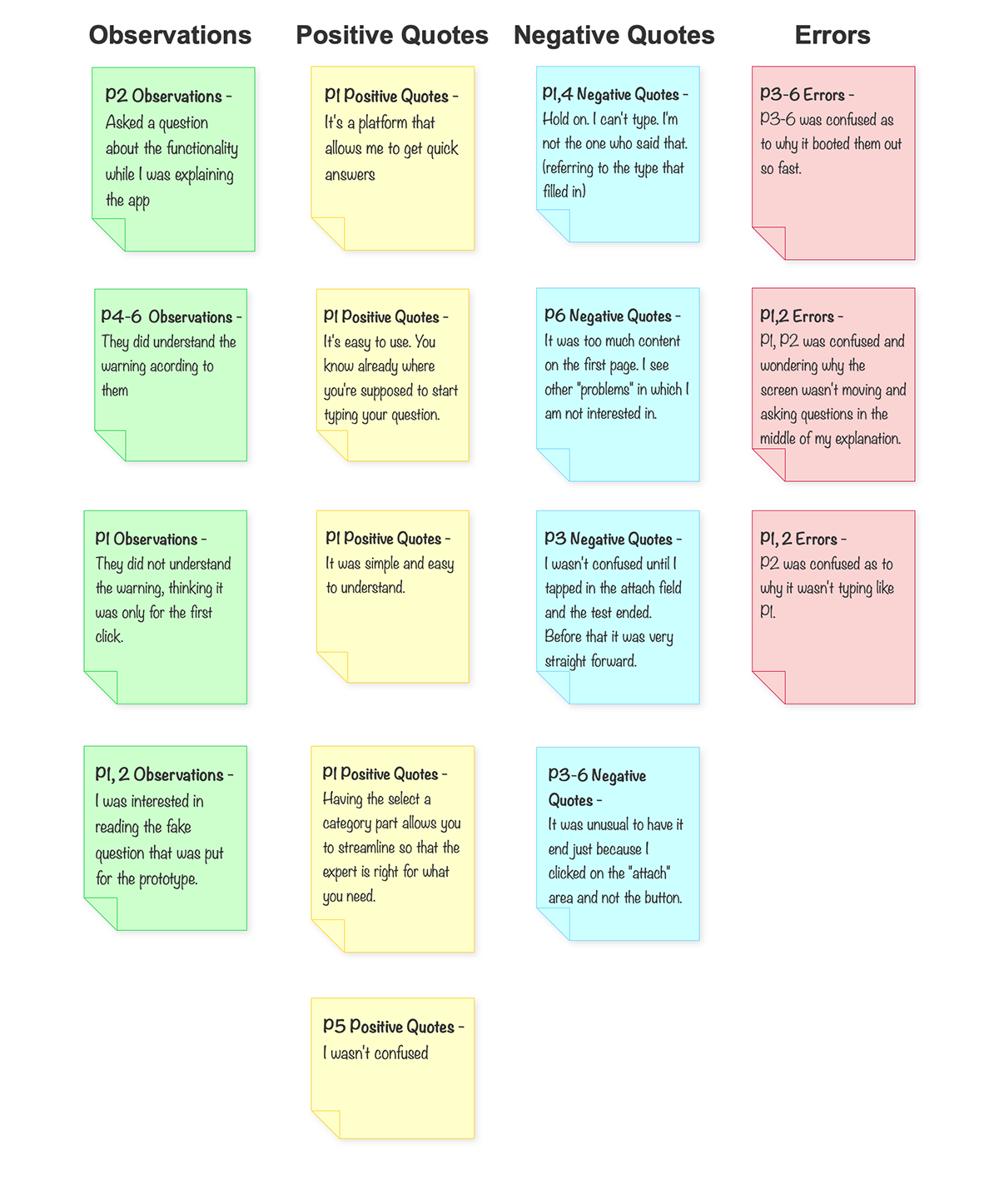
The test results revealed where users where getting confused or stuck, and I used that to refine the layouts of the screens.
I continued to use feedback from users to refine each iteration of my screens.
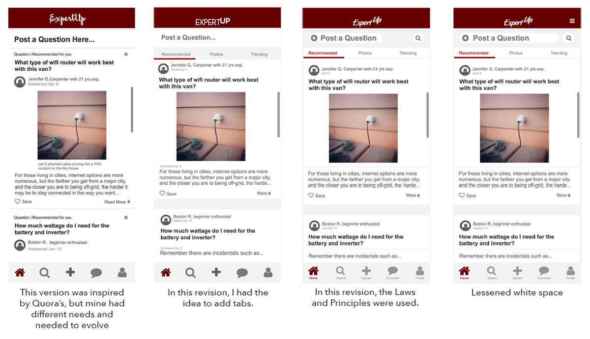
Then, the Laws of Gestalt and Principles of Design were introduced to further improve the screens.
For example, Home evolved:
Upload also evolved.
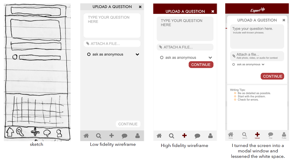
After getting feedback about the white space, I added writing tips and moved the continue button down further.
Style Guide
In order to maintain a level of consistency throughout the design, a style guide was introduced. This would outline the color scheme, the fonts, button styles, and so on. If you noticed in the Home screen's revision, the logo was all over the place! A style guide was much needed.
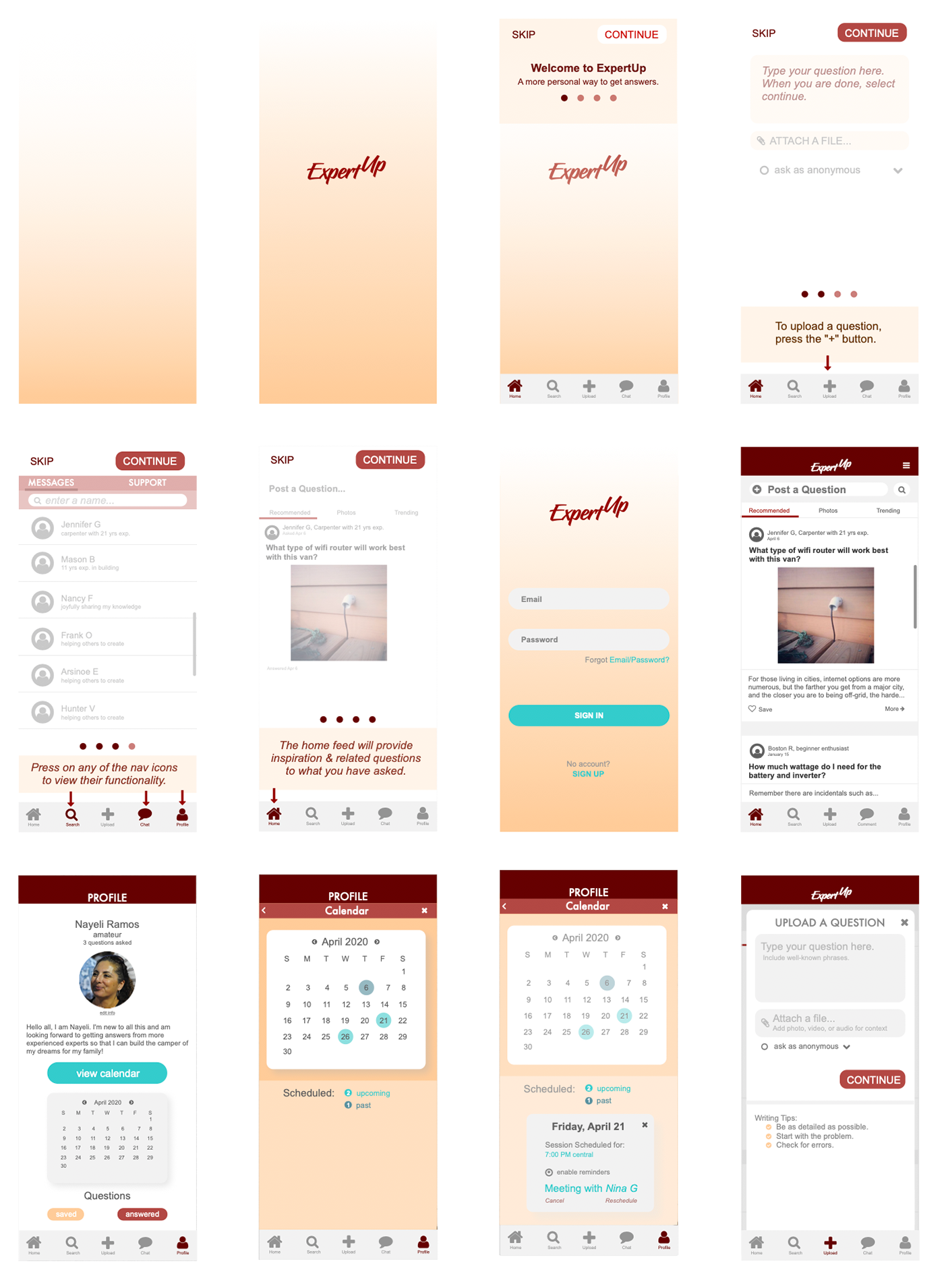
Afterwards, my screens looked like this:
That's it! Overall, I learned a lot about the Design Thinking process and tinkering with many aspects of it helped get my prototype to where it is today.


