A Visitor Health, localizada em Curitiba/PR, procurou-nos para o desafio de ajudarmos na construção da sua marca de acompanhamento remoto de pacientes por App, buscando gerar conexões que representem maior confiabilidade de informação e qualidade de dados nas atividades médicas.
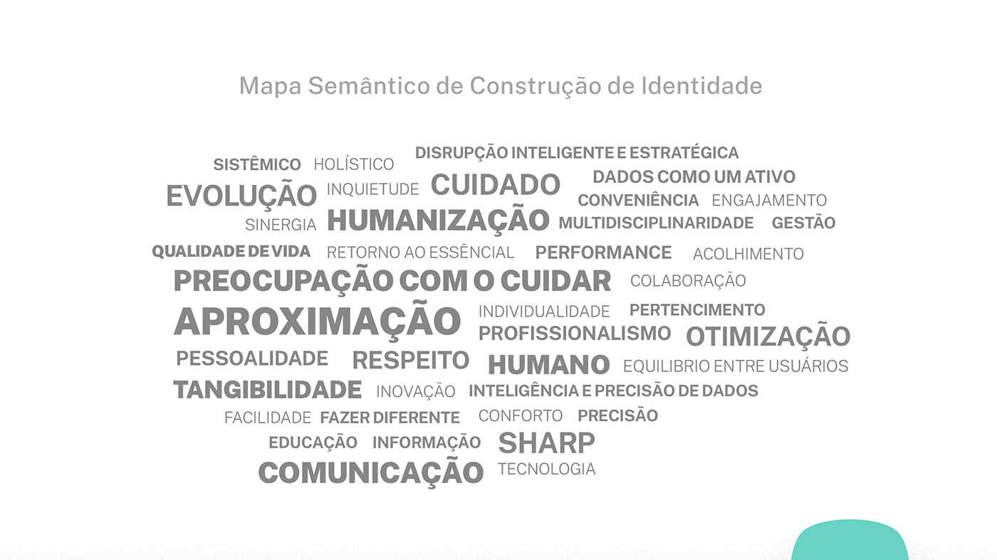
Desde o início do processo de escavação da identidade, ficou evidente o caráter disruptivo da proposta quanto à finalidade de fazer da tecnologia o caminho para inovar em prol de uma comunicação médico/paciente que valorize o humano na essência da medicina!
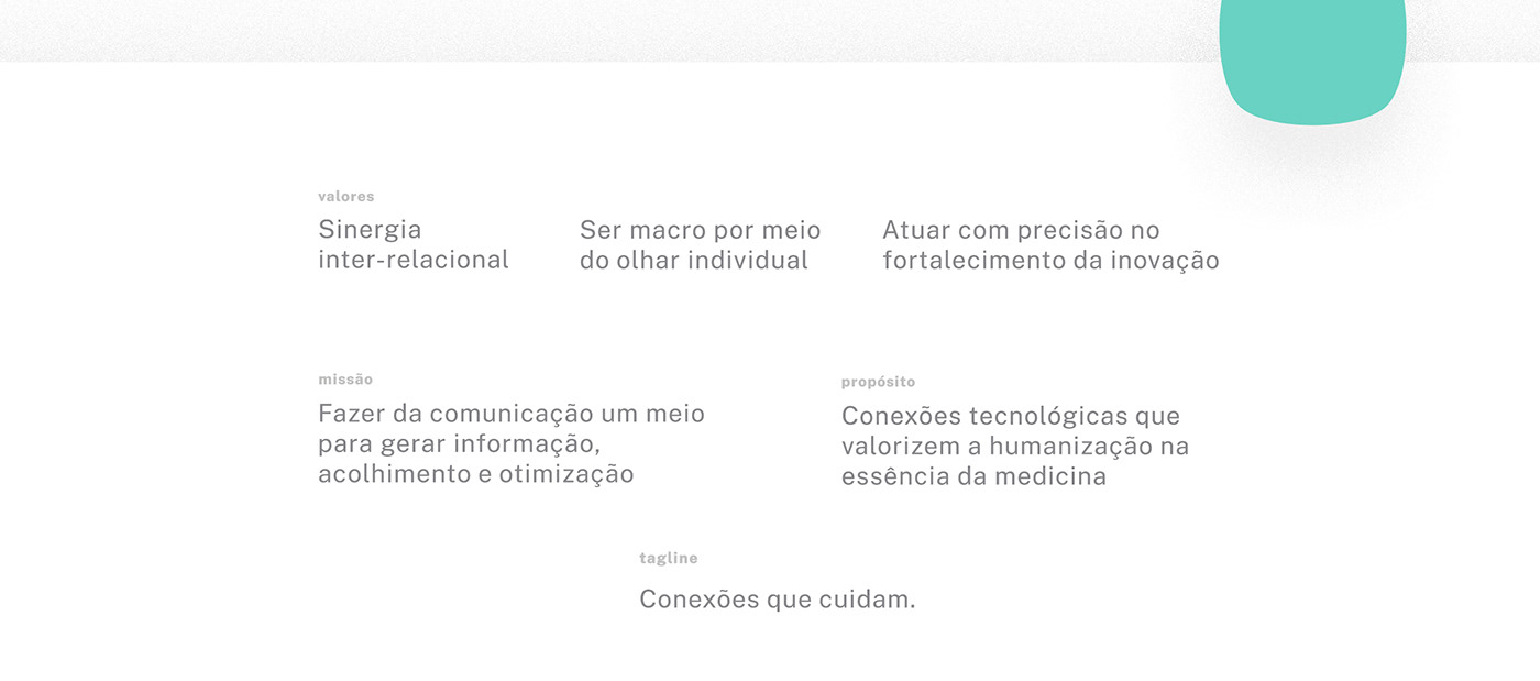
O caminho de definição do posicionamento da marca foi enaltecendo exatamente o acolhimento e otimização que sustentam o conceito: Aproximando realidades à medicina! E na tagline que acompanha a marca sintetizamos para: Conexões que cuidam!
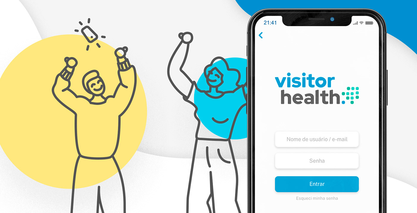
A solução visual, permeada de cores e personagens, veio para defender toda a essência humanizada, mas ainda transpondo mais uma necessidade primordial da marca, fazer-se amigável, leve, empática, fluída e positiva, para que os usuários enxerguem o App como um verdadeiro “diário de saúde” em que se sentem motivados e à vontade para confidenciarem suas rotinas e possíveis sintomas.
Nesse projeto atuamos:
• Identidade corporativa;
• Logotipo e identidade visual;
• Tagline e manifesto;
• Posicionamento conceitual;
• Planejamento de ativação do marketing;
• Gestão da comunicação;
• Identidade corporativa;
• Logotipo e identidade visual;
• Tagline e manifesto;
• Posicionamento conceitual;
• Planejamento de ativação do marketing;
• Gestão da comunicação;
----------------------------------------------------------
Visitor Health, located in Curitiba / PR, approached us for the challenge of helping to build its brand of remote monitoring of patients by application, seeking to generate connections that represent greater information and quality of data in medical activities.
Since the beginning of the process of excavating the identity, the disruptive character of the proposal was evident, regarding the use of technology or the way to innovate in favor of medical / patient communication that values the human essence of medicine!
The path of defining the brand positioning was praising exactly the welcoming and optimization that support the concept: Bringing realities to medicine! And for the tagline that accompanies the brand we synthesize: Connections that care!
The visual solution, permeated with colors and characters, came to defend all the humanized essence, but still transposing yet another primordial need of the brand, to make itself friendly, light, empathic, fluid and positive, so that the users could see the App as a true “health diary” in which they feel motivated and at ease to confide in their routines and possible symptoms.
In this project we were responsible of:
• Construction of corporate identity;
• Brand positioning;
• Branding, logo and identity design;
• Marketing activation planning;
• Continuous communication management;
• Construction of corporate identity;
• Brand positioning;
• Branding, logo and identity design;
• Marketing activation planning;
• Continuous communication management;