UI/UX Design to a college intranet


Details:
UX Design process:
I don’t completely agree with the illustrated UX Design process. If you identify that the fifth step has a good response from those users testing the product and that it only has minor changes that have to be looked over again, it’s a good process. But when the feedback from those users is negative, it’s essential to go back to your analysis. Going over to the second step is extremely important when the rating from your products is lower than expected because probably something is not matching up. Maybe you mistook a piece of information or didn’t look over something that you should’ve (these things happen with everyone, we are human after all). But, independently of what happened, it’s important to take a step back, go through your material again and identify what is causing the disturbance.
UX Research
Methods: I would do qualitative research and behavioral research. By choosing these methods I can understand better how my persona actually acts and thinks on a daily basis, and which of their problems can be solved via the intranet.
Tools: Forms, interviews, questionnaires, and attendance of their online classes.
Deliverables: Important documentation of our user target, such as their routine, habits, hobbies, likes and dislikes, and so on;
Analysis
Methods: Since I have unlimited time to deliver the project, I would take my time to organize and categorize all the data. Thinking that my database is composed of texts and audiovisual material, I would read and watch everything collected, identifying patterns that can be described as the user’s pain and gain points.
Tools: To help me organize all the material and steps that this phase requires, I would use a kanban platform, such as Trello or Pro-Tarefa. For the data in text format, I like to use Microsoft Word and, if available, I would like to use a software that helps to identify patterns in writing. And lastly, I would like to use a phonology software, such as Praat, to analyze the user’s pitch, alongside their facial and corporal expression.
Deliverables: A well-defined persona, with their pain, gain and motivation understood.
Design
Methods: Creation of sketches and wireframes; Definition of what the project requires based on the Brand Voice: color chart, typography, images, iconography…
Tools: Papers, pencils, pens, Adobe Color, open-source images or images sent by the client, Figma and/or Illustrator (probably Figma since I have little knowledge of Illustrator).
Deliverables: A dossier of everything that will compose the intranet, along with the sketches and wireframes.
Prototyping
Methods: With the dossier and wireframe approved by the client, I would start with the creation of the screens. Here I would like to divide into two deliverables: the first one being a low fidelity prototype and, it being approved, I would start to transform those screens into a high fidelity prototype. Through all the process, I would apply Nielsen's heuristics, combined with accessibility and UX principles.
Tools: Figma and/or Illustrator.
Deliverables: Low and high fidelity prototypes.
User testing
Methods: Usage of some software that allows users to navigate through the prototypes and give feedback.
Tools: Userbrain, UsabilityHub, Loop11…
Deliverables: Feedback from users about design, responsivity, usability, and accessibility.
I used my friends and I (college students), and my father (a federal employee at IFRR) as reference users.
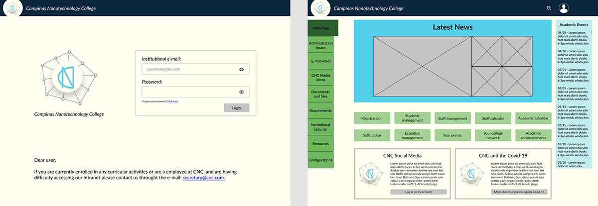
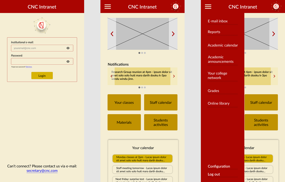
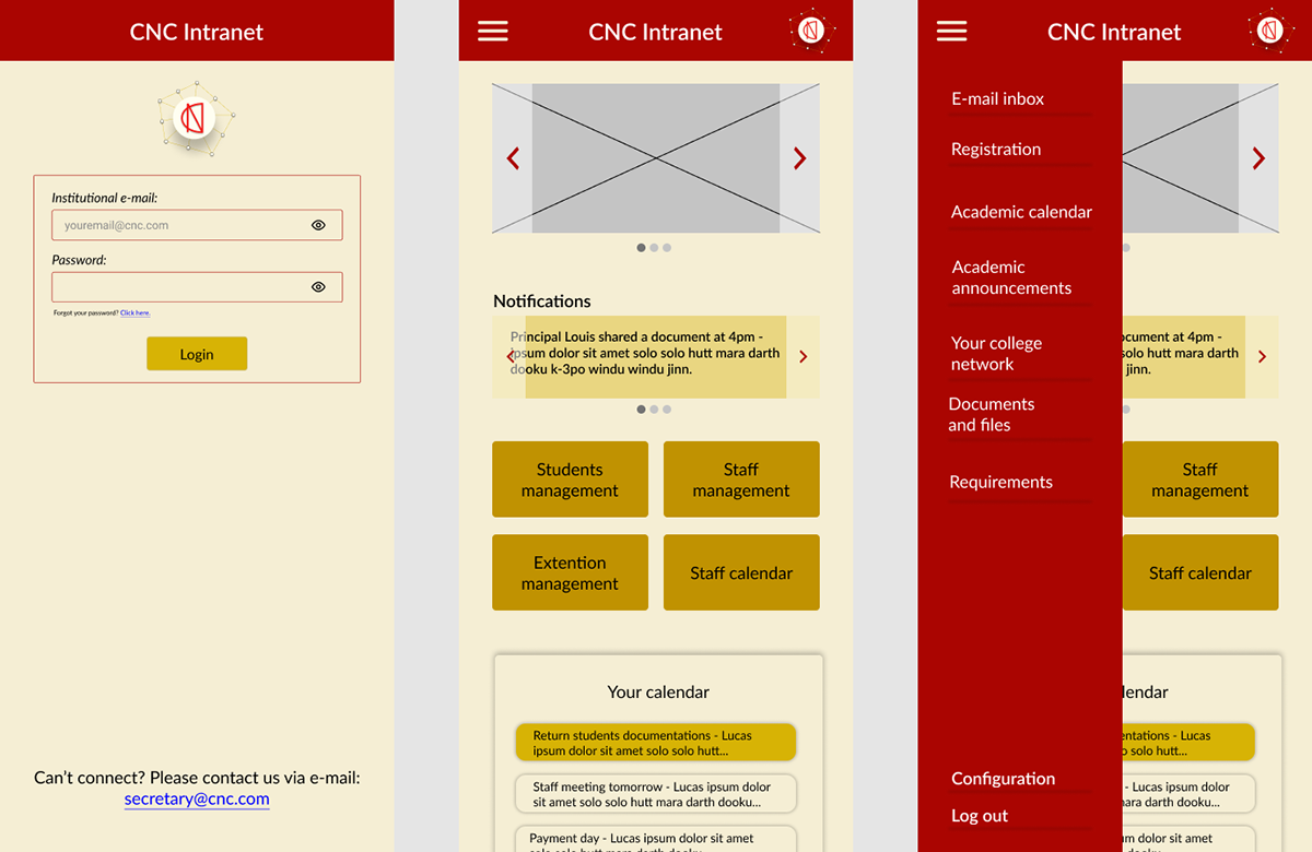
Each “main page” was specifically made to match users' profiles: students, professors, and administrative staff.
I started by choosing the palette colors and which buttons each user would need.
Palette color: we often see blue/green and red palettes associated with teaching institutions, that’s because blue enhances creativity and alertness, green has a calming effect and red is stimulating and spurs action.
I used UFSCar and IFRR’s “Siga” and “AVA” as a guide. I based my decisions on the patterns that I found on the websites.
So, first, I placed the side buttons to see how they would fit in the screen's grid. Then I proceeded to resolve the first problem: the bulletin board.
The idea of the “Latest news” is to broadcast any and all information posted by the professors and administrative staff, replacing the bulletin board. I also thought that it could work as a college journal, sharing news about the CNC.
Next, I added the “Academic Events”. Because I always felt the need to have easy access to the academic calendar without having to make a 5 minutes route to get to it and I think it would solve this problem: I would always know if there was something important by just looking at the “Main Page”. And added the buttons:
Students:
College classes that the students are enrolled at;
Shared materials between classmates and professors;
Activities to be delivered;
Personal notes that they can write for themselves;
Their grades;
Their events, that would work as a planner;
Their currently extracurricular activities;
Their college network;
Access to the complete academic calendar;
Academic announcements.
Professors:
The classes they give;
The materials they are sharing;
The activities that they pass to their students;
Personal notes that they can write for themselves;
Their students’ grades;
Their events, that would work as a planner;
The internal staff calendar;
Their college network;
Access to the complete academic calendar;
Academic announcements.
Administrative staff:
Registration;
Solicitation;
Student management;
Extension management;
Staff management;
Their events, that would work as a planner;
The internal staff calendar;
Their college network;
Access to the complete academic calendar;
Academic announcements.
The side buttons contemplate the administrative notifications and configuration options.
I also added the “Covid policies” and “CNC Social Media” for easy access (the social media option could work like an internal facebook where everybody can socialize, and this social media composes their college network button).
The main difference between the desktop website and the smartphone application is that, in the smartphone, you have a notifications carousel, fewer buttons on the “Main page” and a calendar that shows you your appointments and is programmed to change colors when the date is near.
Overall, about the space decisions that I made, based on everything that I know about UX, I tried to make the screens as intuitive and cognitive accessible as possible, voting for a cleaner design: without too many distractions, so the users can do what they want the easiest way possible.


