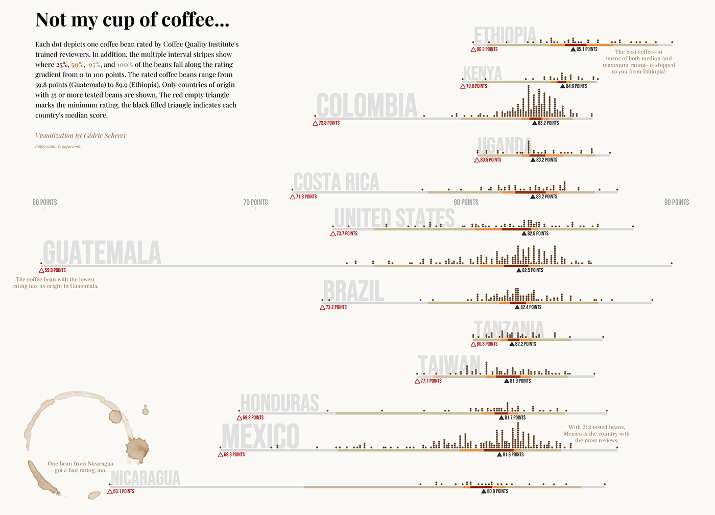
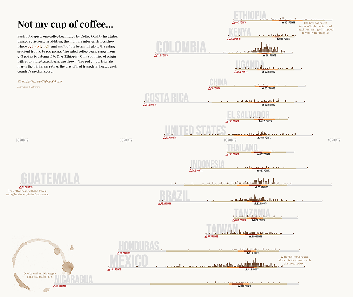
Coffee Ratings per Country
The visualization shows the distribution of coffee bean ratings by the Coffee Quality Institute for countries with 25 or more reviews (up to 2018). Distributions are shown as dot plots and multiple interval stripes. The chart highlights that
the median and highscore per country are quite similar but the score of the worst coffee beans differs a lot.
The visualization was featured on "Bean Poet" together
with an interview about the project and my person ☕
with an interview about the project and my person ☕
... and selected by Andy Kirk as one of the
"Best of the DataVisualization Web" in September 2020🏅
"Best of the DataVisualization Web" in September 2020🏅
Tool: ggplot2 in R
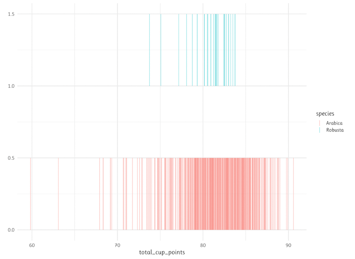
Data: Coffee Quality Database
Data: Coffee Quality Database
Project: Challenge contribution to #TidyTuesday
Details


Extended Version
Design Process
Code

Thank you for your visit and enjoy your coffee ☕


