Riding Service: I decided to create a project for a car ride service. While I did create the design, the focus of this project is on the UX Writing. The case study is below.
Case Study:
There are a lot of car riding services around the world, so in creating this, I thought of what could be made different. In this project, Nigeria, Benin, and other West African countries were used as a location to figure out what the users would want, why they'd want it, and what can be done to make them use it. This is where I decided to create a statement. "Makes your movement swift and relaxing," is the best way to make the user feel relaxed. This tells them that the riding service is going to be swift and relaxing, unlike what they are used to. The button then goes on to tell them what to do next in a simple manner. Instead of saying, "next," I decided to tell the user what to expect next.

Title page.
Now, what else can be done to keep the user from leaving after getting to the next page? You can easily tell them to sign up, or tell them why they need to sign up without divulging much and also keeping the copy clean and concise. I went for the latter.
The user wants to sign up to a service they can trust, and at the same time, wants to know what makes this service different.This is where I write in two sentences why they need to sign up because signing up = accessing the service. But a question remains, what kind of feature can be found here, that others do not have?
(The Name, Number, and Password tables are labeled to make the experience easy for the user. This shows the user what each one is for. The picture below also shows what kind of password is needed. From that, the user can get an idea of why they need a strong password.)

Sign up page.
Every user wants to feel safe in an app, thus welcoming them is an important thing to do. Now, adding an illustration is my own way of telling the user, "this is run by humans, not a robot." Also, telling the user what to do in case they encounter a problem also reminds them that humans are running everything and they are safe. This makes them to click on the button, which shows that, "yes, it's time to book that ride."
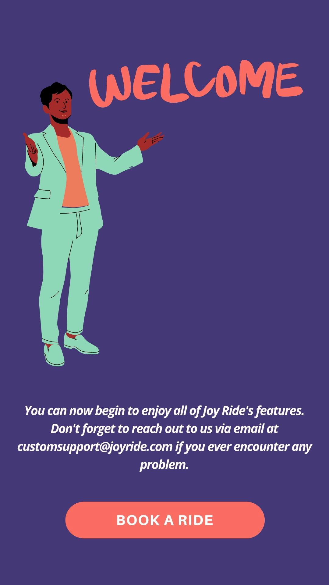
Welcome page.
"Input your destination here," asks the user in a short sentence, "where are you going?" This helps the user to begin a search on the map.
Earlier on I mentioned West Africa because a lot of riders have to direct their drivers to their pick up location and to their destination, and I had mentioned a feature that required the user to sign up. This is where the user wants to know everything, and when you have little space, being concise but helpful is important.
From the picture, the user knows that the driver won't call them all the time just to get to their location, this also means that the user doesn't have to worry much about getting into the wrong vehicle because the driver knows to inform the user on getting to the exact location.
This does everything to keep the user at ease. But all these can happen only when the user confirms their ride with the button. So what if they don't want to ride? They can always exit the app until the next time they want to use it.

Confirmation page.
A video below:
