Case study
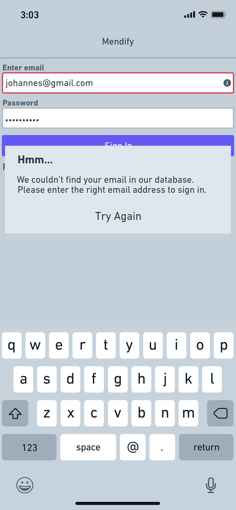
A returning user about to sign in to an app enters the wrong email address. The first thing the user sees is the red line on the email text field, then the popup, telling them about the error the app encountered during the process.
- The idea behind the error message.
The first word the user comes across is hmm in bold letters. Unlike the generic "incorrect email/invalid email," the former eases the user because it is different. How often do you come across 'hmm' in error messages?
After easing in the user, the following words tell the user the reason for the error. At first, I went for 'Sorry, your email doesn't exist,' but I realized that maybe the email does exist for the user, except that it isn't the email they used in signing up. So thinking of the next words carefully, I understood that the user only entered an email address that doesn't exist in the app's database. Which brought about '...find your email in our database.' This lets the user know that while the email address they entered might work elsewhere, it is different here.
The next step is to tell the user what they should do. And 'please enter the right email address to sign in' does it.
And the final step is to implore the user to try again. It's concise yet understandable.
Every word lets the user know what to do. While writing error messages can be tricky, it is helpful to think about how users feel when they receive an error message. How do you intend to let them know the cause of the error? Or can they still sign in once they put in their correct details? It is important to know who your users are and, if possible, put yourself in their shoes.