For the past few months, I worked on the content design of a ride-hailing service called Beninfy, researching the potential customers (university students and tourists) and using the insights received to address pain points, factoring in their ages and what they want to see.
CASE STUDY.
Uber, Bolt, Rida, Indriver; there are many ride-hailing services out there. But for Beninfy, whose customers are primarily university students and tourists in Benin republic, the only competition is 'GoZem.'
A look at the competitors revealed two things: Beninfy's potential customers do not use it because of its user experience. And, when they do, it is limited in several ways.
A look at the competitors revealed two things: Beninfy's potential customers do not use it because of its user experience. And, when they do, it is limited in several ways.
As stated earlier, to begin, I conducted research, and it revealed that users want a seamless experience in simple language. Which leads to every decision taken.
From the first screen: After verifying their phone numbers, users can select their pickup location when visiting the application. The microcopy here, "Confirm Pickup Location," is for them to confirm where the driver has to meet them.
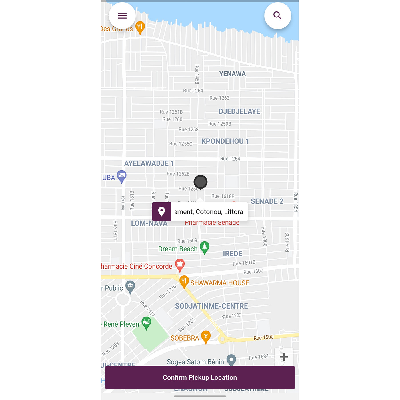
Home screen.
After confirming their destination, users then select a time for the pickup. Unlike other ride-hailing services where a confirmation automatically selects a driver, the content design lets the user choose a time under the same day. Insights show that the customer base accepts this booking form due to its flexibility.
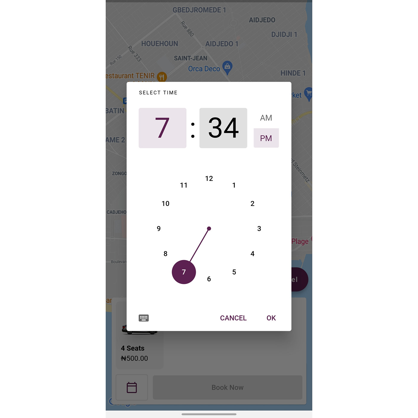
Booking a ride.
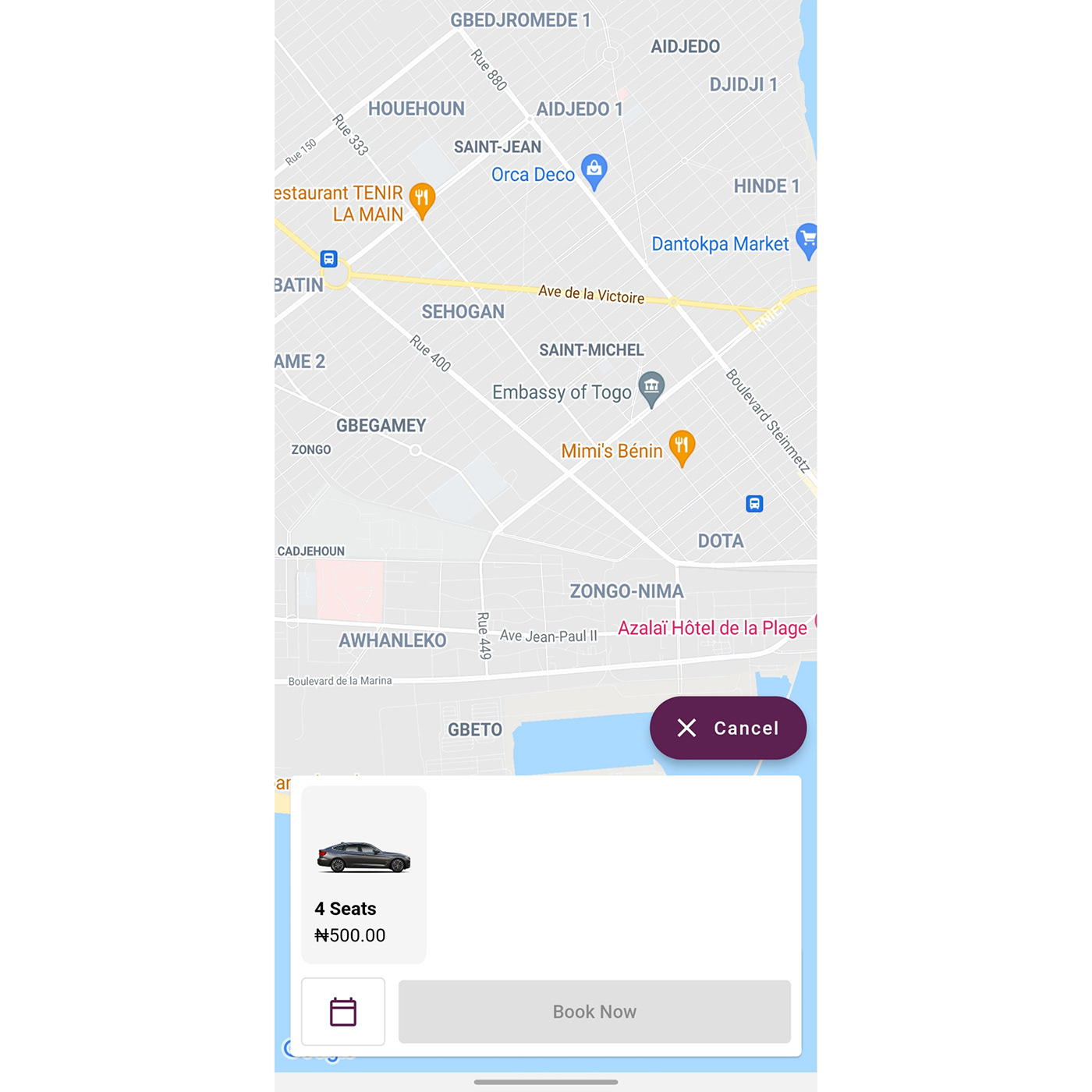
"Book now" lets the user know they are good to go. It is concise and has no underlying message to it. There is also a cancel button if users decide against booking a ride. This screen works for the user and doesn't force them to determine their rides immediately.
We implemented the "Wallet" screen to allow users to add funds. As the customer base is mainly Nigerian, and many of them would rather pay directly from their bank accounts instead of using cash, the screen creates activities based on the funds added by a user.
It also has a button titled "Add Funds," a CTA. At first, it read, "Add Credit," but credit doesn't do justice to the action required of the user. With the definition of what credit means, and after speaking to a few stakeholders, funds felt appropriate. (But the image in this case study uses 'credit')
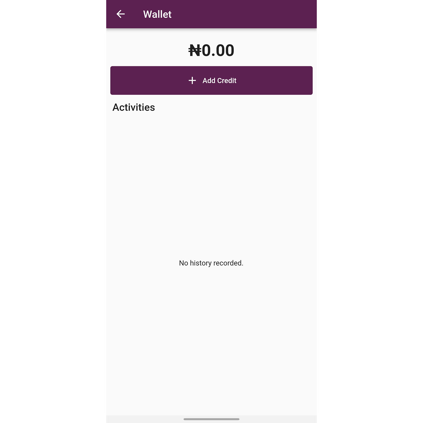
Wallet Screen.
Below, I highlighted the decisions involved in some microcopy:
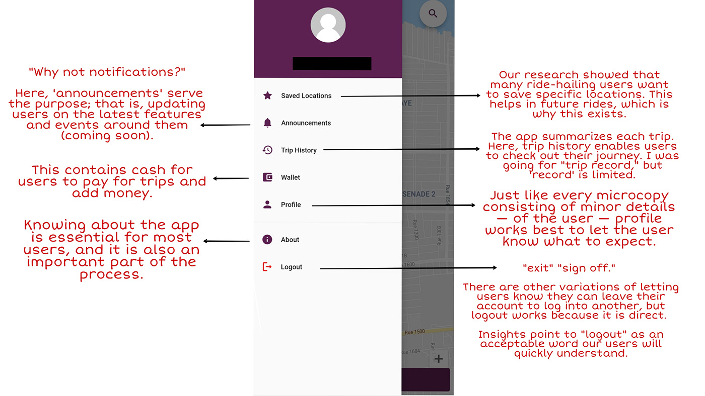
Menu.
Problems Faced:
A significant hiccup to this process was the lack of collaboration from the designers/developers, leading to so many copies not getting implemented. It not only made it stressful but locked me out of the entire process. And as the only UX Writer on the team, I did my best to ensure the proper placement of buttons correctly and make sure the microcopy turned out well, documenting user flows, carrying out user testing, and implementing the changes across.
Take Away:
It is always important to know who you are writing for and how your copy works for them. Also, it is more than the microcopy you write; it is also in knowing how to place them for accessibility to ease the users' experience.
For example, the wrong placement of a CTA can make understanding what is on-screen hard.
