A company is looking to sell a new product in a new market to a foreign community that isn't familiar with the product and does not speak English. For this case study, I'll design a landing page's hero section that highlights and solves this user problem. I'll also create copy that communicates what the business is trying to sell to this community and account for the English-speaking residents who may also be interested in the product. Then, a pricing page that sells services for two classes of people; middle and upper class. The goal is to increase conversion and purchase rates with good UX writing.
...
The company, NIBdy, used for this task doesn’t exist. So to begin, I thought of the new tech product NIBdy wants to offer and went with a watch designed for the heart and French as the language of this community.
Below, I map out some things to know before the UX Writing begins.
The Problem
NIBdy is trying to sell the NIBdy watch to a community that doesn’t understand English or know about the watch. This is a problem because NIBdy wants members of this community to buy the watch and has to ensure they understand.
Who the targeted users are
1. French speakers
2. Millenials + Boomers
3. People with heart conditions
4. Fitness users

What they want
1. Not be bothered about visiting the hospital for checkups.
2. An easy way to check their stress levels.
3. Knowing their heart rhythm.
Pain points
1. Lack of heart rate monitor.
2. Exorbitant test fees.
3. Lack of access to a doctor at a go.
4. High-stress levels.
Defining the tone of voice
To begin, I tried to define the tone of voice. The tone of voice is important because it either makes or breaks the copy and sends the user away. So I went with a conversational, informative, trustworthy tone.
It’s important for the user to feel a human was/is behind the scenes and not a robot. This helps in creating a sense of familiarity.
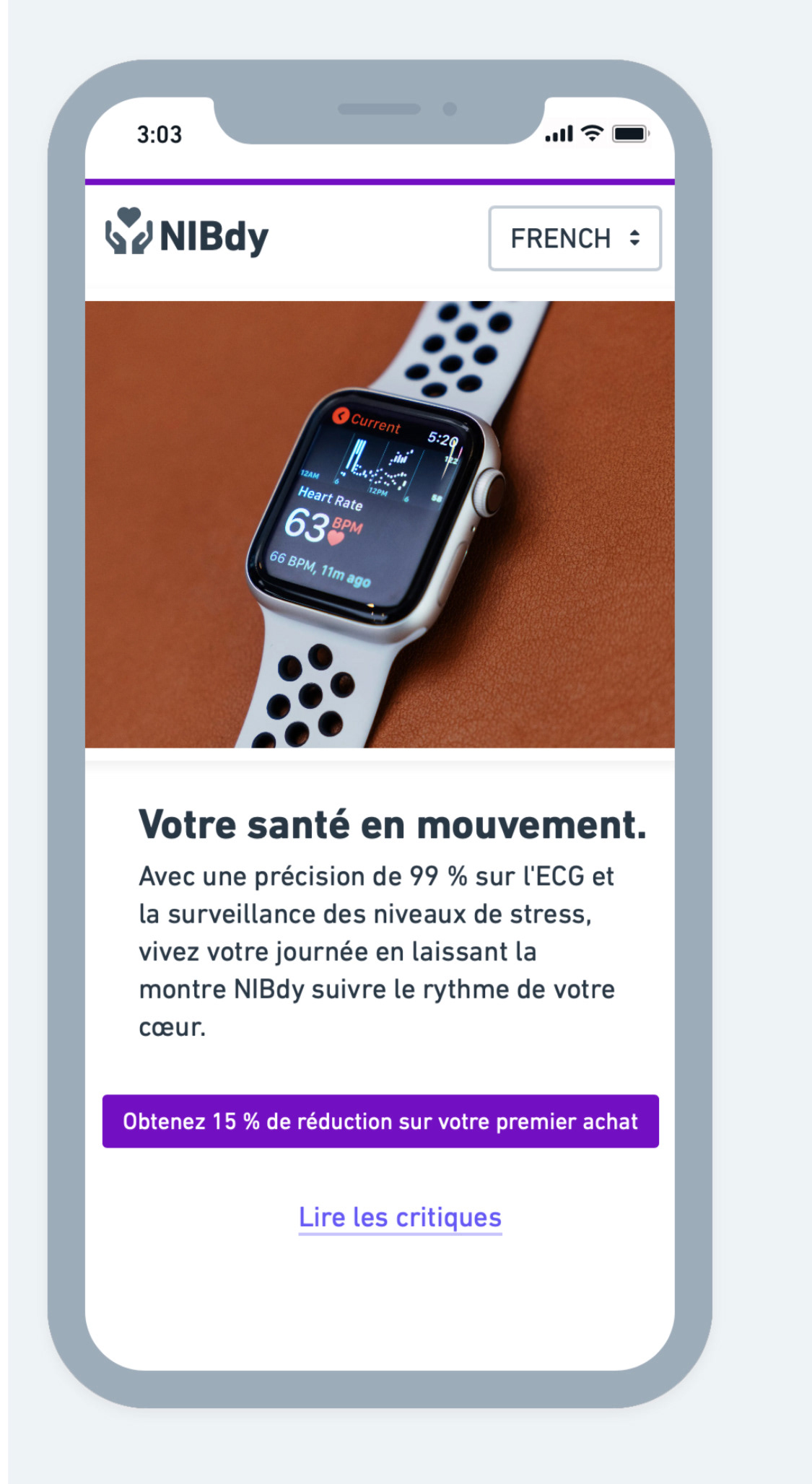
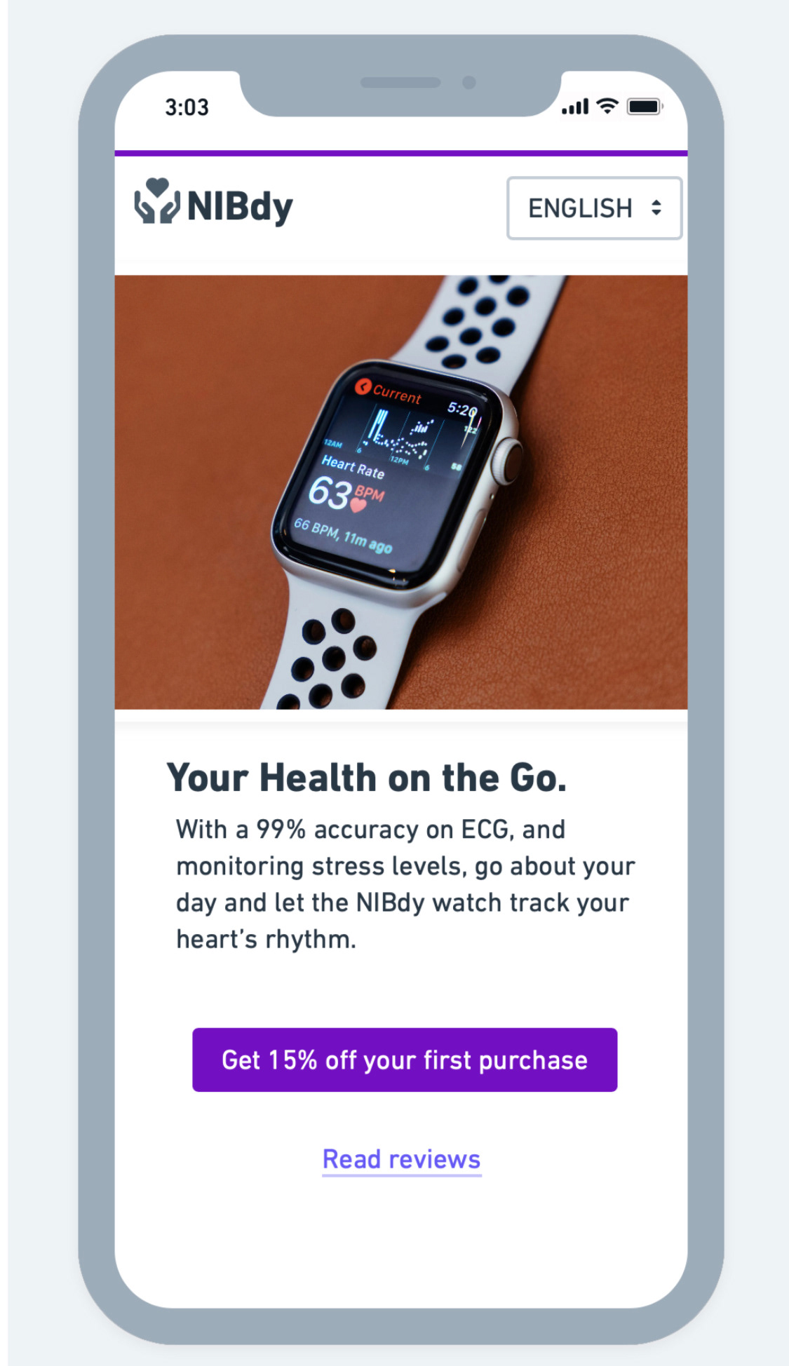
Hero Section: To begin the hero section, I created a headline showing what NIBdy has to offer. This is important as it’s the first thing the user sees, and we want to pique their interest immediately.
Together with the image, the headline, “Your Health on the GO”, tells the user what NIBdy has to offer: A health watch.
The sub-heading that follows introduces the user to the product, gives a little background to the watch, and also tries to get them to trust the brand.
In the final part, the Call-to-Action not only tells the customer what to do next but gives them a reason to click on the button by mentioning a “15% off”. Users also need to know what other people think about the product, which helps them make an informed decision.
As NIBdy is in a French-speaking community, there is a dropdown above to give control to the user on the language they’d like to read from. This helps non-French speakers in the community too.

French look at the hero section

English look at the hero section
Pricing Page
The pricing page begins with a headline that reminds the user about the discount they get on their first purchase. This, together with the sub-heading, keeps the user on the page.
This page is for two classes of people; the middle and upper classes. So how do you give each category a NIBdy watch while making the features slightly different?
To do this, I outlined the features of the cheaper one and named it “standard”, and outlined that of the “premium” while adding extra features to it. The extra features on the premium are not an exact necessity but provide ease of use. And this ease of use is why people with the means to get it will go for it.
The call-to-action, “Buy it now”, was used in place of “Buy now” because I wanted the user to follow through and not be unsure what to do.
The difference in layout between the French and English pages is because the French translation requires more words, which requires more space.
“You can do more with NIBdy on your wrist” is a closing phrase that also adds a bit of a nudge in letting the user make an informed decision, which has a chance of driving up the purchase rate. In a further iteration, “3000 + users do more with NIBdy on their wrist” is another way of getting the user interested because it lets the user know how many people are interested in the product without having to perform further actions.

English look at the pricing page


Hero section and Pricing page
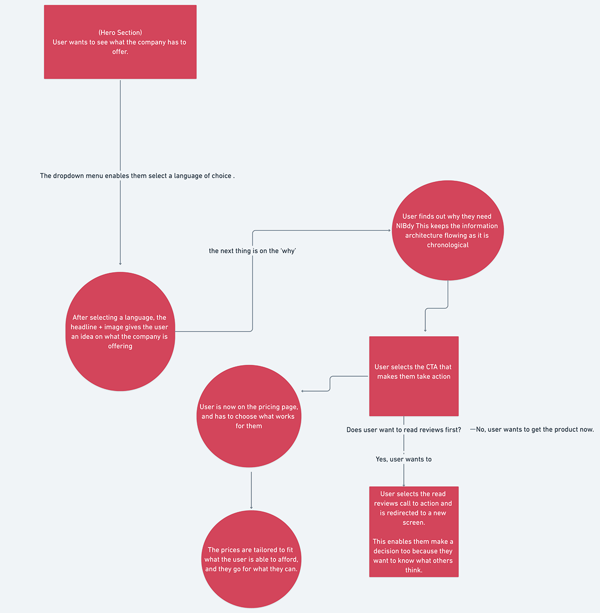
Below is a chart mapping the user journey from the hero section to the pricing page.


