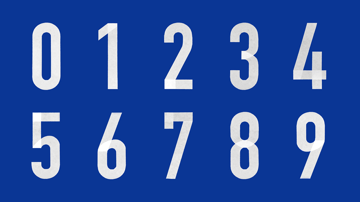
The symbol of 'parking' is used to echo the 'P' of 'packaging' as a call for the reader to stop and read the book. The content of the book is based on the packaging design, so the front and back covers are made of corrugated paper, a symbol of packaging, to visually describe the concept of the book's subject. The text and elements on the inside pages pay homage to the life of 'packaging' by using tape stickers to simulate the digital three-dimensional features of road signs and sign posting.
To be able to instantly and strikingly remember the design of a book, we believe that the highest priority visual impression of a book is not only the graphic design of the cover, but also the materials and processes that best highlight the concept. We chose a wide, thick corrugated material as our preferred binding material. During the communication process with the printer, we experimented with different types and processes in terms of hardness, thickness, and the unique aesthetic balance of the material. We experimented with different types and processes in terms of hardness, thickness, and the unique aesthetic balance of the material, in order to achieve the popular and contrasting effect we wanted in the final execution.


"Packaging Annual" is a design book published by the well-known design website "gtn9", which covers many excellent packaging works. Since it was the first packaging design book that the client had invested in, it needed to be attractive and memorable in terms of the format and visuals of the binding.


The symbol of "parking" is used to echo the "P" of "packaging", calling on readers to stop and read the book. The front and back covers are made of corrugated paper to symbolize the theme. Inside, the elements of the book pay tribute to the "packaging" in life by using tape stickers to simulate the digital three-dimensional features of road signs and the sign posting effect.


The "P" is also a common "parking" symbol in life, and at the same time, we put together more similar "traffic" symbols and numbers through adhesive paper to form new graphics and inserts, so that the visual presentation is more highly echoed in life through the manual state. The texture of the packaging can be seen everywhere.


